Nouveau Conception UI/UX
Interrupteurs
Les interrupteurs basculent l’état d’un seul élément entre actif et inactif.
Anatomie
Un composant interrupteur bascule possède une anatomie simple. Il se compose de :
- Une piste
- Une poignée
- Une étiquette

La taille de l'interrupteur peut varier selon l'appareil de l'utilisateur. Généralement, la taille de l'interrupteur pour les ordinateurs de bureau est de 20×52 pixels afin que l'utilisateur puisse cliquer facilement et le voir clairement. Mais la zone cible doit avoir une taille minimale de 48px.

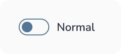
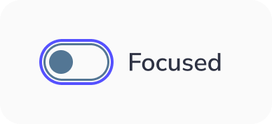
États de l'interrupteur bascule :
Un interrupteur bascule possède 6 types de sélection :
- Inactif : Lorsque l'interrupteur n'est pas actif
- Actif : Lorsque l'interrupteur est actif
- Survolé : Lorsque l'interrupteur est survolé par votre curseur
- Focalisé : Lorsqu'un utilisateur sélectionne l'interrupteur au clavier (généralement avec la touche Tab) ou d'autres outils d'assistance
- Désactivé : Lorsque l'interrupteur n'est pas disponible pour l'interaction
- Sélectionné et désactivé : C'est une situation où l'option de l'interrupteur est sélectionnée mais désactivée pour les interactions.


Bonnes pratiques de conception des Interrupteurs
Rester simple
En tant que designer, vous voulez faire ressortir les choses et vous explorez de nouvelles façons révolutionnaires de les faire. Cependant, ce n'est pas le cas lors de la conception des interrupteurs. Ce composant est très courant et de nombreuses personnes savent comment l'utiliser. Gardez donc les choses aussi simples que possible pour que les utilisateurs comprennent rapidement sa fonction.
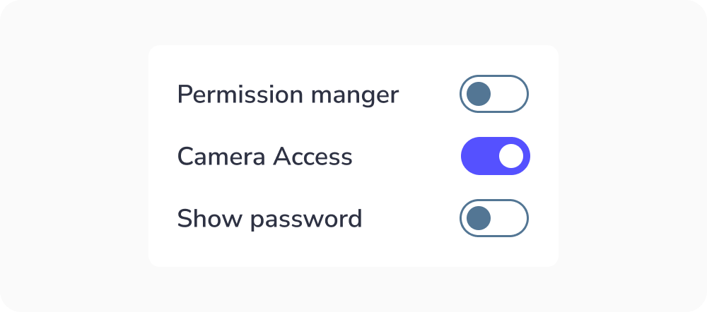
Indiquer l'action requise
Si l'utilisateur doit sélectionner une action parmi un groupe d'interrupteurs, indiquez-le. Ainsi, il comprendra quelle action il doit sélectionner. Cela garantit que l'utilisateur sait quoi faire pour accomplir la tâche :
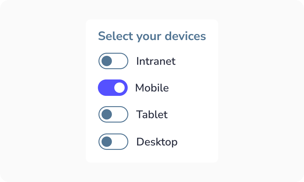
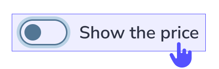
Rendre l'étiquette cliquable
Les étiquettes cliquables permettent aux utilisateurs de sélectionner la bonne option plus facilement car ils peuvent cliquer ou appuyer sur une zone plus grande :
Étiquette tronquée
Pourquoi faut-il l'éviter ?
Lorsque le texte est tronqué, les utilisateurs peuvent :
- Mal interpréter les informations
- Faire de mauvais choix
- Se sentir frustrés ou ralentis
Idée clé :
Les utilisateurs ne devraient pas avoir à deviner ou à travailler pour comprendre le contenu.


Quand utiliser l'interrupteur ?
L'interrupteur bascule permet aux utilisateurs de sélectionner un seul état de l'action « Oui » ou « Non » / « Désactivé » ou « Activé ».
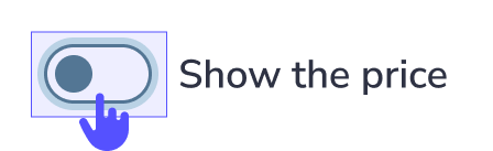
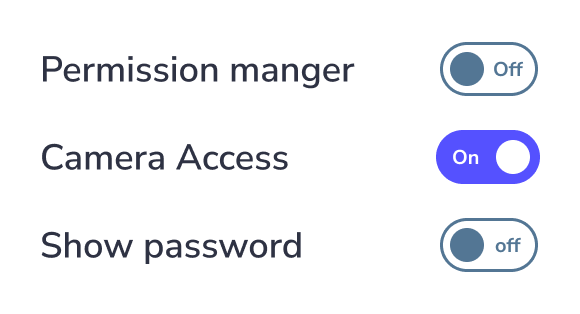
Texte d'étiquette de l'interrupteur
À ne pas faire : Placer le texte de l'étiquette à l'intérieur de l'interrupteur lui-même, car la police serait trop petite pour l'accessibilité. Utilisez une étiquette externe ou une icône appropriée à la place.
Nouveau Conception UI/UX
Les interrupteurs basculent l'état d'un seul élément entre actif et inactif.
Un composant interrupteur bascule possède une anatomie simple. Il se compose de :
- Une piste
- Une poignée
- Une étiquette
La taille de l'interrupteur peut varier selon l'appareil de l'utilisateur. Généralement, la taille de l'interrupteur pour les ordinateurs de bureau est de 20×52 pixels afin que l'utilisateur puisse cliquer facilement et le voir clairement. Mais la zone cible doit avoir une taille minimale de 48px.
États de l'interrupteur bascule :
Un interrupteur bascule possède 6 types de sélection :
- Inactif : Lorsque l'interrupteur n'est pas actif
- Actif : Lorsque l'interrupteur est actif
- Survolé : Lorsque l'interrupteur est survolé par votre curseur
- Focalisé : Lorsqu'un utilisateur sélectionne l'interrupteur au clavier (généralement avec la touche Tab) ou d'autres outils d'assistance
- Désactivé : Lorsque l'interrupteur n'est pas disponible pour l'interaction
- Sélectionné et désactivé : C'est une situation où l'option de l'interrupteur est sélectionnée mais désactivée pour les interactions.
Rester simple
En tant que designer, vous voulez faire ressortir les choses et vous explorez de nouvelles façons révolutionnaires de les faire. Cependant, ce n'est pas le cas lors de la conception des interrupteurs. Ce composant est très courant et de nombreuses personnes savent comment l'utiliser. Gardez donc les choses aussi simples que possible pour que les utilisateurs comprennent rapidement sa fonction.
Indiquer l'action requise
Si l'utilisateur doit sélectionner une action parmi un groupe d'interrupteurs, indiquez-le. Ainsi, il comprendra quelle action il doit sélectionner. Cela garantit que l'utilisateur sait quoi faire pour accomplir la tâche :
Rendre l'étiquette cliquable
Les étiquettes cliquables permettent aux utilisateurs de sélectionner la bonne option plus facilement car ils peuvent cliquer ou appuyer sur une zone plus grande :
Étiquette tronquée
Pourquoi faut-il l'éviter ?
Lorsque le texte est tronqué, les utilisateurs peuvent :
- Mal interpréter les informations
- Faire de mauvais choix
- Se sentir frustrés ou ralentis
Idée clé :
Les utilisateurs ne devraient pas avoir à deviner ou à travailler pour comprendre le contenu.
L'interrupteur bascule permet aux utilisateurs de sélectionner un seul état de l'action « Oui » ou « Non » / « Désactivé » ou « Activé ».
Texte d'étiquette de l'interrupteur
À ne pas faire : Placer le texte de l'étiquette à l'intérieur de l'interrupteur lui-même, car la police serait trop petite pour l'accessibilité. Utilisez une étiquette externe ou une icône appropriée à la place.