New Design UI/UX
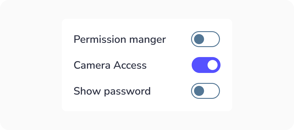
Switches
Switches toggle the state of a single item on or off.
Anatomy
A switches toggle component has a simple anatomy. It consists of :
- A track
- A handle
- A label

The switches toggle size can change depending on the user’s device. Usually, the size of the radio button for desktops is 20×52 pixels so the user can click it easily and see it clearly. But the target area should have a minimm size of 48px.

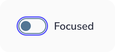
Switches toggle states :
A switches toggle has 6 types of selections associated with it:
- Unactive : When the switches toggle isn’t active
- Active : When the switches toggle is active
- Hovered : When the switches toggle is hovered by your cursor
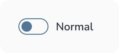
- Focused : When a user selects the rswitches toggle using a keyboard (usually with the Tab key) or other assistive tools
- Disabled : When the switches toggle is not available for interaction
- Activated & Disabled : This is a situation where the switches toggle option is selected but disabled for interactions.


Best practices for Switches toggle design
Keep it simple
As a designer, you want to make things stand out, and you investigate new, groundbreaking ways to do things.
However, this isn’t the case when you work on switches toggle design. This is because this component is a very common one, and many people know how to use it. So, keep things as simple as possible so the users will understand its function quickly.
Indicate the action selection required
If the user has to select an action to make from a switches toggle group, mention it. By doing so, they’ll understand which action they must select. This ensures the user knows what to do to complete the task:
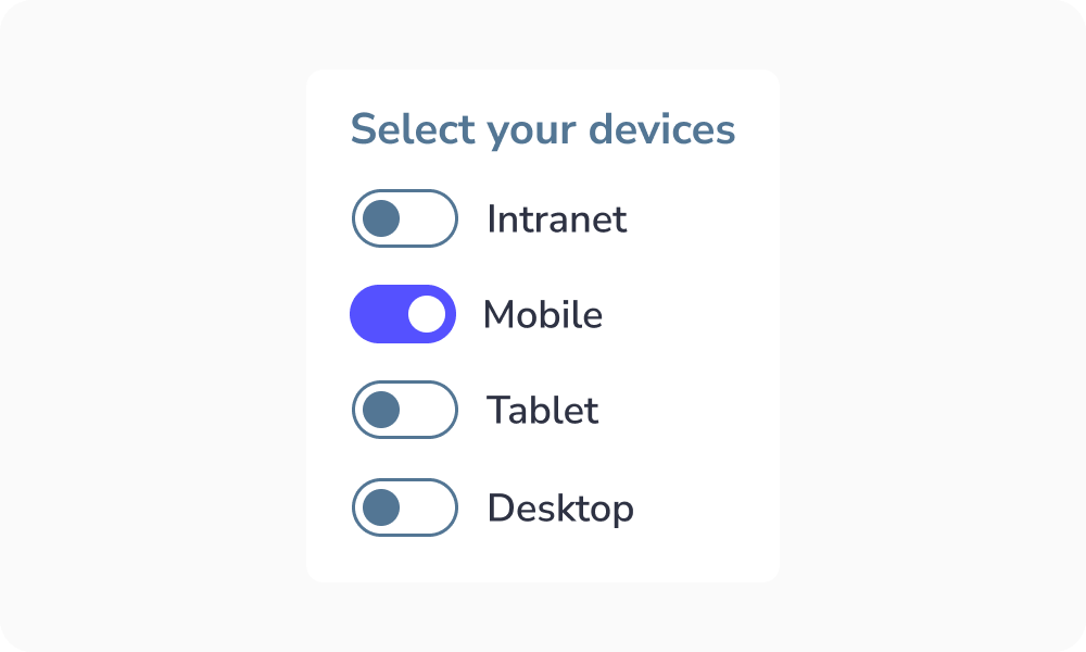
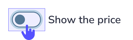
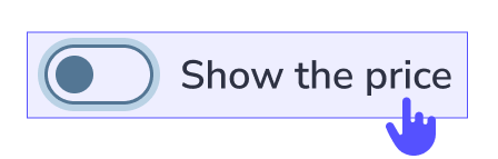
Make the label clickable
Clickable labels enable users to select the right option more easily because they can click or tap on a larger area:
Truncated label
Why it should be avoided?
When text is truncated, users may:
- Misinterpret information
- Make wrong choices
- Feel frustrated or slowed down
Key idea:
Users should not have to guess or work to understand content.


When to use Switches toggle ?
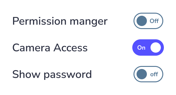
Switches toggle allow users to select only one state of the action "Yes" or "No" / "Off" or "On".
Switch Label Text
Don’t: Place the label text inside the switch itself, as the font would be too small for accessibility. Use an external label or an appropriate icon instead.
New Design UI/UX
Switches toggle the state of a single item on or off.
A switches toggle component has a simple anatomy. It consists of :
- A track
- A handle
- A label
The switches toggle size can change depending on the user’s device. Usually, the size of the radio button for desktops is 20×52 pixels so the user can click it easily and see it clearly. But the target area should have a minimm size of 48px.
Switches toggle states :
A switches toggle has 6 types of selections associated with it:
- Unactive : When the switches toggle isn’t active
- Active : When the switches toggle is active
- Hovered : When the switches toggle is hovered by your cursor
- Focused : When a user selects the rswitches toggle using a keyboard (usually with the Tab key) or other assistive tools
- Disabled : When the switches toggle is not available for interaction
- Activated & Disabled : This is a situation where the switches toggle option is selected but disabled for interactions.
Keep it simple
As a designer, you want to make things stand out, and you investigate new, groundbreaking ways to do things.
However, this isn’t the case when you work on switches toggle design. This is because this component is a very common one, and many people know how to use it. So, keep things as simple as possible so the users will understand its function quickly.
Indicate the action selection required
If the user has to select an action to make from a switches toggle group, mention it. By doing so, they’ll understand which action they must select. This ensures the user knows what to do to complete the task:
Make the label clickable
Clickable labels enable users to select the right option more easily because they can click or tap on a larger area:
Truncated label
Why it should be avoided?
When text is truncated, users may:
- Misinterpret information
- Make wrong choices
- Feel frustrated or slowed down
Key idea:
Users should not have to guess or work to understand content.
Switches toggle allow users to select only one state of the action "Yes" or "No" / "Off" or "On".
Switch Label Text
Don’t: Place the label text inside the switch itself, as the font would be too small for accessibility. Use an external label or an appropriate icon instead.