Nouveau Conception UI/UX
Boutons
Les boutons sont essentiels pour l’interaction des utilisateurs et la navigation dans les interfaces numériques, permettant aux utilisateurs d’initier diverses fonctions d’un simple clic ou d’un appui.
Anatomie
Boutons principaux
Boutons principaux Un interface utilisateur comprend généralement trois types de boutons principaux :
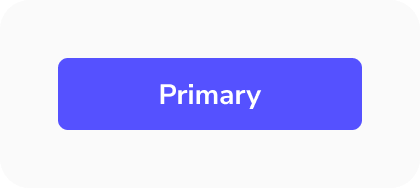
- Bouton primaire : Ce bouton est utilisé pour les actions les plus importantes, comme effectuer un paiement, soumettre un formulaire ou supprimer un élément. En tant qu'action clé à l'écran, il doit se démarquer visuellement pour guider l'utilisateur. Il ne doit y avoir qu'un seul bouton primaire à l'écran.
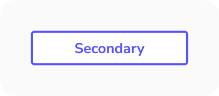
- Bouton secondaire : Ce bouton déclenche des actions qui sont encore pertinentes pour l'utilisateur, mais moins critiques que l'action primaire. Par exemple, un bouton pour enregistrer et un autre pour annuler. L'action d'annulation est généralement secondaire, apparaissant avec moins d'emphase que le bouton primaire. Il peut être utilisé plusieurs fois à l'écran.
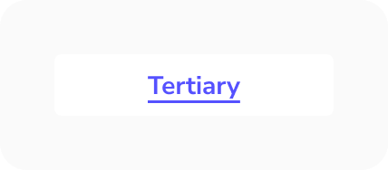
- Bouton tertiaire ou fantôme : Ces boutons sont utilisés pour des tâches moins importantes que l'utilisateur peut effectuer, ils sont donc conçus pour être moins proéminents. Par exemple, un bouton « réinitialiser le mot de passe » sur une page de connexion. Ils sont minimalistes dans leur design et peuvent apparaître plusieurs fois dans l'interface, c'est pourquoi on les appelle « fantômes ».
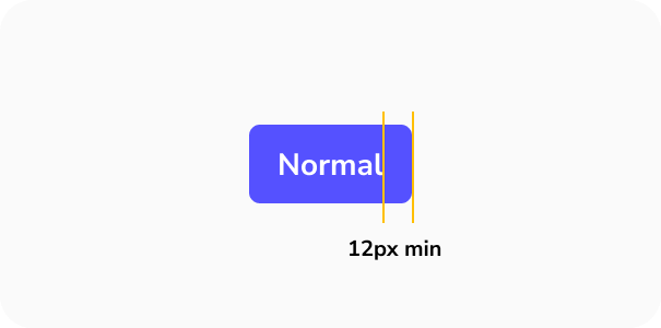
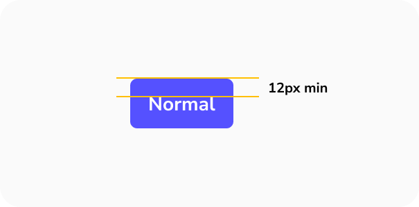
Taille de la cible
Les cibles plus petites sont plus difficiles à cliquer ou à toucher que les plus grandes. C'est particulièrement difficile pour les personnes avec un contrôle moteur limité ou pour celles utilisant leur téléphone d'une seule main, en s'appuyant sur leur pouce.
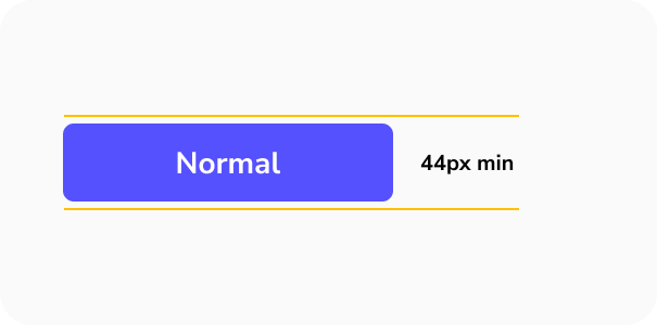
- Les WCAG suggèrent une taille minimale de 44px par 44px pour les zones cliquables.
- Augmentez la taille des boutons fréquemment utilisés pour améliorer l'utilisabilité et réduire le risque que les utilisateurs les ratent.
- Assurez un espacement minimum de 12px entre les boutons pour éviter les appuis accidentels sur le mauvais.
Boutons supplémentaires
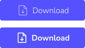
En plus des boutons principaux, il est possible d'inclure des boutons supplémentaires dans une interface, bien qu'ils ne soient pas toujours présents. Ces boutons supplémentaires remplissent des fonctions spécifiques :
- Bouton d'action flottant (FAB) : Couramment vu sur les appareils mobiles, un FAB fournit un raccourci vers les actions principales de l'interface. Lorsqu'on clique dessus, il déclenche une action. Généralement conçu pour se démarquer, il est souvent circulaire avec une icône à l'intérieur, accompagné d'ombres pour créer l'effet de flottement. Un bon exemple est le bouton « Rédiger un nouvel e-mail » de Gmail.
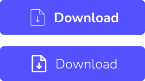
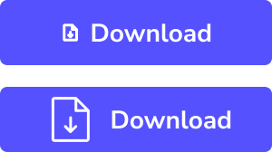
- Bouton icône : Ce type de bouton est utilisé lorsqu'il n'y a pas assez d'espace pour inclure un bouton avec étiquette mais que l'interaction utilisateur est toujours requise. Des exemples incluent une icône d'avion en papier pour envoyer, ou une icône de corbeille pour supprimer dans un tableau de données.
- Lien : Les liens fonctionnent aussi comme des boutons. Ils permettent aux utilisateurs de naviguer vers différentes sections ou pages de l'interface. Ce sont généralement des éléments basés sur du texte, souvent colorés différemment pour montrer qu'ils sont cliquables.
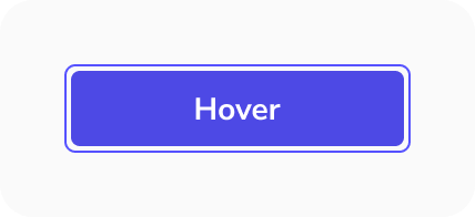
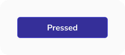
Types et états des boutons
Les interfaces utilisateur comportent généralement deux types principaux de boutons : primaire et secondaire, avec de possibles styles tertiaires pour les appels à l'action (CTA). Ces boutons ont différents états interactifs, essentiels pour l'accessibilité, aidant les utilisateurs à comprendre comment ils interagissent avec l'interface. Plus précisément, l'état de focus doit être clairement visible, car il facilite la navigation au clavier. Les principaux états des boutons sont :
- Par défaut
- Survol
- Appuyé
- Focalisé
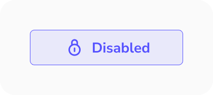
- Désactivé


Bonnes pratiques de conception pour les boutons
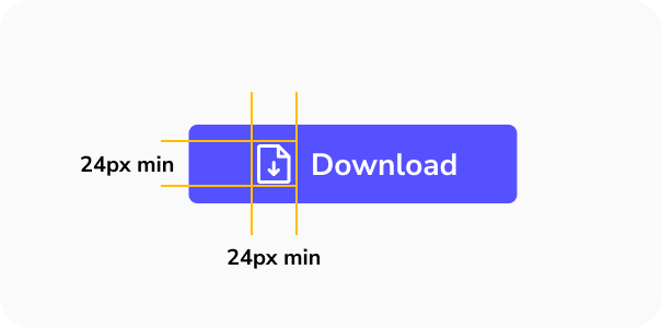
Définir une taille minimale de bouton
Établissez une largeur minimale pour les boutons afin de maintenir une hiérarchie d'écran cohérente, même si un bouton secondaire finit par être plus large qu'un bouton primaire. Cela garantit également que les utilisateurs peuvent les cliquer confortablement.
Pour les petits éléments interactifs, étendez la zone cible au-delà des limites visuelles de l'élément. Cela signifie que même si quelqu'un rate l'élément, il y a de bonnes chances qu'il déclenche quand même l'action.
Équilibrer les paires icône et texte
Lors de la combinaison d'icônes avec du texte, visez une emphase visuelle égale pour créer une apparence plus cohérente et équilibrée.
Utiliser un épaisseur cohérent
Gardez l'icône et le texte au même épaisseur pour les connecter visuellement. Cela crée également une apparence plus équilibrée.
Adapter la taille
Assurez-vous que la taille de l'icône est similaire à la taille du texte pour plus de cohérence.

Contraste des couleurs
Lors du choix des couleurs, il est essentiel de considérer les significations que les gens associent à chacune d'elles. Par exemple, le rouge peut signaler une action négative, comme rejeter, annuler ou arrêter, tandis que le vert représente généralement des actions positives, comme accepter, continuer ou aller. De plus, assurer un contraste suffisant pour le texte des boutons est crucial pour l'accessibilité. Make it Clear s'efforce toujours de respecter les normes WCAG AAA, le niveau le plus élevé de conformité aux Directives pour l'accessibilité du contenu web.


Utiliser des titres concises
Les titres des boutons doivent être courtes et claires, expliquant l'action en aussi peu de mots que possible afin que les utilisateurs comprennent immédiatement ce qu'elle fait.


Les icônes doivent être facilement reconnaissables
Lorsque vous ajoutez des icônes aux boutons, privilégiez la simplicité et évitez les formes trop complexes. Cela permettra aux utilisateurs de comprendre rapidement leur fonction.

Utiliser des icônes familières
Choisissez des icônes largement reconnues pour leur action spécifique. Par exemple, utilisez une loupe pour la recherche. Il n'est pas nécessaire de réinventer la roue.
Limiter les styles de boutons
Évitez d'utiliser trop de styles de boutons différents. Créez une hiérarchie visuelle claire et tenez-vous à quelques types de boutons pour rendre la navigation simple pour les utilisateurs. Il est acceptable d'avoir plusieurs boutons avec seulement deux styles distincts.
Vérifiez que tous les états des boutons fonctionnent correctement
Fournissez aux développeurs des états de boutons clairs et bien définis pour une mise en œuvre correcte. Assurez-vous que tous les états fonctionnent comme prévu, afin que l'interface fonctionne comme conçue.
Regrouper les boutons associés
Placez les boutons qui vont ensemble à proximité immédiate pour montrer aux utilisateurs qu'il s'agit d'actions associées. Les espacer trop loin peut créer de la confusion.
Utiliser des étiquettes quand c'est possible
Si l'espace le permet, utilisez des étiquettes textuelles pour les boutons, car elles offrent des explications plus claires de leur fonction. Si l'espace est limité, utilisez des boutons icône mais accompagnez-les toujours d'une infobulle qui explique l'action de l'icône au survol ou au clic long, surtout sur mobile.
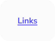
Boutons liens
États
Les boutons liens ont quatre états
- Normal
- Survol
- Focus
- Visité
Normal
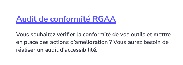
Survol
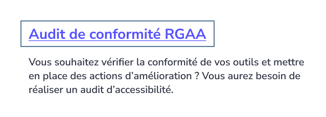
Focus
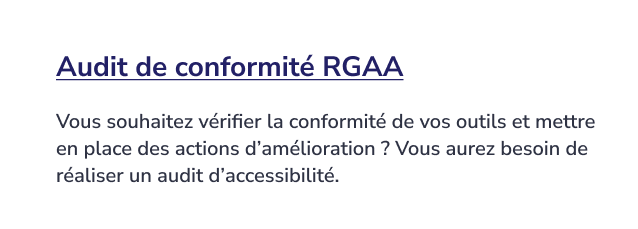
Visité
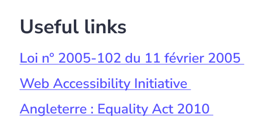
Le surlignage des liens
Le surlignage des liens est souvent négligé, alors qu'il reste le moyen le plus clair et le plus simple d'aider les utilisateurs à identifier les liens. Par défaut, il peut paraître trop épais et visuellement trop chargé, mais son épaisseur peut être ajustée pour créer un aspect plus léger et plus équilibré tout en conservant la clarté.
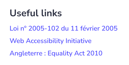
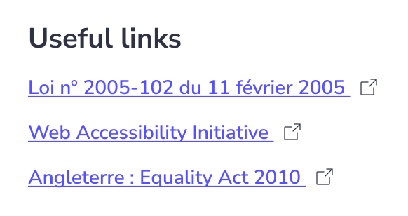
Icônes de liens
Lorsque la page vers laquelle renvoie votre lien s'ouvre dans une nouvelle fenêtre, vous devriez ajouter une icône « Ouvrir dans une nouvelle fenêtre » pour signaler aux utilisateurs qu'ils quittent cette page.
New Conception UI/UX
Les boutons sont essentiels pour l'interaction des utilisateurs et la navigation dans les interfaces numériques, permettant aux utilisateurs d'initier diverses fonctions d'un simple clic ou d'un appui.
Boutons principaux
Boutons principaux Un interface utilisateur comprend généralement trois types de boutons principaux :
- Bouton primaire : Ce bouton est utilisé pour les actions les plus importantes, comme effectuer un paiement, soumettre un formulaire ou supprimer un élément. En tant qu'action clé à l'écran, il doit se démarquer visuellement pour guider l'utilisateur. Il ne doit y avoir qu'un seul bouton primaire à l'écran.
- Bouton secondaire : Ce bouton déclenche des actions qui sont encore pertinentes pour l'utilisateur, mais moins critiques que l'action primaire. Par exemple, un bouton pour enregistrer et un autre pour annuler. L'action d'annulation est généralement secondaire, apparaissant avec moins d'emphase que le bouton primaire. Il peut être utilisé plusieurs fois à l'écran.
- Bouton tertiaire ou fantôme : Ces boutons sont utilisés pour des tâches moins importantes que l'utilisateur peut effectuer, ils sont donc conçus pour être moins proéminents. Par exemple, un bouton « réinitialiser le mot de passe » sur une page de connexion. Ils sont minimalistes dans leur design et peuvent apparaître plusieurs fois dans l'interface, c'est pourquoi on les appelle « fantômes ».
Taille de la cible
Les cibles plus petites sont plus difficiles à cliquer ou à toucher que les plus grandes. C'est particulièrement difficile pour les personnes avec un contrôle moteur limité ou pour celles utilisant leur téléphone d'une seule main, en s'appuyant sur leur pouce.
- Les WCAG suggèrent une taille minimale de 44px par 44px pour les zones cliquables.
- Augmentez la taille des boutons fréquemment utilisés pour améliorer l'utilisabilité et réduire le risque que les utilisateurs les ratent.
- Assurez un espacement minimum de 12px entre les boutons pour éviter les appuis accidentels sur le mauvais.
Boutons supplémentaires
En plus des boutons principaux, il est possible d'inclure des boutons supplémentaires dans une interface, bien qu'ils ne soient pas toujours présents. Ces boutons supplémentaires remplissent des fonctions spécifiques :
- Bouton d'action flottant (FAB) : Couramment vu sur les appareils mobiles, un FAB fournit un raccourci vers les actions principales de l'interface. Lorsqu'on clique dessus, il déclenche une action. Généralement conçu pour se démarquer, il est souvent circulaire avec une icône à l'intérieur, accompagné d'ombres pour créer l'effet de flottement. Un bon exemple est le bouton « Rédiger un nouvel e-mail » de Gmail.
- Bouton icône : Ce type de bouton est utilisé lorsqu'il n'y a pas assez d'espace pour inclure un bouton avec étiquette mais que l'interaction utilisateur est toujours requise. Des exemples incluent une icône d'avion en papier pour envoyer, ou une icône de corbeille pour supprimer dans un tableau de données.
- Lien : Les liens fonctionnent aussi comme des boutons. Ils permettent aux utilisateurs de naviguer vers différentes sections ou pages de l'interface. Ce sont généralement des éléments basés sur du texte, souvent colorés différemment pour montrer qu'ils sont cliquables.
Types et états des boutons
Les interfaces utilisateur comportent généralement deux types principaux de boutons : primaire et secondaire, avec de possibles styles tertiaires pour les appels à l'action (CTA). Ces boutons ont différents états interactifs, essentiels pour l'accessibilité, aidant les utilisateurs à comprendre comment ils interagissent avec l'interface. Plus précisément, l'état de focus doit être clairement visible, car il facilite la navigation au clavier. Les principaux états des boutons sont :
- Par défaut
- Survol
- Appuyé
- Focalisé
- Désactivé
Définir une taille minimale de bouton
Établissez une largeur minimale pour les boutons afin de maintenir une hiérarchie d'écran cohérente, même si un bouton secondaire finit par être plus large qu'un bouton primaire. Cela garantit également que les utilisateurs peuvent les cliquer confortablement.
Pour les petits éléments interactifs, étendez la zone cible au-delà des limites visuelles de l'élément. Cela signifie que même si quelqu'un rate l'élément, il y a de bonnes chances qu'il déclenche quand même l'action.
Équilibrer les paires icône et texte
Lors de la combinaison d'icônes avec du texte, visez une emphase visuelle égale pour créer une apparence plus cohérente et équilibrée.
Utiliser un épaisseur cohérent
Gardez l'icône et le texte au même épaisseur pour les connecter visuellement. Cela crée également une apparence plus équilibrée.
Adapter la taille
Assurez-vous que la taille de l'icône est similaire à la taille du texte pour plus de cohérence.
Contraste des couleurs
Lors du choix des couleurs, il est essentiel de considérer les significations que les gens associent à chacune d'elles. Par exemple, le rouge peut signaler une action négative, comme rejeter, annuler ou arrêter, tandis que le vert représente généralement des actions positives, comme accepter, continuer ou aller. De plus, assurer un contraste suffisant pour le texte des boutons est crucial pour l'accessibilité. Make it Clear s'efforce toujours de respecter les normes WCAG AAA, le niveau le plus élevé de conformité aux Directives pour l'accessibilité du contenu web.
Utiliser des titres concises
Les titres des boutons doivent être courtes et claires, expliquant l'action en aussi peu de mots que possible afin que les utilisateurs comprennent immédiatement ce qu'elle fait.
Les icônes doivent être facilement reconnaissables
Lorsque vous ajoutez des icônes aux boutons, privilégiez la simplicité et évitez les formes trop complexes. Cela permettra aux utilisateurs de comprendre rapidement leur fonction.
Utiliser des icônes familières
Choisissez des icônes largement reconnues pour leur action spécifique. Par exemple, utilisez une loupe pour la recherche. Il n'est pas nécessaire de réinventer la roue.
Limiter les styles de boutons
Évitez d'utiliser trop de styles de boutons différents. Créez une hiérarchie visuelle claire et tenez-vous à quelques types de boutons pour rendre la navigation simple pour les utilisateurs. Il est acceptable d'avoir plusieurs boutons avec seulement deux styles distincts.
Vérifiez que tous les états des boutons fonctionnent correctement
Fournissez aux développeurs des états de boutons clairs et bien définis pour une mise en œuvre correcte. Assurez-vous que tous les états fonctionnent comme prévu, afin que l'interface fonctionne comme conçue.
Regrouper les boutons associés
Placez les boutons qui vont ensemble à proximité immédiate pour montrer aux utilisateurs qu'il s'agit d'actions associées. Les espacer trop loin peut créer de la confusion.
Utiliser des étiquettes quand c'est possible
Si l'espace le permet, utilisez des étiquettes textuelles pour les boutons, car elles offrent des explications plus claires de leur fonction. Si l'espace est limité, utilisez des boutons icône mais accompagnez-les toujours d'une infobulle qui explique l'action de l'icône au survol ou au clic long, surtout sur mobile.
États
Les boutons liens ont quatre états
- Normal
- Survol
- Focus
- Visité
Normal
Survol
Focus
Visité
Le surlignage des liens
Le surlignage des liens est souvent négligé, alors qu'il reste le moyen le plus clair et le plus simple d'aider les utilisateurs à identifier les liens. Par défaut, il peut paraître trop épais et visuellement trop chargé, mais son épaisseur peut être ajustée pour créer un aspect plus léger et plus équilibré tout en conservant la clarté.
Icônes de liens
Lorsque la page vers laquelle renvoie votre lien s'ouvre dans une nouvelle fenêtre, vous devriez ajouter une icône « Ouvrir dans une nouvelle fenêtre » pour signaler aux utilisateurs qu'ils quittent cette page.