New Design UI/UX
Search bar
Search is one of the most frequently used ways for users to navigate a website or application. A poor search experience can directly impact user satisfaction and, ultimately, business performance.
However, the search box users interact with is only the visible part of a much deeper design process. So, how can you create a search UX that truly meets users’ needs? In this section, we’ll explore the key principles of effective search design.
Before diving in, it’s important to ask: does your product really need search functionality? Let’s take a step back to determine when a search interface is truly necessary.
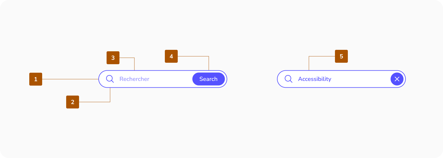
Anatomy
Search includes a search bar and a container for suggestions and results. The container is empty by default.
- Search bar container
- Leading icon
- Supporting text
- Submit button
- Input text
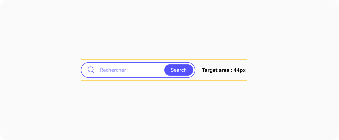
Target Area
Best practices for search bar
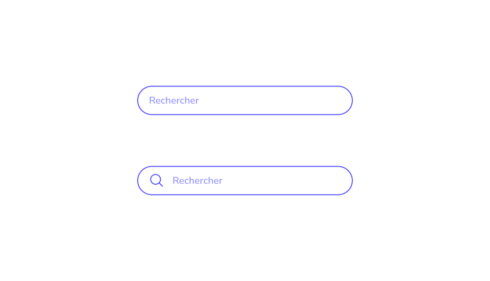
Use a Universal Search Symbol
The magnifying glass is widely recognized as the standard search icon. Users instinctively look for it when trying to find a search bar, so overly creative alternatives can lead to a confusing search experience.
Keep the magnifying glass simple, with minimal detail, and ensure it has a large, easily clickable area that stands out clearly in the interface.
Make Your Search Box Visible
Hiding the search box forces users to hunt for it, resulting in a frustrating search experience. The goal is for users to locate it immediately upon entering the page.
Visibility is key place the search box in a strategic location. Since users typically scan pages in an F-shaped pattern, they are likely to notice a universally recognized magnifying glass quickly.


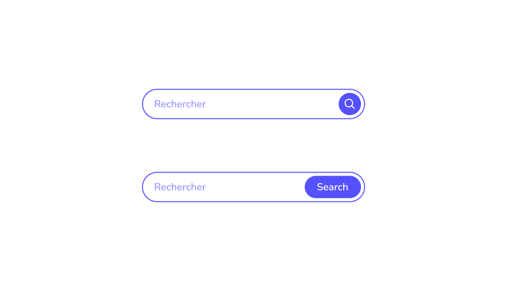
Include a “Submit” Button
While many users initiate a search by pressing “Enter,” some prefer using a traditional “submit” button. On mobile devices, tapping a button is often faster and more convenient than using the keyboard. A well-designed search UX should always include a clearly visible submit button.
Ensure the button is large enough to be easily tapped or clicked, so users don’t need to make multiple attempts, switch keyboards, or zoom in to activate it.
Make Your Search Field Long Enough
Ensure the search box is wide enough to accommodate the user’s entire query. On mobile devices which account for 79% of online purchases it’s especially important for the search field to span most of the screen width. This allows users to type comfortably, regardless of finger size, eyesight, or other factors, improving usability and reducing errors.


When Do You Need a Search ?
Not every website requires a search function—simple one-page sites with no plans to expand can do without it. However, for many platforms, an effective search experience is critical. These include:
- eCommerce websites
- Marketplaces
- News portals
- Booking services
- Educational platforms, such as libraries or encyclopedias
In short, any large website with hundreds of entries needs a well-designed search UX.
But why is search so essential in these cases? And why is simply having a search box not enough to guarantee business success? Let’s explore this further.
Place a Search Box on Every Page
Users don’t always use search immediately upon entering a website. They may start by browsing the site and only turn to search when they can’t find what they need. For this reason, the search box should be accessible on every page. Forcing users to return to the homepage just to perform a search creates a frustrating experience and undermines good search UX.
New Design UI/UX
Search is one of the most frequently used ways for users to navigate a website or application. A poor search experience can directly impact user satisfaction and, ultimately, business performance.
However, the search box users interact with is only the visible part of a much deeper design process. So, how can you create a search UX that truly meets users’ needs? In this section, we’ll explore the key principles of effective search design.
Before diving in, it’s important to ask: does your product really need search functionality? Let’s take a step back to determine when a search interface is truly necessary.
Search includes a search bar and a container for suggestions and results. The container is empty by default.
- Search bar container
- Leading icon
- Supporting text
- Submit button
- Input text
Target Area
Use a Universal Search Symbol
The magnifying glass is widely recognized as the standard search icon. Users instinctively look for it when trying to find a search bar, so overly creative alternatives can lead to a confusing search experience.
Keep the magnifying glass simple, with minimal detail, and ensure it has a large, easily clickable area that stands out clearly in the interface.
Make Your Search Box Visible
Hiding the search box forces users to hunt for it, resulting in a frustrating search experience. The goal is for users to locate it immediately upon entering the page.
Visibility is key place the search box in a strategic location. Since users typically scan pages in an F-shaped pattern, they are likely to notice a universally recognized magnifying glass quickly.
Include a “Submit” Button
While many users initiate a search by pressing “Enter,” some prefer using a traditional “submit” button. On mobile devices, tapping a button is often faster and more convenient than using the keyboard. A well-designed search UX should always include a clearly visible submit button.
Ensure the button is large enough to be easily tapped or clicked, so users don’t need to make multiple attempts, switch keyboards, or zoom in to activate it.
Make Your Search Field Long Enough
Ensure the search box is wide enough to accommodate the user’s entire query. On mobile devices which account for 79% of online purchases it’s especially important for the search field to span most of the screen width. This allows users to type comfortably, regardless of finger size, eyesight, or other factors, improving usability and reducing errors.
Not every website requires a search function—simple one-page sites with no plans to expand can do without it. However, for many platforms, an effective search experience is critical. These include:
- eCommerce websites
- Marketplaces
- News portals
- Booking services
- Educational platforms, such as libraries or encyclopedias
In short, any large website with hundreds of entries needs a well-designed search UX.
But why is search so essential in these cases? And why is simply having a search box not enough to guarantee business success? Let’s explore this further.
Place a Search Box on Every Page
Users don’t always use search immediately upon entering a website. They may start by browsing the site and only turn to search when they can’t find what they need. For this reason, the search box should be accessible on every page. Forcing users to return to the homepage just to perform a search creates a frustrating experience and undermines good search UX.