New Design UI/UX
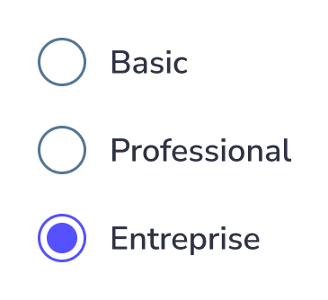
Radio Button
Radio buttons are simple yet essential UI elements that allow users to select one option from a predefined list. They appear as small circular controls where only a single choice can be active at a time.
Commonly used in forms and input fields, radio buttons provide a clear way to present mutually exclusive options. Although they are small components, their design and implementation can significantly impact usability.
The following radio button UX principles will help ensure they are used effectively.
Anatomy
A radio button component has a simple anatomy. It consists of :
- An input element
- A selected icon
- A label

The radio button size can change depending on the user’s device. Usually, the size of the radio button for desktops is 20×20 pixels so the user can click it easily and see it clearly. But the target area should have a minimm size of 48px.

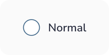
Radio button states :
A radio button has 6 types of selections associated with it:
- Unselected : When the radio button isn’t selected
- Selected : When the radio button is active
- Hovered : When the radio button is hovered by your cursor
- Focused : When a user selects the radio button using a keyboard (usually with the Tab key) or other assistive tools
- Disabled : When the radio button is not available for interaction
- Selected & Disabled : This is a situation where the radio button option is selected but disabled for interactions.


Best practices for radio buttons design
Keep it simple
As a designer, you want to make things stand out, and you investigate new, groundbreaking ways to do things.
However, this isn’t the case when you work on radio button design. This is because this component is a very common one, and many people know how to use it. So, keep things as simple as possible so the users will understand its function quickly.
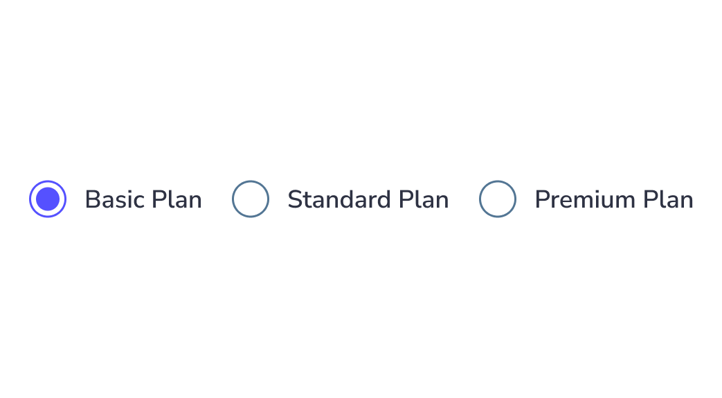
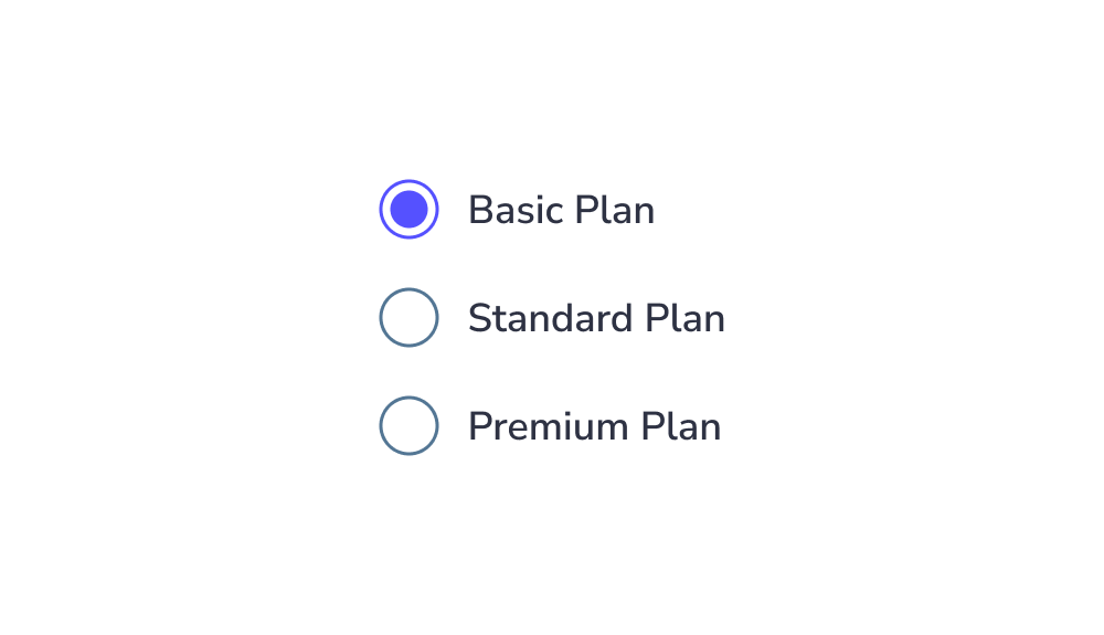
Arrange radio buttons vertically for better readability
Lists of multiple radio buttons should be organized vertically instead of horizontally because vertical lists are easier to read and scan, allowing users to navigate and find what they search for faster:
Indicate the action selection required
If the user has to select an action to make from a radio button group, mention it. By doing so, they’ll understand which action they must select. This ensures the user knows what to do to complete the task:
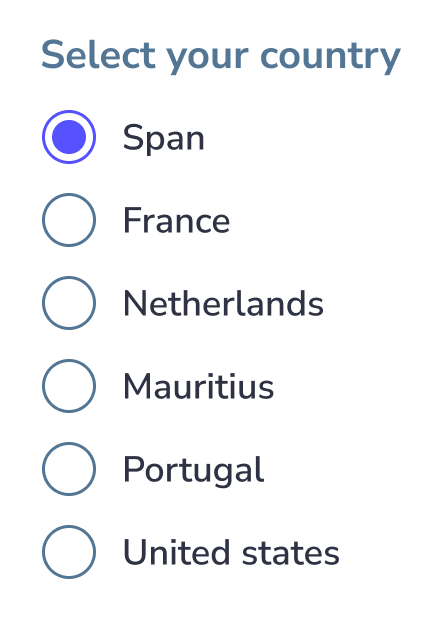
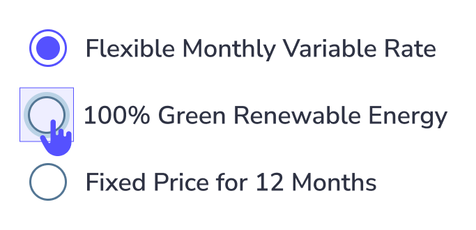
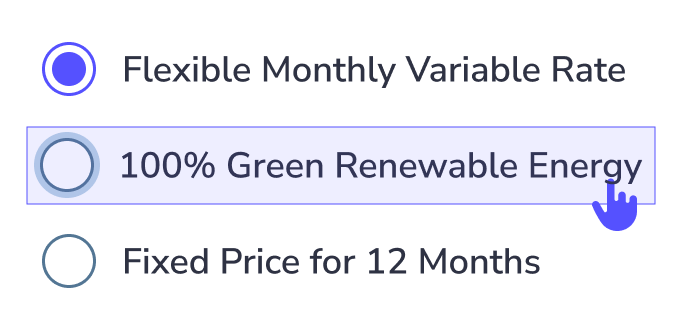
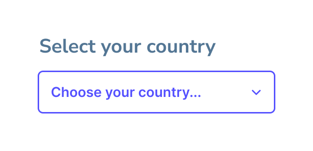
Make the label clickable
Clickable labels enable users to select the right option more easily because they can click or tap on a larger area:
Truncated label
Why it should be avoided?
When text is truncated, users may:
- Misinterpret information
- Make wrong choices
- Feel frustrated or slowed down
Key idea:
Users should not have to guess or work to understand content.
When to use Radio button ?
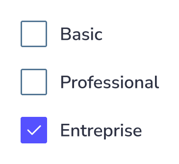
Radio button allow users to select only one options from a set. To select multiple options use checkboxes insted
Creative and Playful Radio Button UX
Adding a touch of creativity to radio buttons can make routine interactions more engaging and enjoyable. Thoughtful use of colors, animations, or interactive elements can inject personality into your interface while keeping it usable.
Creative designs like this can help your interface stand out, but always ensure they enhance clarity and usability, rather than distract or overwhelm users.
New Design UI/UX
Radio buttons are simple yet essential UI elements that allow users to select one option from a predefined list. They appear as small circular controls where only a single choice can be active at a time.
Commonly used in forms and input fields, radio buttons provide a clear way to present mutually exclusive options. Although they are small components, their design and implementation can significantly impact usability.
The following radio button UX principles will help ensure they are used effectively.
A radio button component has a simple anatomy. It consists of :
- An input element
- A selected icon
- A label
The radio button size can change depending on the user’s device. Usually, the size of the radio button for desktops is 20×20 pixels so the user can click it easily and see it clearly. But the target area should have a minimm size of 48px.
Radio button states :
A radio button has 6 types of selections associated with it:
- Unselected : When the radio button isn’t selected
- Selected : When the radio button is active
- Hovered : When the radio button is hovered by your cursor
- Focused : When a user selects the radio button using a keyboard (usually with the Tab key) or other assistive tools
- Disabled : When the radio button is not available for interaction
- Selected & Disabled : This is a situation where the radio button option is selected but disabled for interactions.
Keep it simple
As a designer, you want to make things stand out, and you investigate new, groundbreaking ways to do things.
However, this isn’t the case when you work on radio button design. This is because this component is a very common one, and many people know how to use it. So, keep things as simple as possible so the users will understand its function quickly.
Arrange radio buttons vertically for better readability
Lists of multiple radio buttons should be organized vertically instead of horizontally because vertical lists are easier to read and scan, allowing users to navigate and find what they search for faster:
Indicate the action selection required
If the user has to select an action to make from a radio button group, mention it. By doing so, they’ll understand which action they must select. This ensures the user knows what to do to complete the task:
Make the label clickable
Clickable labels enable users to select the right option more easily because they can click or tap on a larger area:
Truncated label
Why it should be avoided?
When text is truncated, users may:
- Misinterpret information
- Make wrong choices
- Feel frustrated or slowed down
Key idea:
Users should not have to guess or work to understand content.
Radio button allow users to select only one options from a set. To select multiple options use checkboxes insted
Creative and Playful Radio Button UX
Adding a touch of creativity to radio buttons can make routine interactions more engaging and enjoyable. Thoughtful use of colors, animations, or interactive elements can inject personality into your interface while keeping it usable.
Creative designs like this can help your interface stand out, but always ensure they enhance clarity and usability, rather than distract or overwhelm users.