New Design UI/UX
Checkbox
A checkbox is a common UI component used in almost any application on the market. The guidelines of this component are clear, but many times designs don’t provide this info for the developers. This can ultimately make for a poor experience for users. For example, the user must be able to navigate with a keyboard, and the checkbox must be usable with a screen reader.
Apart from desktop devices, you have to think about mobile devices too. You need to consider the size of the checkbox and the space between each element so that the user can easily tap on them.
Anatomy
A checkbox component has a simple anatomy. It consists of :
- An input element
- A sign
- A label
Which can be one of three options: none, checked, or intermediate state

In addition, the checkbox can also display an error or helper text to communicate information to the user.
The checkbox size can change depending on the user’s device. Usually, the size of the box for desktops is 20×20 pixels so the user can click it easily and see it clearly. But the target area should have a minimm size of 48px.

Checkbox selection states :
A checkbox has 6 types of selections associated with it:
- Not selected : When the checkbox isn’t selected
- Checked : When the checkbox is marked with a check icon inside
- Hovered : When the checkbox is hovered by your cursor
- Focused : When a user selects the checkbox using a keyboard (usually with the Tab key) or other assistive tools
- Disabled : When the checkbox is not available for interaction
- Intermediate : This is a situation where the checkbox indicates that some objects are selected and others aren’t. It’s used in a list with hierarchical relationships like a tree view or nested lists


Best practices for checkbox design
Keep it simple
As a designer, you want to make things stand out, and you investigate new, groundbreaking ways to do things.
However, this isn’t the case when you work on checkbox design. This is because this component is a very common one, and many people know how to use it. So, keep things as simple as possible so the users will understand its function quickly.
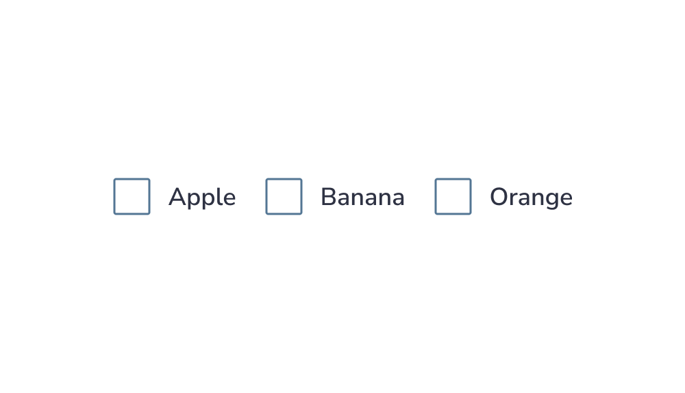
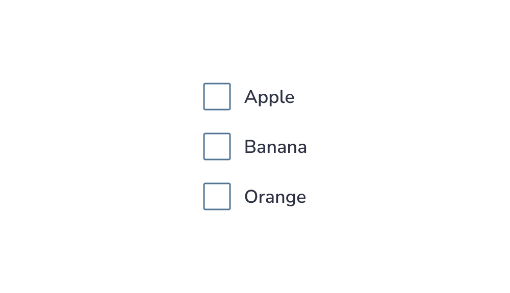
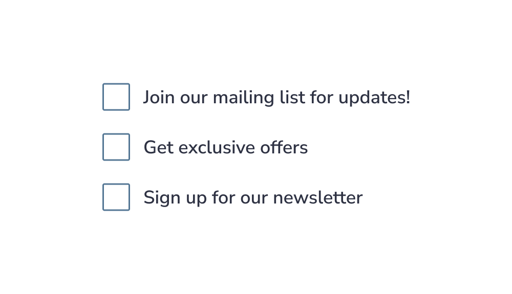
Arrange checkboxes vertically for better readability
Lists of multiple checkboxes should be organized vertically instead of horizontally because vertical lists are easier to read and scan, allowing users to navigate and find what they search for faster:
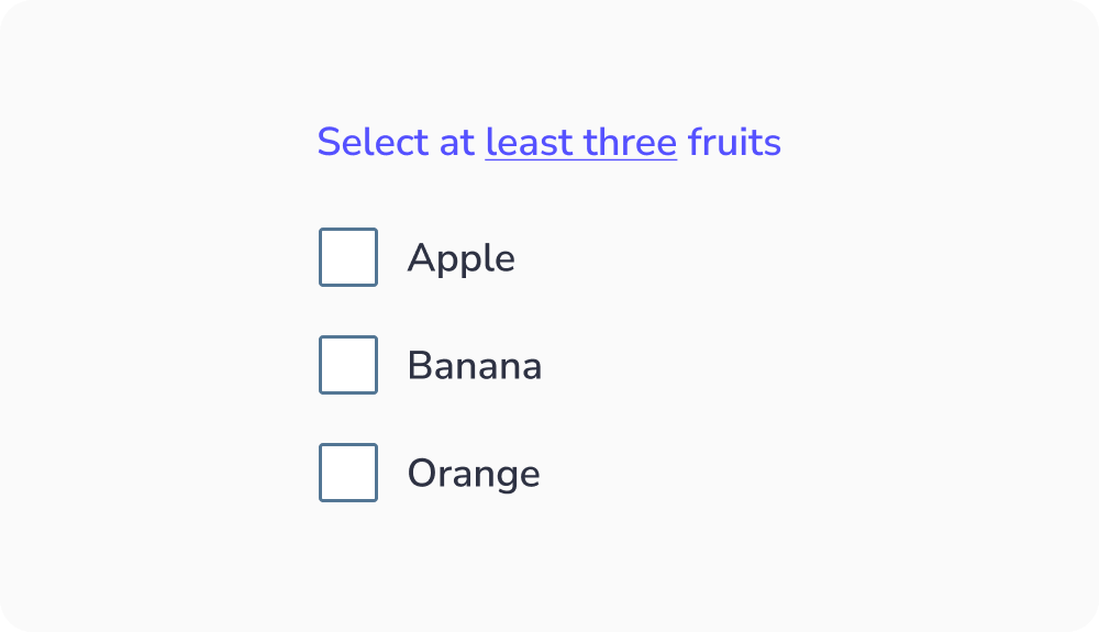
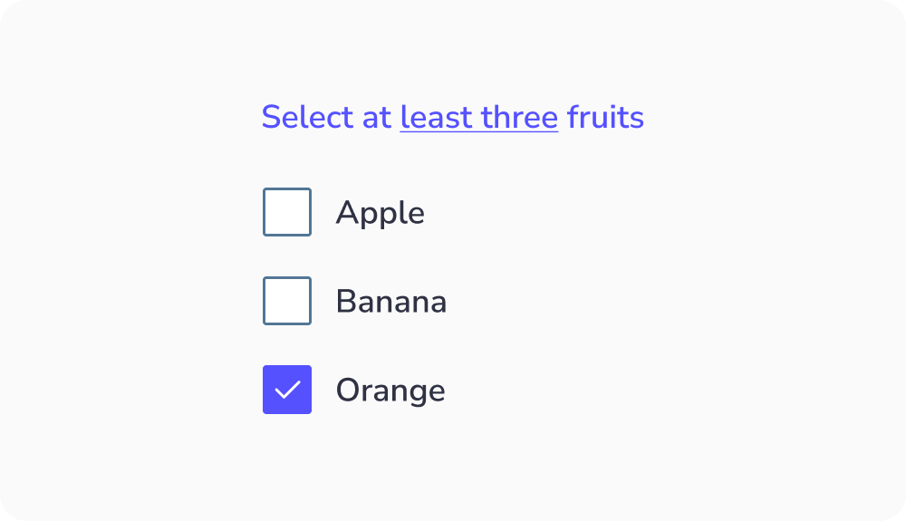
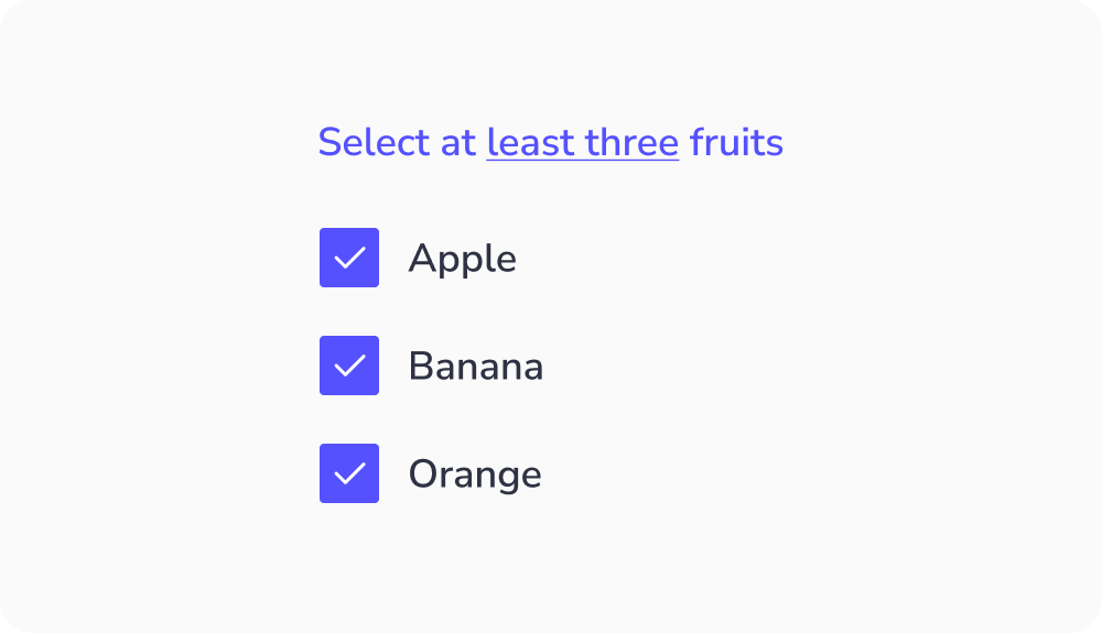
Indicate the minimum selection required
If the user has to select a minimum number of elements from a checkbox group, mention it. By doing so, they’ll understand how many elements they must select. This ensures the user knows what to do to complete the task:
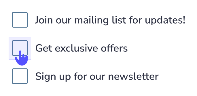
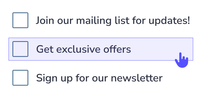
Make the label clickable
Clickable labels enable users to select the checkbox more easily because they can click or tap on a larger area:
Make sure the checkbox is contrasted
Test the color contrast, and make sure the screen readers and keyboard navigation work well to ensure all users can use the component easily:


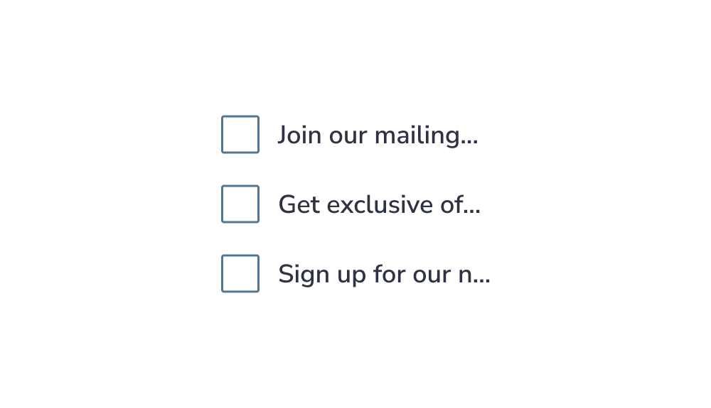
Truncated Text
Why it should be avoided?
When text is truncated, users may:
- Misinterpret information
- Make wrong choices
- Feel frustrated or slowed down
Key idea:
Users should not have to guess or work to understand content.
When to use checkboxes ?
Checkboxes allow users to select one or more options from a set. Each option operates independently.
New Design UI/UX
Checkbox
A checkbox is a common UI component used in almost any application on the market. The guidelines of this component are clear, but many times designs don’t provide this info for the developers. This can ultimately make for a poor experience for users. For example, the user must be able to navigate with a keyboard, and the checkbox must be usable with a screen reader.
Apart from desktop devices, you have to think about mobile devices too. You need to consider the size of the checkbox and the space between each element so that the user can easily tap on them.
A checkbox component has a simple anatomy. It consists of :
- An input element
- A sign
- A label
Which can be one of three options: none, checked, or intermediate state
In addition, the checkbox can also display an error or helper text to communicate information to the user.
The checkbox size can change depending on the user’s device. Usually, the size of the box for desktops is 20×20 pixels so the user can click it easily and see it clearly. But the target area should have a minimm size of 48px.
Checkbox selection states :
A checkbox has 6 types of selections associated with it:
- Not selected : When the checkbox isn’t selected
- Checked : When the checkbox is marked with a check icon inside
- Hovered : When the checkbox is hovered by your cursor
- Focused : When a user selects the checkbox using a keyboard (usually with the Tab key) or other assistive tools
- Disabled : When the checkbox is not available for interaction
- Intermediate : This is a situation where the checkbox indicates that some objects are selected and others aren’t. It’s used in a list with hierarchical relationships like a tree view or nested lists
Keep it simple
As a designer, you want to make things stand out, and you investigate new, groundbreaking ways to do things.
However, this isn’t the case when you work on checkbox design. This is because this component is a very common one, and many people know how to use it. So, keep things as simple as possible so the users will understand its function quickly.
Arrange checkboxes vertically for better readability
Lists of multiple checkboxes should be organized vertically instead of horizontally because vertical lists are easier to read and scan, allowing users to navigate and find what they search for faster:
Indicate the minimum selection required
If the user has to select a minimum number of elements from a checkbox group, mention it. By doing so, they’ll understand how many elements they must select. This ensures the user knows what to do to complete the task:
Make the label clickable
Clickable labels enable users to select the checkbox more easily because they can click or tap on a larger area:
Make sure the checkbox is contrasted
Test the color contrast, and make sure the screen readers and keyboard navigation work well to ensure all users can use the component easily:
Truncated Text
Why it should be avoided?
When text is truncated, users may:
- Misinterpret information
- Make wrong choices
- Feel frustrated or slowed down
Key idea:
Users should not have to guess or work to understand content.
Checkboxes allow users to select one or more options from a set. Each option operates independently.