New Design UI/UX
Accordion
Well-designed accordions can significantly enhance a UI by helping users find information quickly without overwhelming them with too much content at once.
Anatomy
From a UX perspective, they are excellent for reducing "scroll fatigue" and organizing dense information, but they require precise anatomical structure to remain accessible.
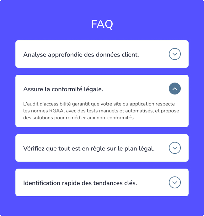
- Trigger Button : The interactive surfac, ensuring users with limited dexterity or those on mobile can easily activate the toggle.
- State Icon : A visual affordance. It uses a rotation (0° to 180°) to communicate state. For accessibility, it is hidden from screen readers (
aria-hidden) because the state is already communicated by the button's attributes. - Content Panel : The revealed region.

Target Area
Smaller targets are harder to click or tap compared to larger ones. This is particularly challenging for individuals with limited motor control or for those using their phone with one hand, relying on their thumb. Ensure a minimum of 12px padding to help people with disailities get easy access to your informations.

Best practices for Accordion
Clicking the Entire Header Should Expand the Menu
The entire header section, including the icon, should be clickable to expand the menu. Ensure that the area containing both the header text and icon is clickable to trigger the expansion. Limiting clickability to just the header or icon reduces the chances of a successful interaction. Accordions must be accessible through various methods such as tapping, clicking, and keyboard navigation. They present additional challenges for accessibility and should be usable with keyboards, screen readers, and touch devices.


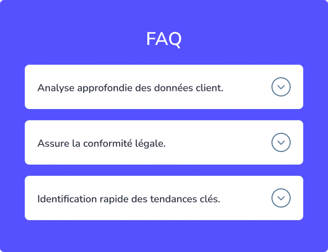
Collapsed State
An accordion typically starts in a collapsed state, where the content is hidden and requires a click or tap to expand. To show that more content is available, use indicators like a plus (+) icon or a right arrow (→) beside each expandable item. This maintains a clean look while offering additional content for those who want it.


Expanded State
Think of a collapsed accordion as a set of labeled drawers, where each label hints at the content inside. When a user expands the menu, it reveals the full content for deeper exploration. To indicate the expanded state, change the icon from a plus (+) or right arrow (→) to a minus (−) or down arrow (↓). This visual cue helps users recognize the content is open, making navigation intuitive.
Pro Tip! Straying from familiar icons can confuse users about the menu’s expandability, leading to frustration. Stick to standard icons for clarity.


Hover State for Interactivity
When users hover over an interactive element, it signals that the item is clickable. To ensure clear interaction, provide at least two visual cues for the hover state, such as a pointer cursor and a color change. This combination makes it obvious that the element can be clicked.


Adequate Space Between Containers
Each accordion section should have enough space around it to make content easy to scan. Sufficient spacing also creates larger, more accessible clickable areas. For mobile devices, ensure touch targets are large enough, with a recommended minimum height of 44 pixels to meet accessibility guidelines.


Simple Section Styles
Keep the styling of accordion content consistent with the rest of the design to avoid confusion. Use distinct font styles to differentiate content from titles without overwhelming users. Avoid cluttering the content area with unnecessary links or buttons, as this can make the interface more complex and harder to navigate.


Accordion Behavior to User Needs
Typically, an accordion allows only one section to be open at a time. When a new section is clicked, the previous one collapses automatically. This minimizes user actions and keeps the page clean, but prevents comparing content across multiple sections. If you choose to use automatic collapsing, ensure it works best when there are few sections and users don't need to scroll excessively. Consider offering a "Collapse All" or "Expand All" button for easier navigation when there are many sections.

Indicate Section State
When a section is expanded, subtly change its color or style to highlight that it is active. Altering the background or text color, or using bolder text and more prominent borders, can visually separate the active section from others. These cues should be consistent across all sections while remaining subtle enough to preserve the overall design.


Consistent Icon Placement
While the position of icons within an accordion section doesn’t affect functionality, maintaining consistency in their placement is crucial. Position all icons in the same location (either all on the left or all on the right) to make scanning easier for users. This consistency reduces visual disruption and cognitive load.


Maintain Typographic Hierarchy
Headings within accordion sections should be styled to clearly differentiate them from body text. This helps guide the user's eye and creates visual breaks between sections. Use larger font sizes, different typefaces, or bold text to make headings stand out, but avoid overdoing it to keep the design balanced and aesthetically pleasing.


Use Descriptive Headings
Headings in accordions are like navigational guides. They should be concise, clear, and relevant to the content inside. Make them enticing to encourage users to expand the sections. Here are some tips for effective headings:
- Keep them brief and direct.
- Use language that aligns with users’ needs.
- Include keywords for easy scanning.
- Ensure they accurately reflect the content within.
Understanding user needs through research can help create headings that improve the accordion’s usefulness.
When to Avoid Accordions ?
Accordions may not be ideal when users need access to most or all of the content on a page. In cases where comprehensive information is necessary, displaying it all at once is preferable. Avoid forcing users to click through multiple accordion sections if they intend to view the entire page. For long pages, consider alternative navigation methods, such as breaking content into manageable sections or pages. If accordions are used, allow multiple sections to stay open at once, and ensure the state of each section (open or closed) is persistent across user interactions.
From a UX perspective, they are excellent for reducing "scroll fatigue" and organizing dense information, but they require precise anatomical structure to remain accessible.
- Trigger Button : The interactive surfac, ensuring users with limited dexterity or those on mobile can easily activate the toggle.
- State Icon : A visual affordance. It uses a rotation (0° to 180°) to communicate state. For accessibility, it is hidden from screen readers (
aria-hidden) because the state is already communicated by the button's attributes. - Content Panel : The revealed region.
Target Area
Smaller targets are harder to click or tap compared to larger ones. This is particularly challenging for individuals with limited motor control or for those using their phone with one hand, relying on their thumb. Ensure a minimum of 12px padding to help people with disailities get easy access to your informations.
Clicking the Entire Header Should Expand the Menu
The entire header section, including the icon, should be clickable to expand the menu. Ensure that the area containing both the header text and icon is clickable to trigger the expansion. Limiting clickability to just the header or icon reduces the chances of a successful interaction. Accordions must be accessible through various methods such as tapping, clicking, and keyboard navigation. They present additional challenges for accessibility and should be usable with keyboards, screen readers, and touch devices.
Collapsed State
An accordion typically starts in a collapsed state, where the content is hidden and requires a click or tap to expand. To show that more content is available, use indicators like a plus (+) icon or a right arrow (→) beside each expandable item. This maintains a clean look while offering additional content for those who want it.
Expanded State
Think of a collapsed accordion as a set of labeled drawers, where each label hints at the content inside. When a user expands the menu, it reveals the full content for deeper exploration. To indicate the expanded state, change the icon from a plus (+) or right arrow (→) to a minus (−) or down arrow (↓). This visual cue helps users recognize the content is open, making navigation intuitive.
Pro Tip! Straying from familiar icons can confuse users about the menu’s expandability, leading to frustration. Stick to standard icons for clarity.
Hover State for Interactivity
When users hover over an interactive element, it signals that the item is clickable. To ensure clear interaction, provide at least two visual cues for the hover state, such as a pointer cursor and a color change. This combination makes it obvious that the element can be clicked.
Adequate Space Between Containers
Each accordion section should have enough space around it to make content easy to scan. Sufficient spacing also creates larger, more accessible clickable areas. For mobile devices, ensure touch targets are large enough, with a recommended minimum height of 44 pixels to meet accessibility guidelines.
Simple Section Styles
Keep the styling of accordion content consistent with the rest of the design to avoid confusion. Use distinct font styles to differentiate content from titles without overwhelming users. Avoid cluttering the content area with unnecessary links or buttons, as this can make the interface more complex and harder to navigate.
Accordion Behavior to User Needs
Typically, an accordion allows only one section to be open at a time. When a new section is clicked, the previous one collapses automatically. This minimizes user actions and keeps the page clean, but prevents comparing content across multiple sections. If you choose to use automatic collapsing, ensure it works best when there are few sections and users don't need to scroll excessively. Consider offering a "Collapse All" or "Expand All" button for easier navigation when there are many sections.
Indicate Section State
When a section is expanded, subtly change its color or style to highlight that it is active. Altering the background or text color, or using bolder text and more prominent borders, can visually separate the active section from others. These cues should be consistent across all sections while remaining subtle enough to preserve the overall design.
Consistent Icon Placement
While the position of icons within an accordion section doesn’t affect functionality, maintaining consistency in their placement is crucial. Position all icons in the same location (either all on the left or all on the right) to make scanning easier for users. This consistency reduces visual disruption and cognitive load.
Maintain Typographic Hierarchy
Headings within accordion sections should be styled to clearly differentiate them from body text. This helps guide the user's eye and creates visual breaks between sections. Use larger font sizes, different typefaces, or bold text to make headings stand out, but avoid overdoing it to keep the design balanced and aesthetically pleasing.
Use Descriptive Headings
Headings in accordions are like navigational guides. They should be concise, clear, and relevant to the content inside. Make them enticing to encourage users to expand the sections. Here are some tips for effective headings:
- Keep them brief and direct.
- Use language that aligns with users’ needs.
- Include keywords for easy scanning.
- Ensure they accurately reflect the content within.
Understanding user needs through research can help create headings that improve the accordion’s usefulness.
Accordions may not be ideal when users need access to most or all of the content on a page. In cases where comprehensive information is necessary, displaying it all at once is preferable. Avoid forcing users to click through multiple accordion sections if they intend to view the entire page. For long pages, consider alternative navigation methods, such as breaking content into manageable sections or pages. If accordions are used, allow multiple sections to stay open at once, and ensure the state of each section (open or closed) is persistent across user interactions.
New Design UI/UX
Accordions are vertically stacked interactive containers used to show and hide sections of content.