New Design UI/UX
Navbar
Navigation menus (navbars) are among the most frequently viewed and interacted with elements of a website interface. They play a critical role in usability by enabling users to move easily between pages and sections.
Let’s explore a few navigation design principles that can improve the overall user experience.
Anatomy
text
Best practices for Navbar design
Position the navigation menu in a strategic location
The placement of a navigation bar is crucial for usability. Over time, the web has established widely recognized conventions for navigation placement typically at the top of the page, along the left side, or in the footer. Placing navigation outside of these common areas can make it harder for users to locate, leading to confusion and unnecessary effort during navigation.
Prefer mega menus over dropdown lists
Research suggests that mega menus often provide a better user experience than traditional dropdown lists. They allow users to view multiple options at once, making it easier to scan and understand the available content. In addition, mega menus can include images, support clearer grouping of links, and offer a more visually structured presentation.
Include an appropriate number of items
The optimal number of items in a navigation menu depends on several factors, such as the complexity of the product and the users’ level of familiarity. However, it is generally recommended to limit the menu to no more than six or seven items. The order of these items is also important, as it influences how easily users can find the information they need.
Do not hide your navigation menu
Navigation menus are among the most frequently used elements of an interface. Because they provide essential context and help users understand where they are and where they can go, they should remain easily accessible at all times.
On mobile devices, the hamburger menu has become a common default pattern. However, other solutions can keep navigation more visible, such as tab bars, thoughtful grouping of items, or well-designed dropdowns. These alternatives help reduce the need to fully hide navigation options.
When to use Navbar
Focus on visual layout
A well-structured interface layout greatly enhances the user experience. Here are some tips to create a more effective and intuitive design. Whenever possible, test your layouts with real users, and always consider accessibility—even in approximate form—to ensure your design works for everyone.
- Keep the navigation bar clean and minimal; avoid decorative elements or animations.
- Make links clearly interactive and visually distinct from regular content.
- Emphasize key pages.
- Ensure links are large enough for easy clicking.
- Separate navigation from content visually, using lines or white space.
On this page
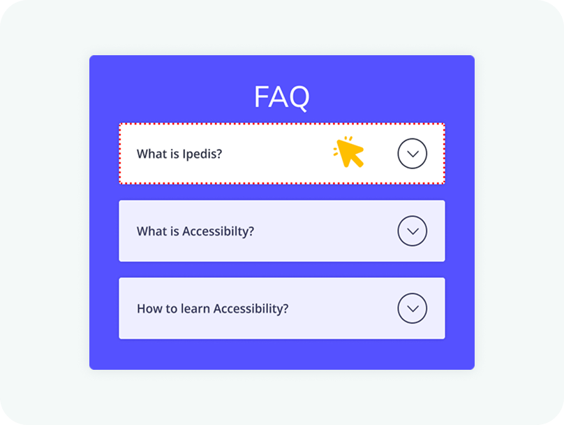
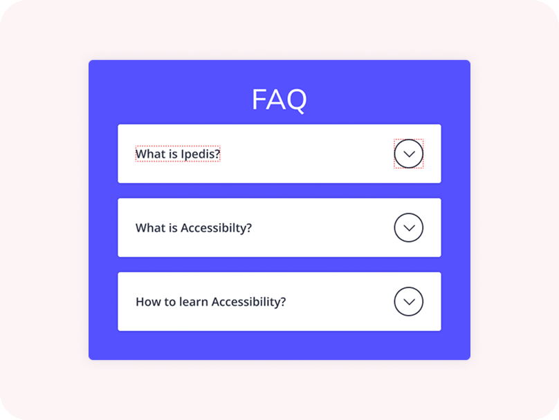
The entire header area of an accordion should be clickable, not just the icon. This improves accessibility and makes the component easier to use, especially on touch devices. Users should be able to expand or collapse a section by clicking anywhere within the header.
Clicking anywhere within the header section should trigger the expansion of the accordion. Limiting the interaction to a small icon can create usability issues and make the component harder to interact with. A larger clickable area ensures a smoother and more intuitive user experience.
New Design UI/UX
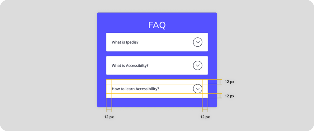
Accordions are vertically stacked interactive containers used to show and hide sections of content.