New Design UI/UX
Snackbar
Snackbars provide brief messages about the processes at the bottom of the screen.
On this page
Anatomy
- Container
- Supporting text
- Action button (optional)
- Close button (optional)
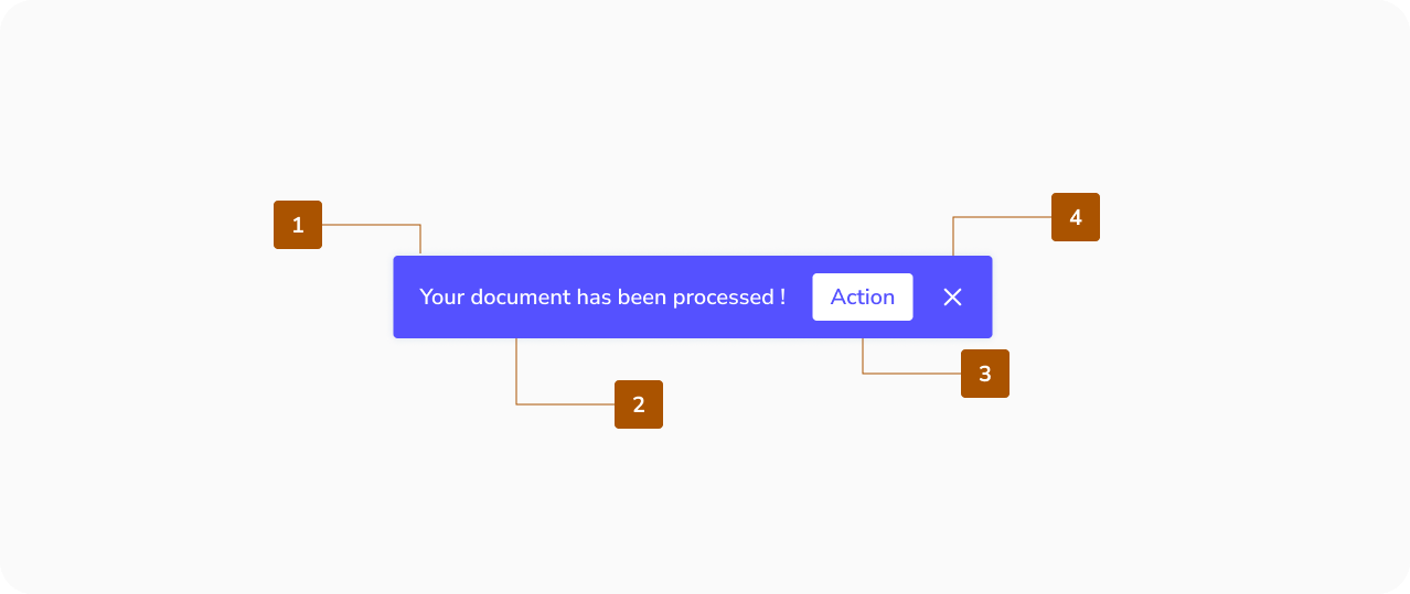
Note : For an easy web accessibility it is better to avoid adding actions and closing buttons to your snackbar.
Best practices for Snackbar
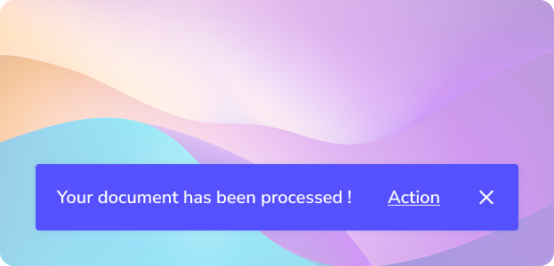
Container
Snackbars are presented in rectangular containers with a solid grey background for legibility.
- Use a solid background with shadow to distinguish the snackbar from content.
- Slight transparency is acceptable, but text must remain legible.
- Do not: significantly alter the container shape or remove elevation.


Text Label
Snackbars include a text label that clearly communicates the action or process being performed.
- Keep labels short, clear, and informative.
- Do not include icons in snackbars; if an icon is needed, consider another component.
Action
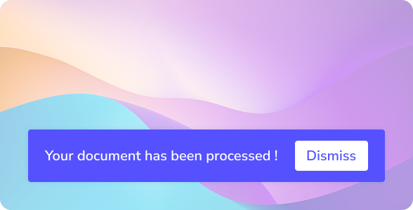
Snackbars can include a single text button for user actions related to the process.
- Action buttons should use colored text to stand out from the label.
- Do not: use the same color for label and action, or use filled/elevated buttons.
- Caution: A “Dismiss” button is usually unnecessary since snackbars disappear automatically.
- Do: allow longer actions on a third line if needed, and include actions like “Undo” to let users amend choices.

Frequency
Only one snackbar must be displayed at a time.
When to use Snackbar ?
Use a snackbar for short, non-critical feedback after a user action.
Good use cases:
- Confirming an action
- Showing a quick status update
- Providing a simple optional action
Key idea: Snackbars are for feedback, not for decisions.
When NOT to use a snackbar ?
Avoid using a snackbar when the message is important or requires attention.
Don’t use it for:
- Errors that block the user
- Important warnings
- Long or complex messages
- Actions that require a decision
Use modals, alerts, or inline messages instead.
Why use a snackbar ?
- Keeps the experience smooth and non-disruptive
- Gives users instant feedback
- Does not interrupt the user flow
New Design UI/UX
Snackbars provide brief messages about the processes at the bottom of the screen.
- Container
- Supporting text
- Action button (optional)
- Close button (optional)
Note : For an easy web accessibility it is better to avoid adding actions and closing buttons to your snackbar.
Container
Snackbars are presented in rectangular containers with a solid grey background for legibility.
- Use a solid background with shadow to distinguish the snackbar from content.
- Slight transparency is acceptable, but text must remain legible.
- Do not: significantly alter the container shape or remove elevation.
Text Label
Snackbars include a text label that clearly communicates the action or process being performed.
- Keep labels short, clear, and informative.
- Do not include icons in snackbars; if an icon is needed, consider another component.
Action
Snackbars can include a single text button for user actions related to the process.
- Action buttons should use colored text to stand out from the label.
- Do not: use the same color for label and action, or use filled/elevated buttons.
- Caution: A “Dismiss” button is usually unnecessary since snackbars disappear automatically.
- Do: allow longer actions on a third line if needed, and include actions like “Undo” to let users amend choices.
Frequency
Only one snackbar must be displayed at a time.
Use a snackbar for short, non-critical feedback after a user action.
Good use cases:
- Confirming an action
- Showing a quick status update
- Providing a simple optional action
Key idea: Snackbars are for feedback, not for decisions.
When NOT to use a snackbar ?
Avoid using a snackbar when the message is important or requires attention.
Don’t use it for:
- Errors that block the user
- Important warnings
- Long or complex messages
- Actions that require a decision
Use modals, alerts, or inline messages instead.
Why use a snackbar ?
- Keeps the experience smooth and non-disruptive
- Gives users instant feedback
- Does not interrupt the user flow