New Design UI/UX
Links
Links on the web too often receive less attention than they deserve. Their visual style usually follows the brand guidelines, and their interaction is considered so obvious that it is rarely discussed during the design process.
Link underlines
Link underlines are often overlooked, yet they remain the clearest and simplest way to help users identify links. By default, they can appear too thick and visually heavy, but their thickness can be adjusted to create a lighter and more balanced appearance while maintaining clarity.
Link icons
In the example below, instead of using arrows to indicate links and mixing them with chevrons used for accordions, links can simply be underlined and the arrows removed entirely.
Focus and Active
It’s common for users to get lost on a page—not because the content is confusing, but because the UI doesn’t provide clear feedback when an action is taken. This can lead to accidental double-clicks, page refreshes, and the frustration known as rage clicks or rage taps
Keyboard users often struggle to follow links while tabbing through a page, and mobile users may have difficulty seeing links obscured by their fingers. In these cases, it can be hard to tell whether a target was missed or if the connection is simply slow. Proper focus and active styles address these issues, with a bright yellow background often being an effective choice to make links stand out
There are strategies for designing better focus styles. In Tips for Focus Styles and Custom :focus Styles, Nic Chan and Lari Maza offer practical advice on improving focus indicators using enhanced affordance, padding, offsets, and outlines.
Visited State
There is no downside to using a visited state. Communicating to users that they’ve already clicked a link can be very helpful—especially when they need to navigate through many links in a list. A visited state allows users to quickly recognize and return to sections they’ve previously explored, improving orientation and efficiency.
On this page
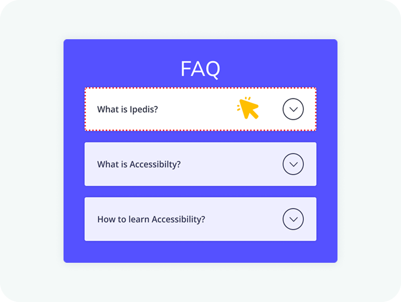
The entire header area of an accordion should be clickable, not just the icon. This improves accessibility and makes the component easier to use, especially on touch devices. Users should be able to expand or collapse a section by clicking anywhere within the header.
Clicking anywhere within the header section should trigger the expansion of the accordion. Limiting the interaction to a small icon can create usability issues and make the component harder to interact with. A larger clickable area ensures a smoother and more intuitive user experience.
New Design UI/UX
Accordions are vertically stacked interactive containers used to show and hide sections of content.