Nouveau Conception UI/UX
Accordéon
Des accordéons bien conçus peuvent considérablement améliorer une interface en aidant les utilisateurs à trouver rapidement des informations sans les submerger de trop de contenu à la fois.
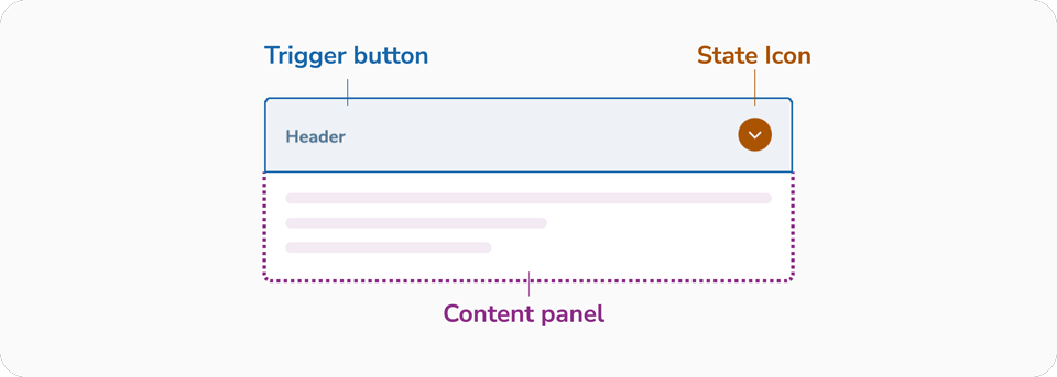
Anatomie
D'un point de vue UX, ils sont excellents pour réduire la « fatigue de défilement » et organiser des informations denses, mais ils nécessitent une structure anatomique précise pour rester accessibles
- Bouton déclencheur : La surface interactive, garantissant que les utilisateurs avec une dextérité limitée ou ceux sur mobile peuvent facilement activer le bouton bascule.
- Icône d'état : Une affordance visuelle. Elle utilise une rotation (de 0° à 180°) pour communiquer l'état. Pour l'accessibilité, elle est masquée aux lecteurs d'écran (aria-hidden) car l'état est déjà communiqué par les attributs du bouton.
- Panneau de contenu : La zone révélée.
Zone cible
Les cibles plus petites sont plus difficiles à cliquer ou à toucher que les plus grandes. C'est particulièrement difficile pour les personnes avec un contrôle moteur limité ou pour celles utilisant leur téléphone d'une seule main, en s'appuyant sur leur pouce. Assurez un rembourrage minimum de 12px pour aider les personnes présentant des handicaps à accéder facilement à vos informations.

Bonnes pratiques de conception pour l'accordéon
Cliquer sur l'en-tête complet doit développer le menu
La section d'en-tête complète, y compris l'icône, doit être cliquable pour développer le menu. Assurez-vous que la zone contenant le texte de l'en-tête et l'icône est cliquable pour déclencher le développement. Limiter la cliquabilité au seul en-tête ou à l'icône réduit les chances d'une interaction réussie. Les accordéons doivent être accessibles via diverses méthodes telles que l'appui, le clic et la navigation au clavier. Ils présentent des défis supplémentaires pour l'accessibilité et doivent être utilisables avec des claviers, des lecteurs d'écran et des appareils tactiles.


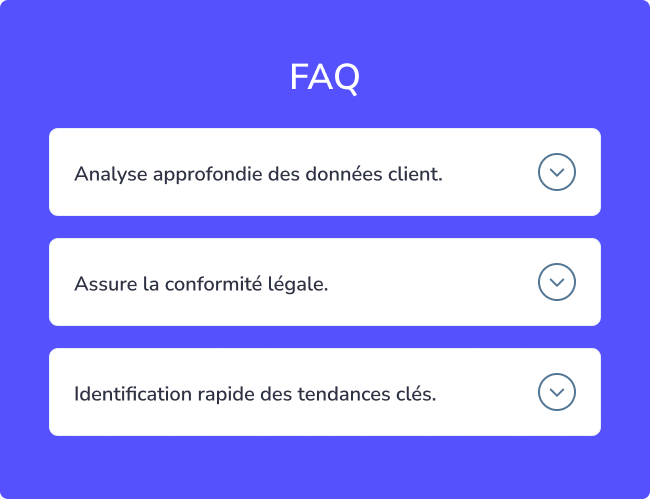
État réduit
Un accordéon commence généralement dans un état réduit, où le contenu est masqué et nécessite un clic ou un appui pour se développer. Pour indiquer que du contenu supplémentaire est disponible, utilisez des indicateurs comme une icône plus (+) ou une flèche droite (→) à côté de chaque élément extensible. Cela maintient un aspect épuré tout en offrant du contenu supplémentaire pour ceux qui le souhaitent.


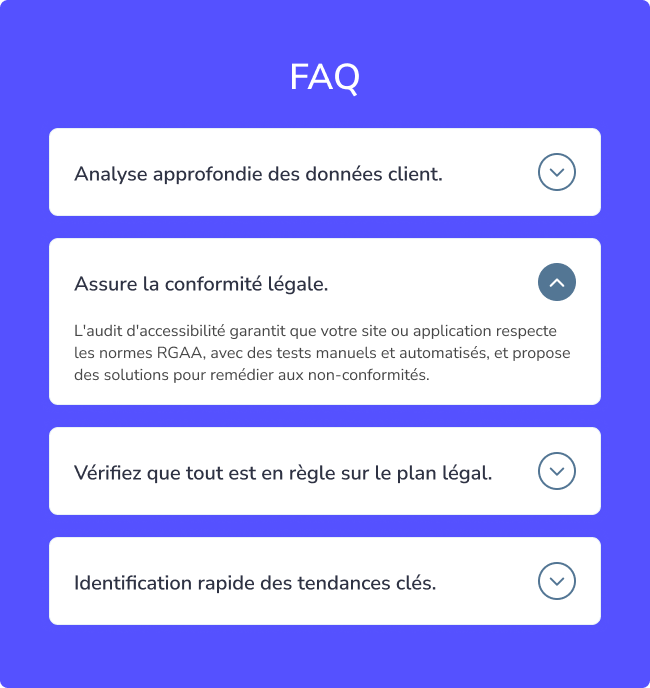
État développé
Pensez à un accordéon réduit comme un ensemble de tiroirs étiquetés, où chaque étiquette donne un aperçu du contenu à l'intérieur. Lorsqu'un utilisateur développe le menu, il révèle le contenu complet pour une exploration approfondie. Pour indiquer l'état développé, changez l'icône d'un plus (+) ou d'une flèche droite (→) vers un moins (−) ou une flèche vers le bas (↓). Ce repère visuel aide les utilisateurs à reconnaître que le contenu est ouvert, rendant la navigation intuitive.
Astuce pro ! S'éloigner des icônes familières peut confondre les utilisateurs quant à la possibilité de développer le menu, entraînant de la frustration. Restez sur des icônes standard pour plus de clarté.


État de survol pour l'interactivité
Lorsque les utilisateurs survolent un élément interactif, cela signale que l'élément est cliquable. Pour garantir une interaction claire, fournissez au moins deux repères visuels pour l'état de survol, comme un curseur pointeur et un changement de couleur. Cette combinaison rend évident que l'élément peut être cliqué.


Espace adéquat entre les conteneurs
Chaque section d'accordéon doit avoir suffisamment d'espace autour d'elle pour faciliter la lecture du contenu. Un espacement suffisant crée également des zones cliquables plus grandes et plus accessibles. Pour les appareils mobiles, assurez-vous que les zones de touche sont suffisamment grandes, avec une hauteur minimale recommandée de 44 pixels pour respecter les directives d'accessibilité.


Styles de section simples
Maintenez la cohérence du style du contenu de l'accordéon avec le reste du design pour éviter toute confusion. Utilisez des styles de police distincts pour différencier le contenu des titres sans surcharger les utilisateurs. Évitez d'encombrer la zone de contenu avec des liens ou des boutons inutiles, car cela peut rendre l'interface plus complexe et plus difficile à naviguer.


Comportement de l'accordéon selon les besoins des utilisateurs
En général, un accordéon n'autorise qu'une seule section ouverte à la fois. Lorsqu'une nouvelle section est cliquée, la précédente se réduit automatiquement. Cela minimise les actions de l'utilisateur et maintient la page épurée, mais empêche la comparaison du contenu de plusieurs sections. Si vous choisissez d'utiliser la réduction automatique, assurez-vous qu'elle fonctionne mieux lorsqu'il y a peu de sections et que les utilisateurs n'ont pas besoin de faire défiler excessivement. Envisagez d'offrir un bouton « Tout réduire » ou « Tout développer » pour une navigation plus facile lorsqu'il y a de nombreuses sections.

Indiquer l'état de la section
Lorsqu'une section est développée, modifiez subtilement sa couleur ou son style pour mettre en évidence qu'elle est active. Modifier la couleur d'arrière-plan ou du texte, ou utiliser un texte en gras et des bordures plus prononcées, peut visuellement séparer la section active des autres. Ces repères doivent être cohérents dans toutes les sections tout en restant suffisamment subtils pour préserver le design global.


Placement cohérent des icônes
Bien que la position des icônes dans une section d'accordéon n'affecte pas la fonctionnalité, maintenir la cohérence de leur placement est crucial. Positionnez toutes les icônes au même endroit (soit toutes à gauche, soit toutes à droite) pour faciliter la lecture pour les utilisateurs. Cette cohérence réduit la perturbation visuelle et la charge cognitive.


Maintenir la hiérarchie typographique
Les titres dans les sections d'accordéon doivent être stylisés pour se différencier clairement du corps du texte. Cela guide le regard de l'utilisateur et crée des ruptures visuelles entre les sections. Utilisez des tailles de police plus grandes, des polices différentes ou du texte en gras pour faire ressortir les titres, mais évitez d'en faire trop pour maintenir un design équilibré et esthétiquement agréable.


Utiliser des titres descriptifs
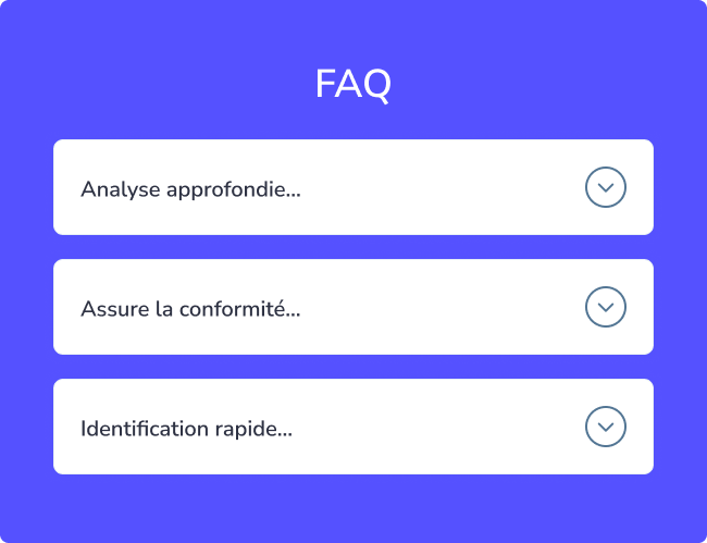
Les titres dans les accordéons sont comme des guides de navigation. Ils doivent être concis, clairs et pertinents par rapport au contenu intérieur. Rendez-les attrayants pour encourager les utilisateurs à développer les sections. Voici quelques conseils pour des titres efficaces :
- Soyez bref et direct.
- Utilisez un langage qui correspond aux besoins des utilisateurs.
- Incluez des mots-clés pour faciliter la lecture rapide.
- Assurez-vous qu'ils reflètent fidèlement le contenu à l'intérieur.
Comprendre les besoins des utilisateurs grâce à la recherche peut aider à créer des titres qui améliorent l'utilité de l'accordéon.
Quand éviter les accordéons ?
Les accordéons peuvent ne pas être idéaux lorsque les utilisateurs ont besoin d'accéder à la plupart ou à la totalité du contenu d'une page. Dans les cas où des informations complètes sont nécessaires, il est préférable de tout afficher en même temps. Évitez de forcer les utilisateurs à parcourir plusieurs sections d'accordéon s'ils ont l'intention de consulter la page entière. Pour les longues pages, envisagez des méthodes de navigation alternatives, comme la division du contenu en sections ou en pages gérables. Si des accordéons sont utilisés, permettez à plusieurs sections de rester ouvertes simultanément et assurez-vous que l'état de chaque section (ouverte ou fermée) est persistant lors des interactions de l'utilisateur.
D'un point de vue UX, ils sont excellents pour réduire la « fatigue de défilement » et organiser des informations denses, mais ils nécessitent une structure anatomique précise pour rester accessibles
- Bouton déclencheur : La surface interactive, garantissant que les utilisateurs avec une dextérité limitée ou ceux sur mobile peuvent facilement activer le bouton bascule.
- Icône d'état : Une affordance visuelle. Elle utilise une rotation (de 0° à 180°) pour communiquer l'état. Pour l'accessibilité, elle est masquée aux lecteurs d'écran (aria-hidden) car l'état est déjà communiqué par les attributs du bouton.
- Panneau de contenu : La zone révélée.

Zone cible
Les cibles plus petites sont plus difficiles à cliquer ou à toucher que les plus grandes. C'est particulièrement difficile pour les personnes avec un contrôle moteur limité ou pour celles utilisant leur téléphone d'une seule main, en s'appuyant sur leur pouce. Assurez un rembourrage minimum de 12px pour aider les personnes présentant des handicaps à accéder facilement à vos informations.
Cliquer sur l'en-tête complet doit développer le menu
La section d'en-tête complète, y compris l'icône, doit être cliquable pour développer le menu. Assurez-vous que la zone contenant le texte de l'en-tête et l'icône est cliquable pour déclencher le développement. Limiter la cliquabilité au seul en-tête ou à l'icône réduit les chances d'une interaction réussie. Les accordéons doivent être accessibles via diverses méthodes telles que l'appui, le clic et la navigation au clavier. Ils présentent des défis supplémentaires pour l'accessibilité et doivent être utilisables avec des claviers, des lecteurs d'écran et des appareils tactiles.
État réduit
Un accordéon commence généralement dans un état réduit, où le contenu est masqué et nécessite un clic ou un appui pour se développer. Pour indiquer que du contenu supplémentaire est disponible, utilisez des indicateurs comme une icône plus (+) ou une flèche droite (→) à côté de chaque élément extensible. Cela maintient un aspect épuré tout en offrant du contenu supplémentaire pour ceux qui le souhaitent.
État développé
Pensez à un accordéon réduit comme un ensemble de tiroirs étiquetés, où chaque étiquette donne un aperçu du contenu à l'intérieur. Lorsqu'un utilisateur développe le menu, il révèle le contenu complet pour une exploration approfondie. Pour indiquer l'état développé, changez l'icône d'un plus (+) ou d'une flèche droite (→) vers un moins (−) ou une flèche vers le bas (↓). Ce repère visuel aide les utilisateurs à reconnaître que le contenu est ouvert, rendant la navigation intuitive.
Astuce pro ! S'éloigner des icônes familières peut confondre les utilisateurs quant à la possibilité de développer le menu, entraînant de la frustration. Restez sur des icônes standard pour plus de clarté.
État de survol pour l'interactivité
Lorsque les utilisateurs survolent un élément interactif, cela signale que l'élément est cliquable. Pour garantir une interaction claire, fournissez au moins deux repères visuels pour l'état de survol, comme un curseur pointeur et un changement de couleur. Cette combinaison rend évident que l'élément peut être cliqué.
Espace adéquat entre les conteneurs
Chaque section d'accordéon doit avoir suffisamment d'espace autour d'elle pour faciliter la lecture du contenu. Un espacement suffisant crée également des zones cliquables plus grandes et plus accessibles. Pour les appareils mobiles, assurez-vous que les zones de touche sont suffisamment grandes, avec une hauteur minimale recommandée de 44 pixels pour respecter les directives d'accessibilité.
Styles de section simples
Maintenez la cohérence du style du contenu de l'accordéon avec le reste du design pour éviter toute confusion. Utilisez des styles de police distincts pour différencier le contenu des titres sans surcharger les utilisateurs. Évitez d'encombrer la zone de contenu avec des liens ou des boutons inutiles, car cela peut rendre l'interface plus complexe et plus difficile à naviguer.
Comportement de l'accordéon selon les besoins des utilisateurs
En général, un accordéon n'autorise qu'une seule section ouverte à la fois. Lorsqu'une nouvelle section est cliquée, la précédente se réduit automatiquement. Cela minimise les actions de l'utilisateur et maintient la page épurée, mais empêche la comparaison du contenu de plusieurs sections. Si vous choisissez d'utiliser la réduction automatique, assurez-vous qu'elle fonctionne mieux lorsqu'il y a peu de sections et que les utilisateurs n'ont pas besoin de faire défiler excessivement. Envisagez d'offrir un bouton « Tout réduire » ou « Tout développer » pour une navigation plus facile lorsqu'il y a de nombreuses sections.
Indiquer l'état de la section
Lorsqu'une section est développée, modifiez subtilement sa couleur ou son style pour mettre en évidence qu'elle est active. Modifier la couleur d'arrière-plan ou du texte, ou utiliser un texte en gras et des bordures plus prononcées, peut visuellement séparer la section active des autres. Ces repères doivent être cohérents dans toutes les sections tout en restant suffisamment subtils pour préserver le design global.
Placement cohérent des icônes
Bien que la position des icônes dans une section d'accordéon n'affecte pas la fonctionnalité, maintenir la cohérence de leur placement est crucial. Positionnez toutes les icônes au même endroit (soit toutes à gauche, soit toutes à droite) pour faciliter la lecture pour les utilisateurs. Cette cohérence réduit la perturbation visuelle et la charge cognitive.
Maintenir la hiérarchie typographique
Les titres dans les sections d'accordéon doivent être stylisés pour se différencier clairement du corps du texte. Cela guide le regard de l'utilisateur et crée des ruptures visuelles entre les sections. Utilisez des tailles de police plus grandes, des polices différentes ou du texte en gras pour faire ressortir les titres, mais évitez d'en faire trop pour maintenir un design équilibré et esthétiquement agréable.
Utiliser des titres descriptifs
Les titres dans les accordéons sont comme des guides de navigation. Ils doivent être concis, clairs et pertinents par rapport au contenu intérieur. Rendez-les attrayants pour encourager les utilisateurs à développer les sections. Voici quelques conseils pour des titres efficaces :
- Soyez bref et direct.
- Utilisez un langage qui correspond aux besoins des utilisateurs.
- Incluez des mots-clés pour faciliter la lecture rapide.
- Assurez-vous qu'ils reflètent fidèlement le contenu à l'intérieur.
Comprendre les besoins des utilisateurs grâce à la recherche peut aider à créer des titres qui améliorent l'utilité de l'accordéon.
Les accordéons peuvent ne pas être idéaux lorsque les utilisateurs ont besoin d'accéder à la plupart ou à la totalité du contenu d'une page. Dans les cas où des informations complètes sont nécessaires, il est préférable de tout afficher en même temps. Évitez de forcer les utilisateurs à parcourir plusieurs sections d'accordéon s'ils ont l'intention de consulter la page entière. Pour les longues pages, envisagez des méthodes de navigation alternatives, comme la division du contenu en sections ou en pages gérables. Si des accordéons sont utilisés, permettez à plusieurs sections de rester ouvertes simultanément et assurez-vous que l'état de chaque section (ouverte ou fermée) est persistant lors des interactions de l'utilisateur.
New Conception UI/UX
Des accordéons bien conçus peuvent considérablement améliorer une interface en aidant les utilisateurs à trouver rapidement des informations sans les submerger de trop de contenu à la fois.