New Components
Buttons
A button is a user interface element that, when clicked or activated, triggers an action or event, such as submitting a form, opening a menu, or performing a specific task within an application or webpage. Buttons are essential for user interaction and navigation in digital interfaces, allowing users to initiate various functions with a simple click or tap.
On this page
When to Use
- Action Initiation: Primarily use buttons for initiating actions like submitting forms, opening modals, or triggering a functionality.
- Interactive Elements: Opt for buttons when creating interactive elements that perform an action on the current page without navigating to a new one.
When Not to Use
- Navigation Purposes: Avoid using buttons for navigation to different pages or external resources; use links instead.
- Ambiguous Actions: Do not use buttons if their action is not clear or could be confusing to the user.
Behaviors
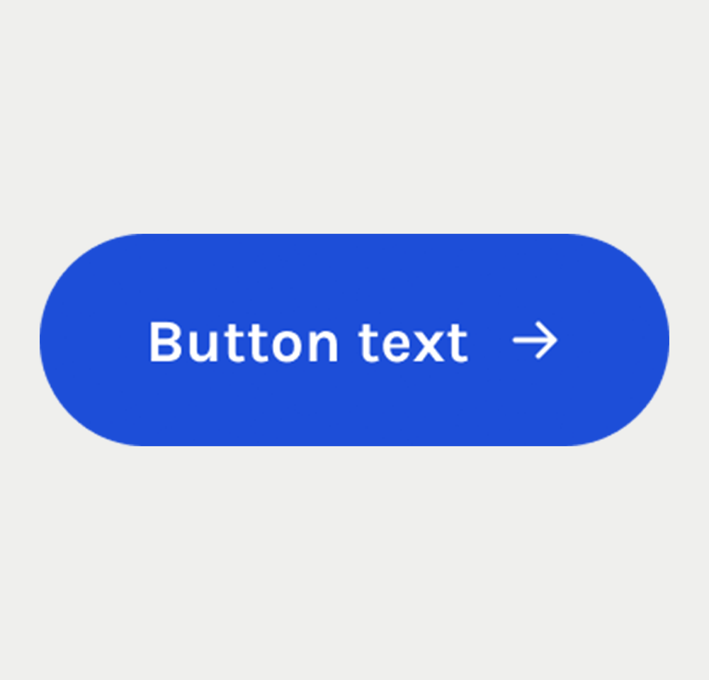
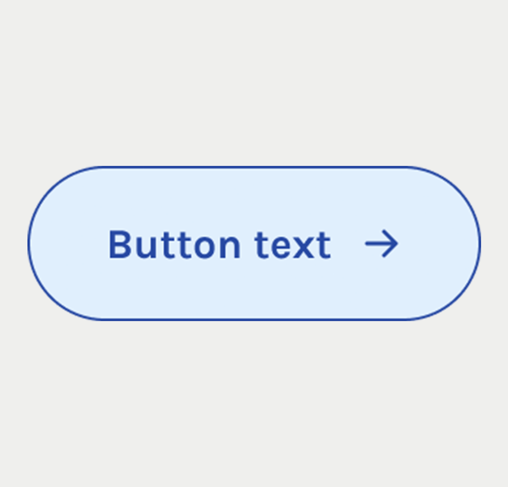
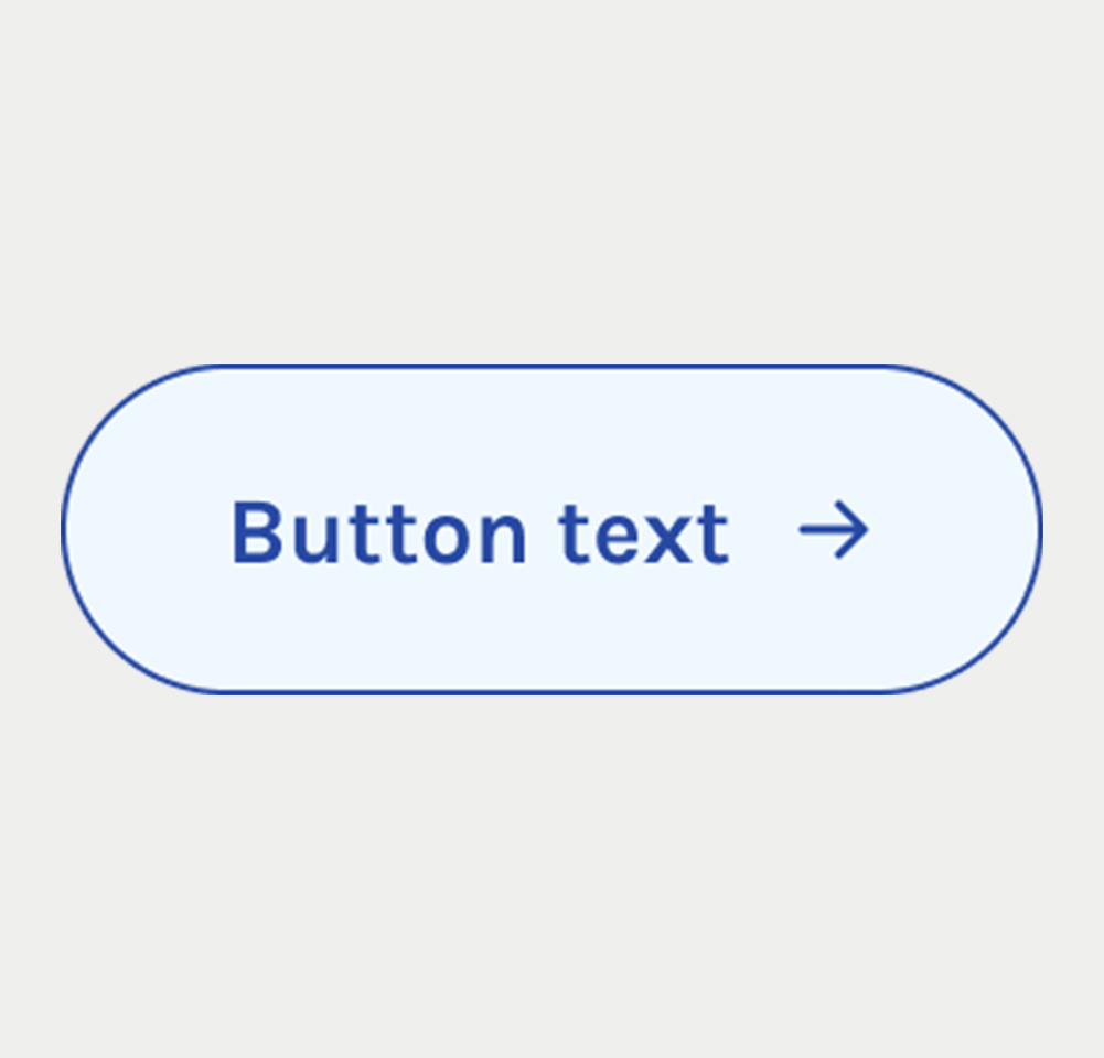
- Mouse Interaction: Buttons should visibly respond to mouse interactions, such as changes in color, shade, or elevation on hover or click.
- Keyboard Accessibility: Ensure buttons are accessible through keyboard navigation, focusable and activatable using the Tab and Enter keys, respectively.
- Screen Reader Accessibility: Buttons should be properly labeled, using either visible text or the
aria-labelattribute, to ensure screen readers can convey their function.
Content
- Clear and Concise Labeling: Button labels should be brief yet descriptive enough to convey the action that will occur when clicked.
- Avoid Ambiguity: Steer clear of vague labels; use specific action words like "Save," "Submit," "Cancel," etc.
- Icon Usage: If using icons without text, ensure they are intuitive and complemented by accessible labels, such as through
aria-labelattributes. - Size and Length: Design button text to fit comfortably within the button, avoiding wrapping or truncation, to maintain clarity and visual appeal.
On this page
Figma files and assets
Designers can import all design documents from our Figma repository using our provided link below. This simplifies the design process and ensures easy access to the latest design assets for a more efficient workflow.
Feel free to utilise the prototype display located below as a practical example and demonstration of how the component is intended to operate. This interactive representation serves as a visual guide to help you grasp the expected functionality and behavior.
Icon
Icon
Icon
Icon
primary
primary
primary
primary
Secondary
Secondary
Secondary
Secondary
Tertiary
Tertiary
Tertiary
Tertiary
Prototype
Keywords
- Button: A clickable element that performs actions within a digital interface.
Breakdown of Components
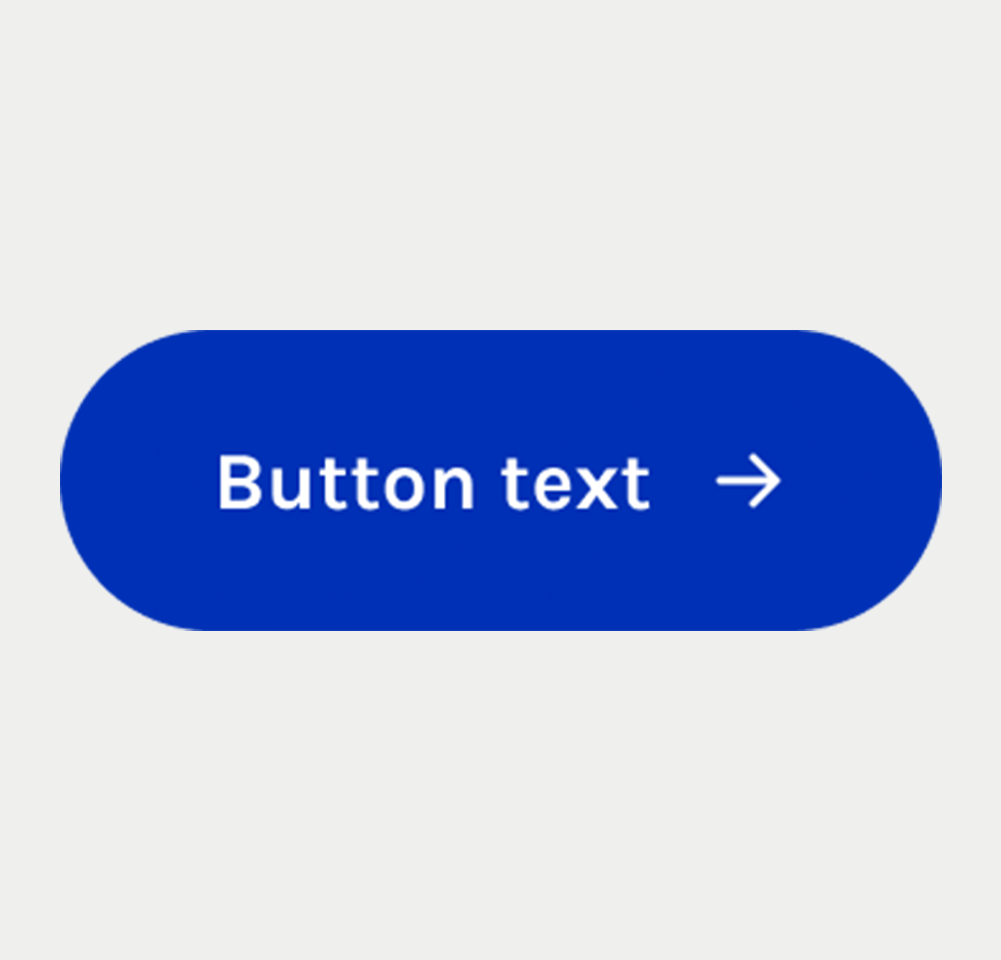
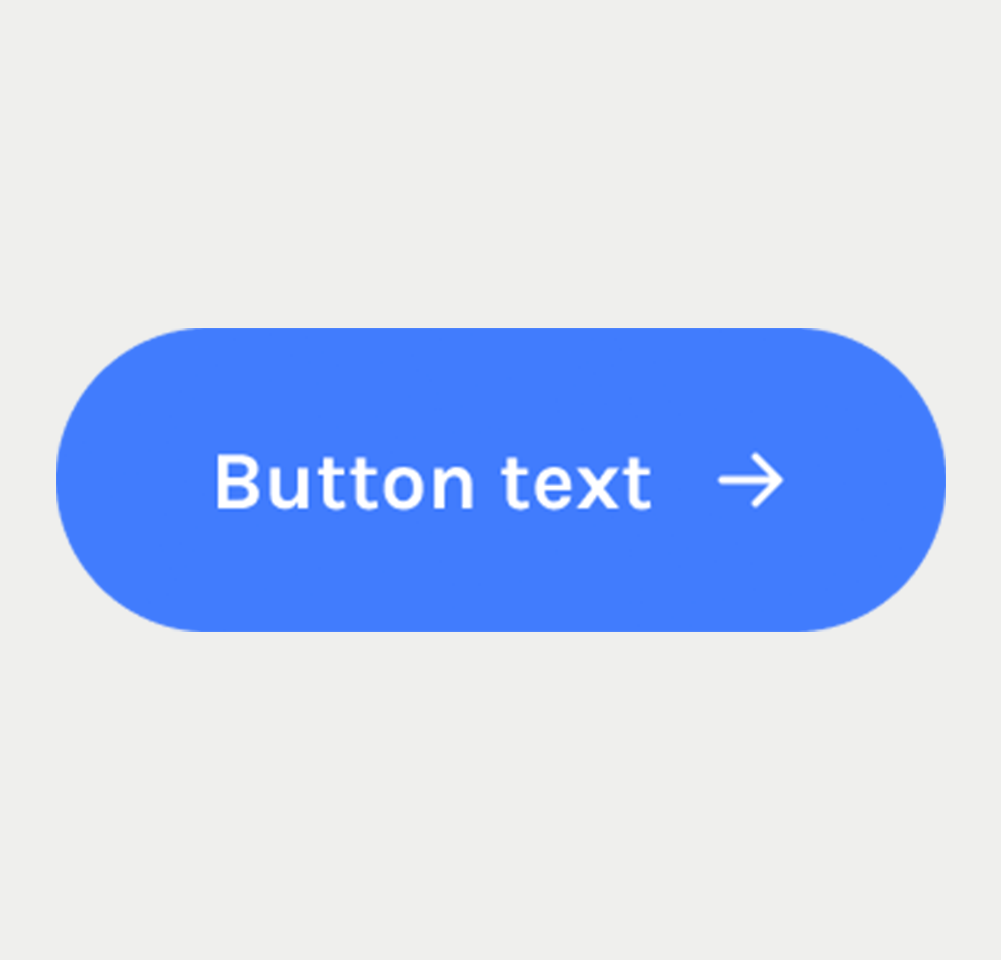
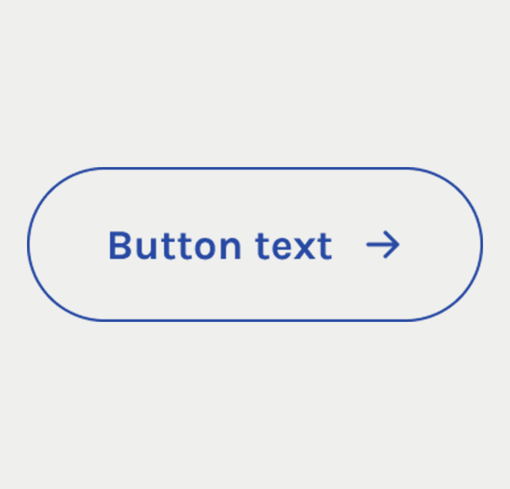
Primary Button
- Visual Distinction: Like text links, primary buttons are visually distinct from the rest of the content. This is achieved through size, color, and style.
- Clear Labeling: The button's purpose is communicated through clear, action-oriented text, steering clear of ambiguous terms. In scenarios where space constraints or design considerations prevent the inclusion of a visually explicit label, the
aria-labelattribute is employed to provide a precise textual description of the button's function.
Icon Button
- Icon Clarity: Ensure that the icon used is universally recognized and conveys the button's function clearly.
- Accessibility: Similar to icon-only links, the icons of the icon buttons are tagged with aria-hidden='true' and accompanied by a descriptive aria-label on the button.
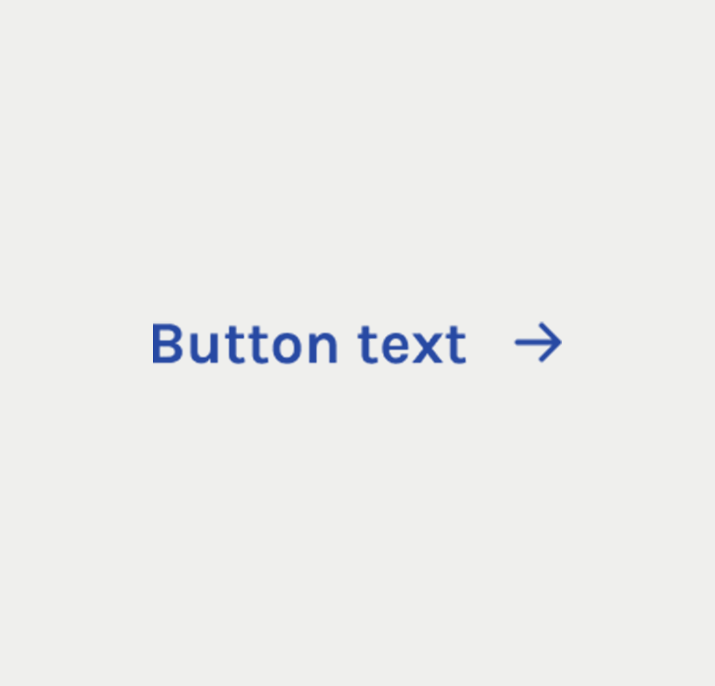
Button with Icon
- Icon Clarity: Similar to the icon-only button, the chosen icon should be easily recognizable and should unambiguously represent the button's purpose, complementing the text provided.
- Accessibility: Regarding accessibility, the icon should include the attribute aria-hidden="true" to conceal it from screen readers, as the accompanying text already provides the necessary information..
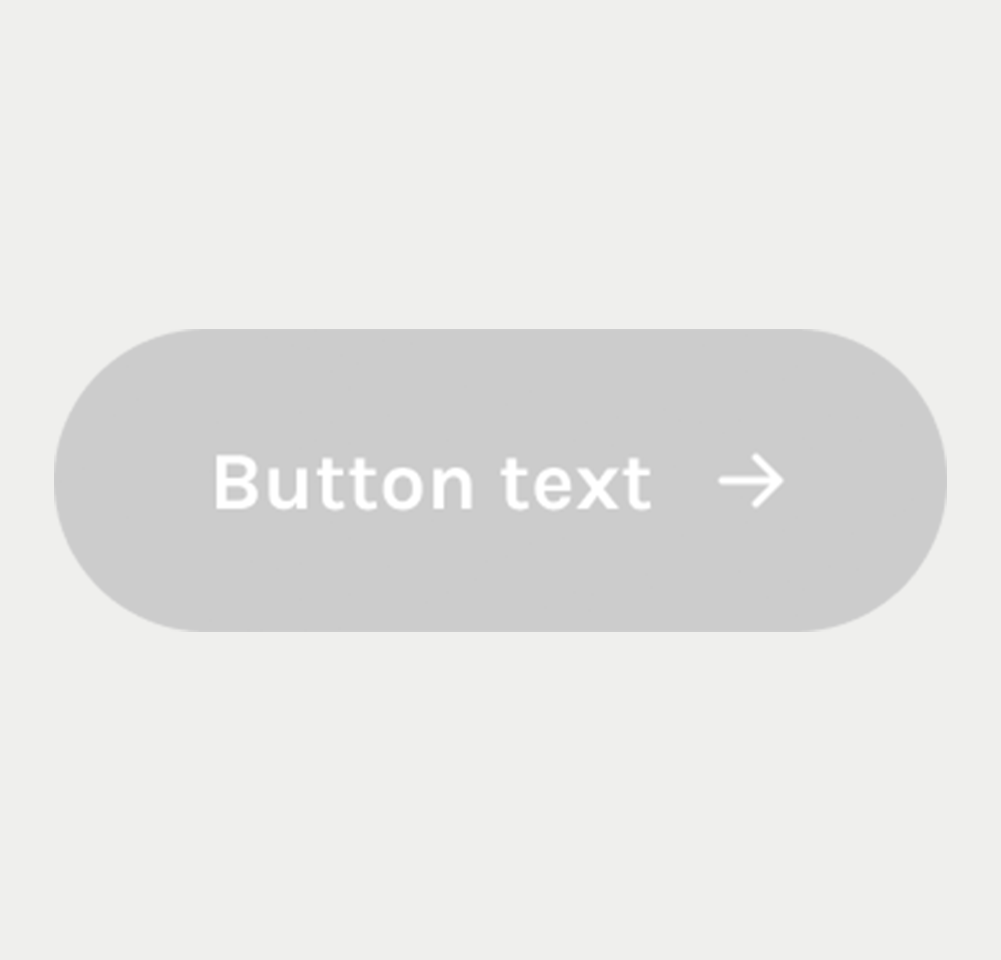
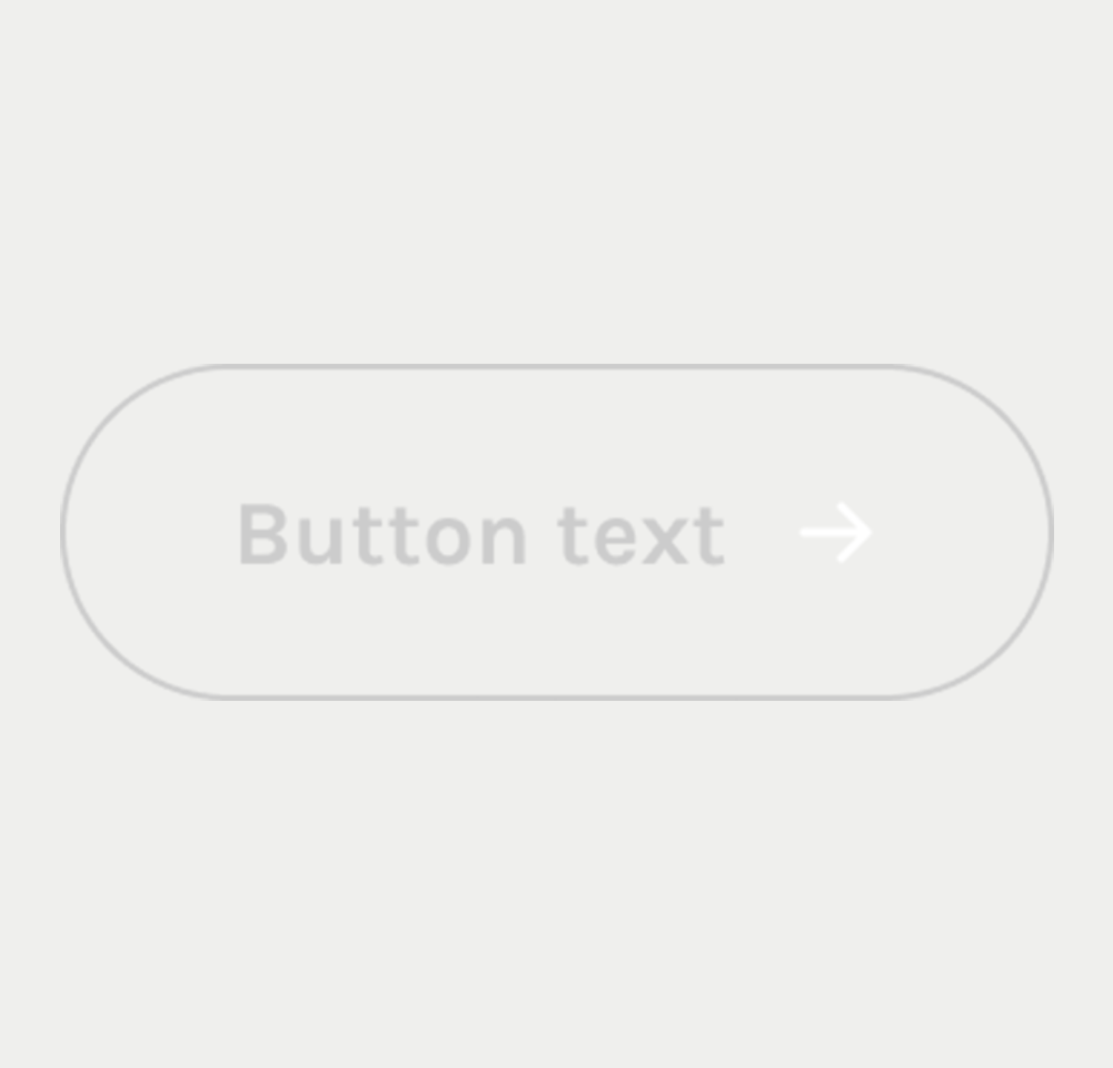
Disabled Button
- Visual Indicators: The disabled button is clearly indicated through dimming, color changes, or other visual cues.
- No Interactive Feedback: Disabled buttons do not respond to hover or focus events, reaffirming their non-interactive status.
Customized Buttons(Incorporating ARIA Attributes for Specific Purposes)
- Various HTML elements are combined with WAI-ARIA attributes to create buttons for specific purposes.
- The role="button" attribute is essential for these elements to be recognized as buttons by assistive technologies.
- This approach ensures both visual identification and accessibility for screen readers.
- Although using ARIA attributes is effective, it's generally advised to use the <button> tag for creating buttons. This ensures broader compatibility and consistency across different browsers and assistive technologies.
| Key | Function |
|---|---|
| Enter | Activates the button and shifts focus to the context change. |
| Tab | When the element doesn't have focus, the focus moves to the button. |
| Shift + F10 | Opens a context menu for the button. |