New Components
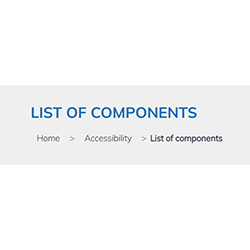
Breadcrumb
A breadcrumb is a navigation aid used in web interfaces that provides users with a clear path of their journey through a website. It typically appears as a horizontal row of textual links, with each link separated by symbols such as greater than signs (>), indicating the hierarchy of the content.
This feature is particularly useful on websites with multiple levels of content organization, allowing users to track their location within the site and navigate back to previous pages easily. Breadcrumbs are especially helpful for users who arrive on a page through external links or search results, providing a quick way to understand the context of the page within the larger website structure.
On this page
When to use
- Hierarchical Navigation: Use breadcrumbs for enabling users to trace and navigate the hierarchy of the website, typically appearing at the top of a page.
- Contextual Awareness: Implement breadcrumbs to provide users with a clear path of their location within the website's structure.
When not to use
- Linear Navigation: Avoid breadcrumbs for linear navigation where the sequence of pages is more important than their hierarchical relationship.
- Single-Level Websites: Do not use breadcrumbs on single-level websites where there is no hierarchy to navigate.
Keep It Simple and Intuitive - Breadcrumbs should be straightforward, showing a clear path from the home page to the current page without complicated navigation.
Do not Overcomplicate - Avoid using breadcrumbs for non-hierarchical or overly complex navigation structures. They should not replace primary navigation.
Behaviors
- Mouse Interaction: Breadcrumb links should visually respond to mouse interaction, indicating they are clickable, typically through color change or underlining.
- Keyboard Navigation: Breadcrumbs should be accessible through the keyboard, allowing users to navigate using the Tab key and select using the Enter key.
- Screen Reader Accessibility: Structure breadcrumb items properly with clear labels, using ARIA landmarks or other attributes to indicate the breadcrumb trail for screen readers.
Content
- Concise Labeling: Keep breadcrumb labels short and to the point, avoiding unnecessary words to maintain clarity.
- Reflecting the Hierarchy: Labels should accurately reflect the hierarchy of the website, showing the relationship between parent and child pages.
- Clear Separators: Use clear visual separators (such as the ">" symbol) to denote the progression from one level to another.
- Avoid Truncation: Ensure that breadcrumb labels do not truncate; they should be fully visible to avoid confusion about the page's location in the hierarchy.
Keywords
Breadcrumb: A breadcrumb is a navigational trail showing the user's path within a website's structure.
Labeling and regions
Structured Hierarchy
- Breadcrumbs are presented as an ordered list within <ol> and <li> tags for a structured hierarchy.
Navigation Landmark
- The breadcrumb trail is contained within a <nav> element titled "Breadcrumb," which serves as a navigation landmark for ease of location. Alternatively, the role="navigation" attribute can be used to indicate its navigational role.
ARIA Labeling
- An aria-label="Breadcrumb" attribute is added to the <nav> tag to explicitly describe the component's function:
<nav aria-label="Breadcrumb" class="breadcrumb">Visual Separators
- Visual separators between breadcrumb links are added via CSS to prevent screen readers from announcing them.
- The graphic may be added through a span that has the aria-hidden="true" attribute, masking it for screen readers.
Current Page Indicator
- The aria-current="page" attribute is applied to the last item in the breadcrumb trail to signify the current page.
Terminal Breadcrumb Markup
- The last element of the breadcrumb sequence is marked up using either a <link> or a <span> tag, depending on its functionality as a clickable link or not.
Screen reader
Screen readers identify the breadcrumb as a navigational landmark due to the <nav> element with aria-label="Breadcrumb". The structure, presented as an ordered list <ol> with list items <li>, allows the screen reader to convey the hierarchy and sequence effectively. Each link within the breadcrumb is announced, providing clear navigation options, while the aria-current="page" attribute on the last item distinctly marks it as the current page. Additionally, visual separators created via CSS are not read by screen readers, ensuring a streamlined auditory experience without unnecessary verbal clutter.
| Key | Function |
|---|---|
| Enter | Executes the link and moves the focus to the link target |
| Tab | When the element doesn't have focus, the focus moves to the link. |
| Shift + F10 | Opens a context menu for the link. |
The demo in mobile version will be available soon. In the meantime, we invite you to check out the desktop version.