New Components
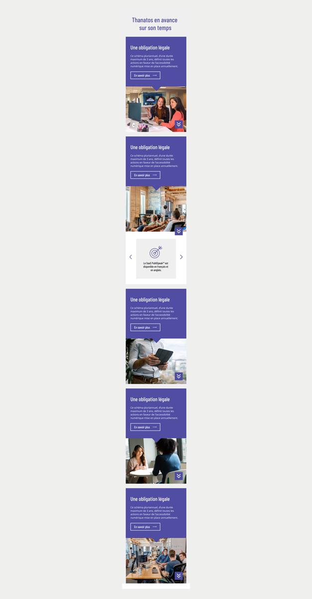
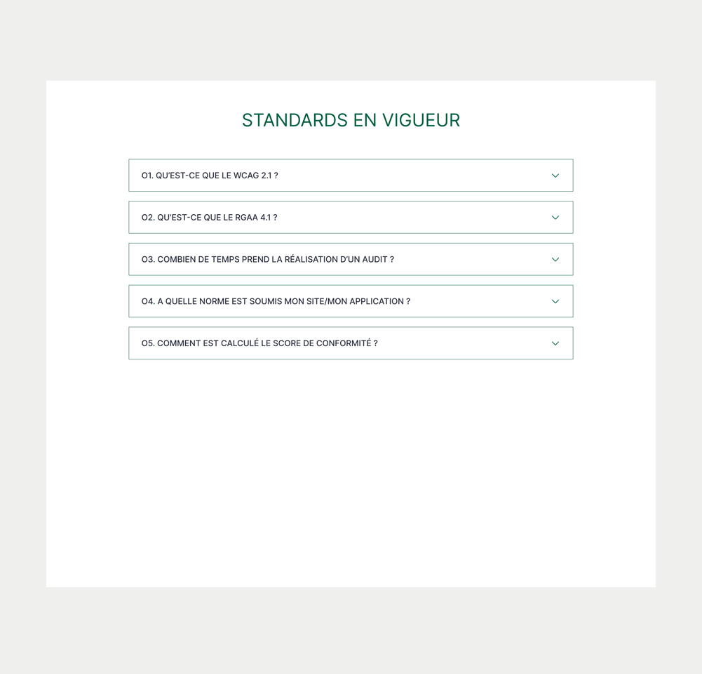
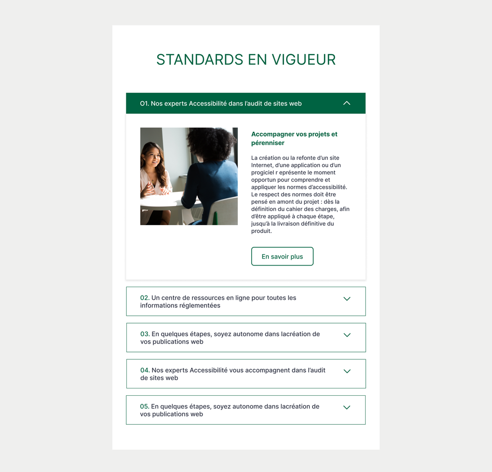
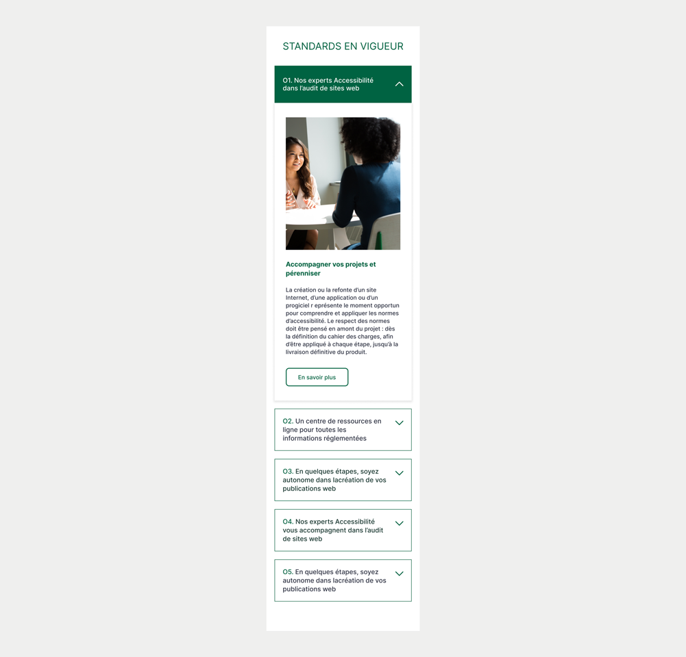
Accordion
An accordion is an interactive element used on websites and applications to organize content in a compact way. It allows users to click on titles or buttons to show or hide sections of content, saving screen space and making information easily accessible.
On this page
When to use an accordion
Accordions serve the purpose of conserving space on lengthy pages by:
- Simplifying Content Access: Users can easily access the specific information they require, simplifying navigation on content-heavy pages.
- Providing Direction: Accordions assist users in navigating intricate content paths, offering a more directed and user-friendly experience.
However, it's essential to remember that accordions are not suitable when users need to read all the enclosed content. Moreover, for very brief content, it is more suitable to use lists or paragraphs instead of accordions.
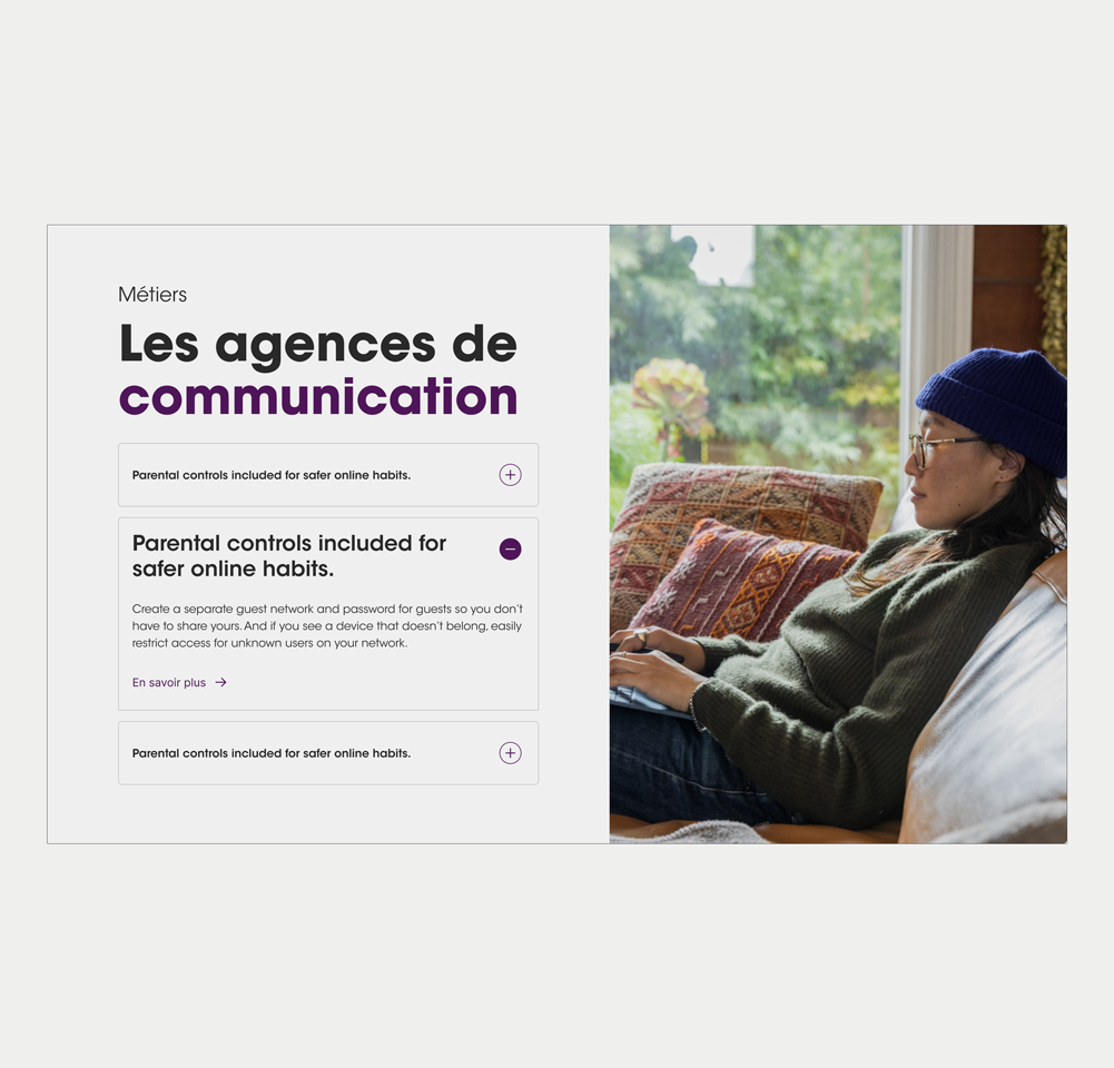
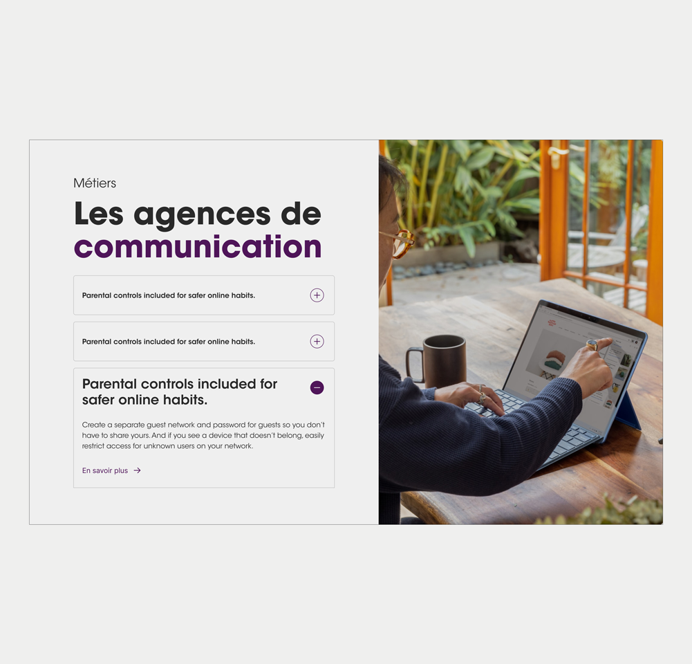
Example : Very short content
Favor simple interactions (button or link, for example) within accordions.
Do not incorporate overly complex components into accordions.
Figma files and assets
Designers can import all design documents from our Figma repository using our provided link below. This simplifies the design process and ensures easy access to the latest design assets for a more efficient workflow.
Feel free to utilise the prototype display located below as a practical example and demonstration of how the component is intended to operate. This interactive representation serves as a visual guide to help you grasp the expected functionality and behavior.
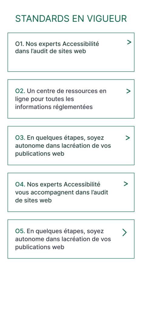
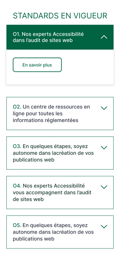
Single Accordion
Desktop (AC-001)
Tablet (AC-001)
Mobile (AC-001)
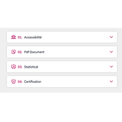
Staked accordion (with brackets)
Desktop (AC-002)
Tablet (AC-002)
Mobile (AC-002)
Prototype
Staked accordion (with a plus sign)
Assets

Accordion + Screen 1

Accordion + Screen 2
Accordion + Screen 3
Accordion + Screen 4
Prototype
In most cases, an accordion begins with all sections collapsed. Users have the flexibility to expand a section by interacting with the heading button, which is clickable anywhere within it.
The accordion needs to be keyboard-friendly for both desktop and mobile use. When navigating through the heading buttons using the tab key, a distinct and robust visual focus indication is provided.
Upon pressing the spacebar or enter key, the heading buttons activates, revealing the collapsed.
Keywords
- Accordion Header: A label that doubles as a control, enabling the option to display or conceal content.
- Accordion Panel: A section containing content that is linked to an accordion header.
Breakdown of Components
Accordion Header:
- The accordion header must be a button type element must be defined using a <button> tag or a role="button".
- It should be easily recognisable as an interactive element. For example, buttons commonly have a rectangular or rounded shape accompanied with a border or drop-shadows.
- It must be reachable using the tab key on the keyboard.
- Activation of the button is accomplished through the enter/spacebar keys on the keyboard.
- The button is responsible for both opening and closing the accordion.
- The target area of the button must not be smaller than 44x44 pixels.
- The button must display a clear focus indicator when the focus is on the button. This indicator should be at least 2 pixels tall, covering the button's width, and have a contrast ratio of 3:1 for accessibility.
- Changes in the state of the accordion (expanded or collapsed) should be visually highlighted, so users can easily discern whether a section is open or closed. This is done through a WAI-ARIA attribute aria-expanded.
- Expanded state: aria-expanded="true"
- Collapsed state: aria-expanded="false"
- The button should be linked to the panel it opens. Use the WAI-ARIA attribute aria-controls to inform assistive technologies. The attribute take the identifier (id) of the panel.
<button type="button" aria-expanded="true" class="accordion-trigger" aria-controls="panel1" id="accordion1id" >
    Titre de l'accordéon
    <span class="accordion-icon"></span>
</button>Accordion Panel:
- The Accordion panel houses the content for each accordion section.
- All interactive elements within the Accordion panel must be accessible using the tab key on the keyboard.
- Define the panel as a region using the role="region" attribute.
- Give a relevant title to the panel. This is important to help users of assistive technologies such as a screen reader to better understand the content of the panel. This is done through the attribute aria-label or aria-labelledby. The aria-label can take a string of values while the aria-labelledby can be used to reference the name of the accordion header through the id attribute.
<div id="panel1" role="region" aria-labelledby="accordion1id" class="accordion-panel">
  <!-- Contenu du panneau -->
</div>Screen reader
A screen reader should vocalize the following for the button:
- A relevant name that clearly conveys its purpose. This can be done either using the visual title added inside the <button> tag or through accessibility attributes such as the aria-label.
- A relevant role that identifies it as a button. Using the HTML tag <button> will automatically add the role button for screen readers but the WAI-ARIA attribute role="button" can also be used
- The current state, indicating whether the section is expanded or collapsed. WAI-ARIA attribute aria-expanded informs screen readers that the item is expanded or collapsed.
| Key | Function |
|---|---|
| Space/Enter | When focus is on the accordion button of a collapsed section, expands the section. |
| Tab |
|
| Shift + Tab |
|
The demo in mobile version will be available soon. In the meantime, we invite you to check out the desktop version.