Nouveau Conception UI/UX
Champ de saisie
Les champs de saisie permettent aux utilisateurs de saisir et de modifier des informations. Leur conception joue un rôle clé dans l’utilisabilité, l’accessibilité et les taux de complétion des formulaires.
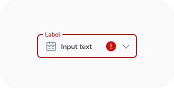
Anatomie
- Contour du conteneur activé
- Texte d'étiquette dans un champ vide
- Icône principale (optionnelle)
- Texte d'étiquette dans un champ rempli
- Icône secondaire (optionnelle)
- Contour du conteneur focalisé
- Curseur de saisie
- Texte de saisie
- Texte d'accompagnement (optionnel)
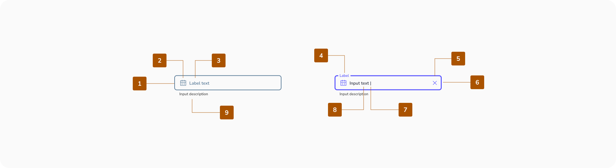
Zone cible
La zone cible doit avoir une taille minimale de 48px.

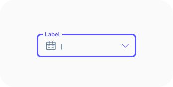
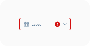
États des champs de saisie
Les états sont des indicateurs visuels qui transmettent le statut ou la condition actuelle d'un composant ou d'un élément interactif dans l'interface.
- Activé
- Survolé
- Focalisé
- Désactivé
- Erreur


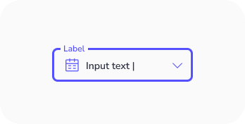
États du texte de saisie
- Activé
- Survolé
- Focalisé
- Désactivé
- Erreur


Bonnes pratiques de conception des Champ de Saisie
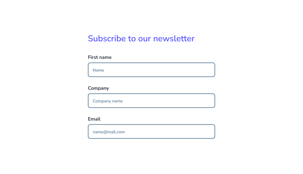
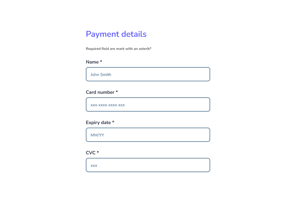
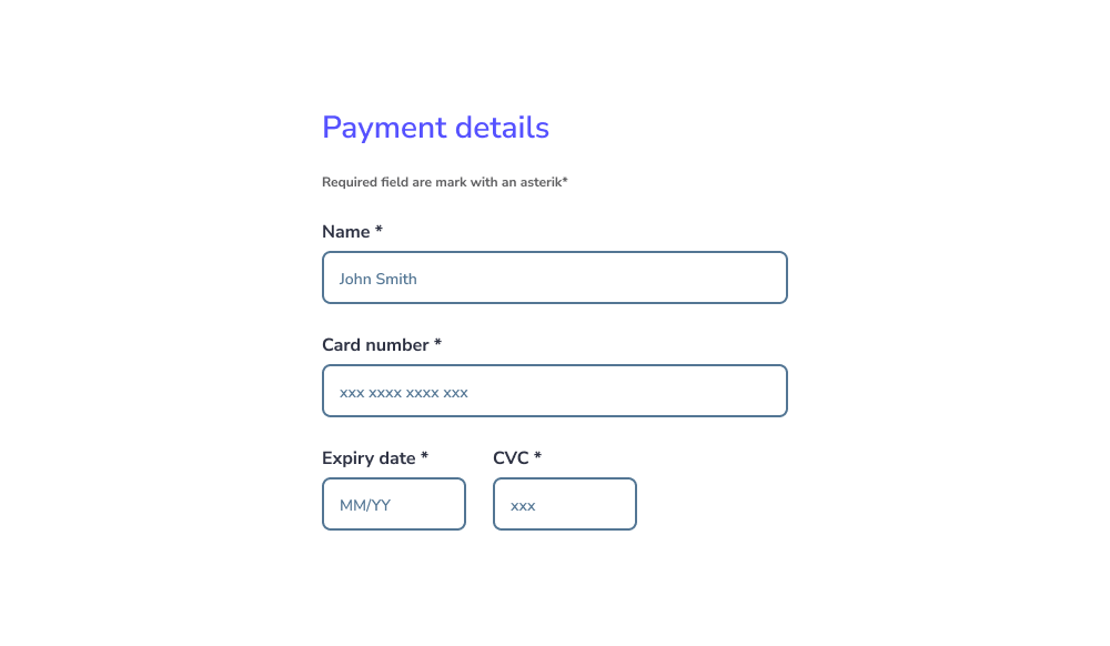
Utiliser une mise en page en colonne unique
Les formulaires doivent être structurés en une seule colonne verticale plutôt qu'en plusieurs colonnes.
- Cela améliore l'efficacité en maintenant un flux naturel vers le bas.
- Cela réduit la charge cognitive, car les utilisateurs n'ont pas à décider où aller ensuite.
- Cela minimise le risque de champs manqués, surtout pour les utilisateurs avec une visibilité d'écran limitée (ex. : loupes d'écran).
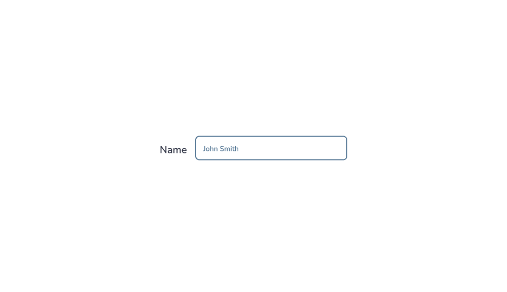
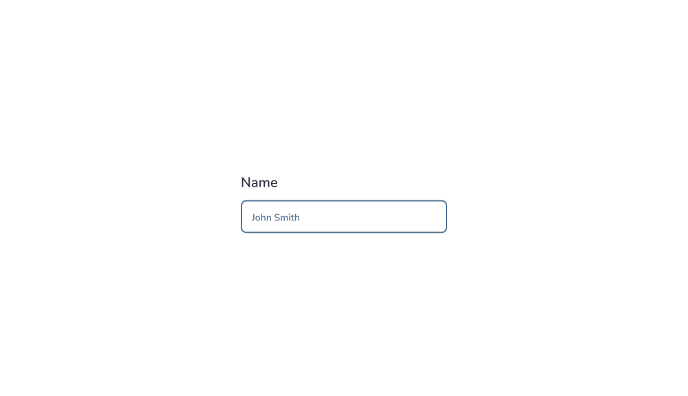
Placer les étiquettes au-dessus des champs
Les étiquettes doivent être positionnées au-dessus des champs de saisie, et non à côté.
- Cela améliore l'efficacité en maintenant un flux naturel vers le bas.
- Cela réduit la charge cognitive, car les utilisateurs n'ont pas à décider où aller ensuite.
- Cela minimise le risque de champs manqués, surtout pour les utilisateurs avec une visibilité d'écran limitée (ex. : loupes d'écran).
Si un formulaire devient trop long, envisagez de le diviser en plusieurs étapes pour réduire la complexité et améliorer les taux de complétion.
Conseils pro : Les formulaires en plusieurs étapes sont particulièrement utiles dans les flux complexes tels que l'intégration ou les processus de paiement.
Minimiser le nombre de champs
Ne demandez que les informations essentielles.
- Trop de champs augmentent les taux d'abandon.
- Ils nécessitent plus d'effort et augmentent la probabilité d'erreurs.
- Ils ajoutent également une complexité de développement inutile.

Si des informations sensibles sont requises, expliquez clairement pourquoi elles sont nécessaires.
Conseils pro : La transparence renforce la confiance et améliore les taux de complétion.
Marquer clairement les champs obligatoires et optionnels
Les utilisateurs doivent toujours savoir quels champs sont obligatoires.
- Marquez les champs obligatoires avec un astérisque (*) ou le mot « obligatoire ».
- Marquez les champs optionnels avec le mot « optionnel ».
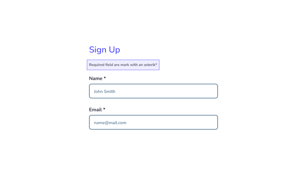
Évitez de vous fier uniquement à des instructions comme « Tous les champs sont obligatoires sauf indication contraire », car les utilisateurs ignorent souvent ces informations.
Conseils pro : Étiqueter clairement les deux types améliore l'accessibilité, surtout pour les utilisateurs de lecteurs d'écran.
Adapter la largeur du champ au type de saisie
La taille du champ doit refléter la longueur de saisie attendue.
- Les saisies courtes (ex. : codes postaux) doivent utiliser des champs plus petits.
- Les saisies plus longues (ex. : adresses) doivent utiliser des champs plus larges.
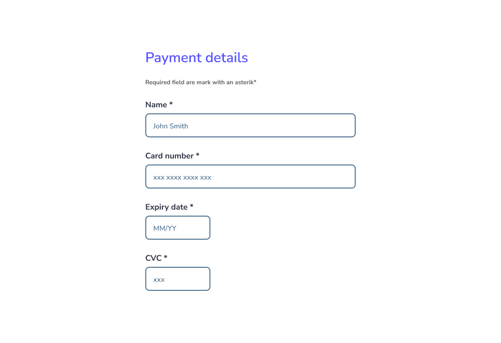
Évitez de rendre tous les champs de la même largeur, car cela peut créer de la confusion.
Utiliser des modèles familiers et conventionnels
Respectez les designs de formulaires standard que les utilisateurs comprennent déjà.
- Évitez les mises en page ou les styles non conventionnels qui peuvent provoquer de la confusion.
- Assurez-vous que les utilisateurs peuvent facilement distinguer les champs vides des champs remplis.
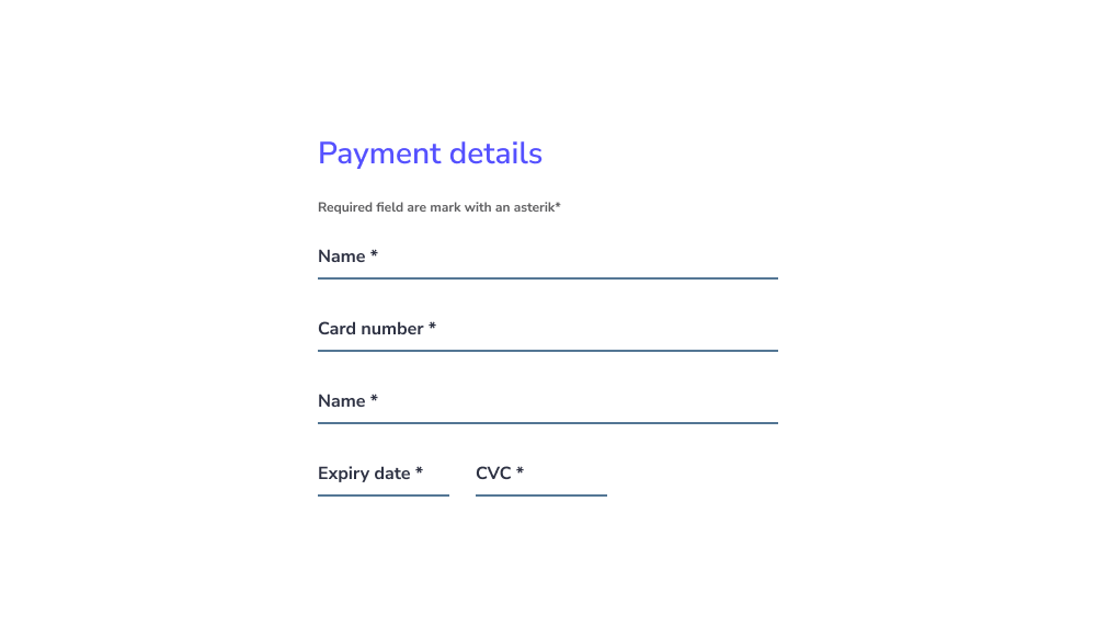
Conseils pro : Suivre des modèles familiers s'aligne sur les modèles mentaux des utilisateurs et réduit la charge cognitive.
Afficher des conseils utiles au-dessus des champs
Lorsqu'une guidance supplémentaire est nécessaire, fournissez un texte d'aide (conseils).
- Placez les conseils au-dessus du champ de saisie, et non en dessous.
- Gardez-les visibles évitez de les masquer dans des infobulles.
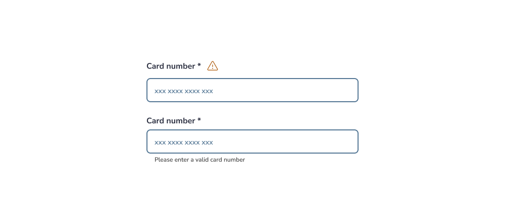
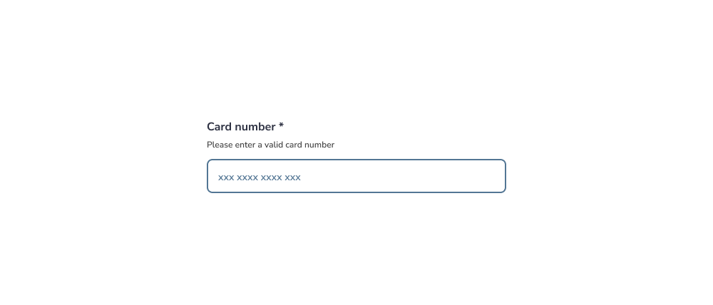
Cela aide les utilisateurs à comprendre les exigences avant d'interagir, réduisant les erreurs.
Points clés à retenir
- Gardez les formulaires simples, structurés et prévisibles.
- Réduisez la charge cognitive et le coût d'interaction.
- Assurez la clarté, l'accessibilité et la cohérence dans toutes les saisies.
Nouveau Conception UI/UX
Les champs de saisie permettent aux utilisateurs de saisir et de modifier des informations. Leur conception joue un rôle clé dans l'utilisabilité, l'accessibilité et les taux de complétion des formulaires.
- Contour du conteneur activé
- Texte d'étiquette dans un champ vide
- Icône principale (optionnelle)
- Texte d'étiquette dans un champ rempli
- Icône secondaire (optionnelle)
- Contour du conteneur focalisé
- Curseur de saisie
- Texte de saisie
- Texte d'accompagnement (optionnel)
Zone cible
La zone cible doit avoir une taille minimale de 48px.
États des champs de saisie
Les états sont des indicateurs visuels qui transmettent le statut ou la condition actuelle d'un composant ou d'un élément interactif dans l'interface.
- Activé
- Survolé
- Focalisé
- Désactivé
- Erreur
États du texte de saisie
- Activé
- Survolé
- Focalisé
- Désactivé
- Erreur
Utiliser une mise en page en colonne unique
Les formulaires doivent être structurés en une seule colonne verticale plutôt qu'en plusieurs colonnes.
- Cela améliore l'efficacité en maintenant un flux naturel vers le bas.
- Cela réduit la charge cognitive, car les utilisateurs n'ont pas à décider où aller ensuite.
- Cela minimise le risque de champs manqués, surtout pour les utilisateurs avec une visibilité d'écran limitée (ex. : loupes d'écran).
Placer les étiquettes au-dessus des champs
Les étiquettes doivent être positionnées au-dessus des champs de saisie, et non à côté.
- Cela améliore l'efficacité en maintenant un flux naturel vers le bas.
- Cela réduit la charge cognitive, car les utilisateurs n'ont pas à décider où aller ensuite.
- Cela minimise le risque de champs manqués, surtout pour les utilisateurs avec une visibilité d'écran limitée (ex. : loupes d'écran).
Si un formulaire devient trop long, envisagez de le diviser en plusieurs étapes pour réduire la complexité et améliorer les taux de complétion.
Conseils pro : Les formulaires en plusieurs étapes sont particulièrement utiles dans les flux complexes tels que l'intégration ou les processus de paiement.
Minimiser le nombre de champs
Ne demandez que les informations essentielles.
- Trop de champs augmentent les taux d'abandon.
- Ils nécessitent plus d'effort et augmentent la probabilité d'erreurs.
- Ils ajoutent également une complexité de développement inutile.
Si des informations sensibles sont requises, expliquez clairement pourquoi elles sont nécessaires.
Conseils pro : La transparence renforce la confiance et améliore les taux de complétion.
Marquer clairement les champs obligatoires et optionnels
Les utilisateurs doivent toujours savoir quels champs sont obligatoires.
- Marquez les champs obligatoires avec un astérisque (*) ou le mot « obligatoire ».
- Marquez les champs optionnels avec le mot « optionnel ».
Évitez de vous fier uniquement à des instructions comme « Tous les champs sont obligatoires sauf indication contraire », car les utilisateurs ignorent souvent ces informations.
Conseils pro : Étiqueter clairement les deux types améliore l'accessibilité, surtout pour les utilisateurs de lecteurs d'écran.
Adapter la largeur du champ au type de saisie
La taille du champ doit refléter la longueur de saisie attendue.
- Les saisies courtes (ex. : codes postaux) doivent utiliser des champs plus petits.
- Les saisies plus longues (ex. : adresses) doivent utiliser des champs plus larges.
Évitez de rendre tous les champs de la même largeur, car cela peut créer de la confusion.
Utiliser des modèles familiers et conventionnels
Respectez les designs de formulaires standard que les utilisateurs comprennent déjà.
- Évitez les mises en page ou les styles non conventionnels qui peuvent provoquer de la confusion.
- Assurez-vous que les utilisateurs peuvent facilement distinguer les champs vides des champs remplis.
Conseils pro : Suivre des modèles familiers s'aligne sur les modèles mentaux des utilisateurs et réduit la charge cognitive.
Afficher des conseils utiles au-dessus des champs
Lorsqu'une guidance supplémentaire est nécessaire, fournissez un texte d'aide (conseils).
- Placez les conseils au-dessus du champ de saisie, et non en dessous.
- Gardez-les visibles évitez de les masquer dans des infobulles.
Cela aide les utilisateurs à comprendre les exigences avant d'interagir, réduisant les erreurs.
- Gardez les formulaires simples, structurés et prévisibles.
- Réduisez la charge cognitive et le coût d'interaction.
- Assurez la clarté, l'accessibilité et la cohérence dans toutes les saisies.