New Components
Tooltip
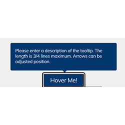
A tooltip is a brief, informative message that appears when a user hovers over or focuses on an element within a graphical user interface. It provides explanations or extra context for the item, enhancing usability and guidance.
When to use
- Supplementary Information: Deploy tooltips to provide additional context or explain the function of an interface element without cluttering the UI.
- Instructional Cues: Utilize tooltips for offering short instructions or clarifications that assist users in navigating complex tasks.
When Not to Use
- Primary Information: Do not use tooltips for essential information that a user must see, as tooltips are not always visible.
- Mobile Interfaces: Avoid tooltips on touch interfaces where "hover" is not a viable action.
Behaviors
- Mouse Interaction: Tooltips should appear when the user hovers over an element with a cursor, typically with a brief delay.
- Keyboard Navigation: Ensure tooltips are triggered during keyboard navigation, often appearing when the element gains focus.
- Screen Reader Accessibility: Tooltips must be accessible to screen readers, ideally through ARIA attributes that describe their association with the UI elements.
Content
- Concise Messaging: Keep tooltip content succinct to quickly relay information without requiring extended reading.
- Immediate Relevance: Ensure that the tooltip content is directly related to the element it's associated with, providing relevant information.
- Visibility on Demand: Tooltips should only appear on interaction and not obstruct other UI elements or remain persistent.
On this page
Figma files and assets
Designers can import all design documents from our Figma repository using our provided link below. This simplifies the design process and ensures easy access to the latest design assets for a more efficient workflow.
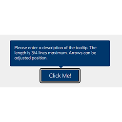
Feel free to utilise the prototype display located below as a practical example and demonstration of how the component is intended to operate. This interactive representation serves as a visual guide to help you grasp the expected functionality and behavior.
Tooltip
Design
Assets
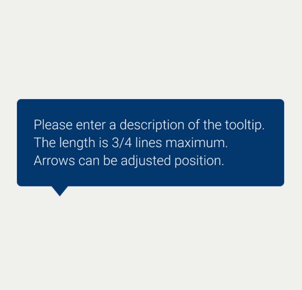
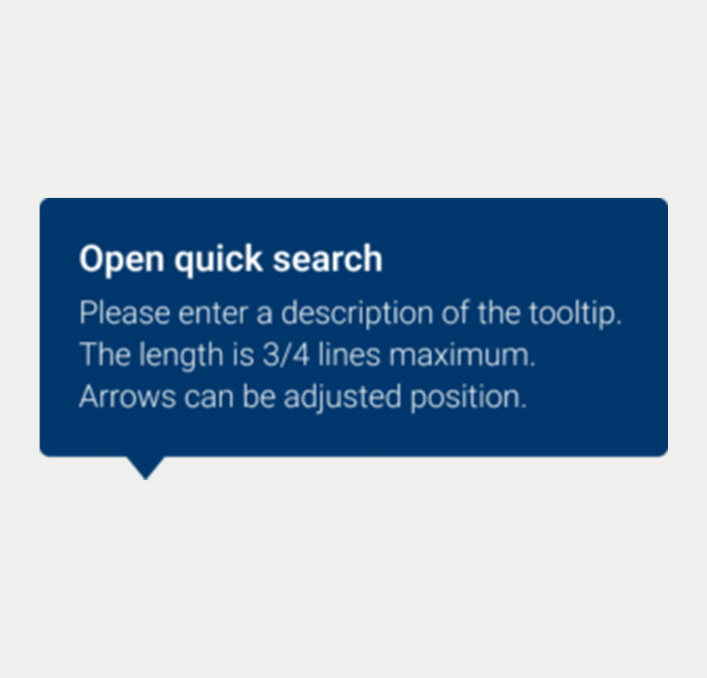
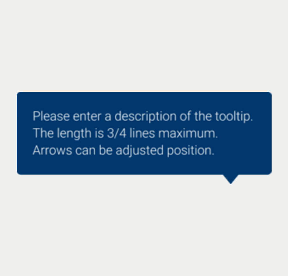
Tooltip Size-Large
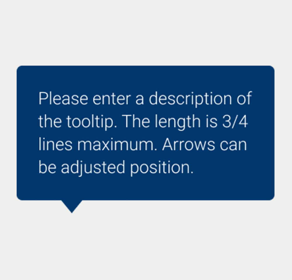
Tooltip Size-Medium
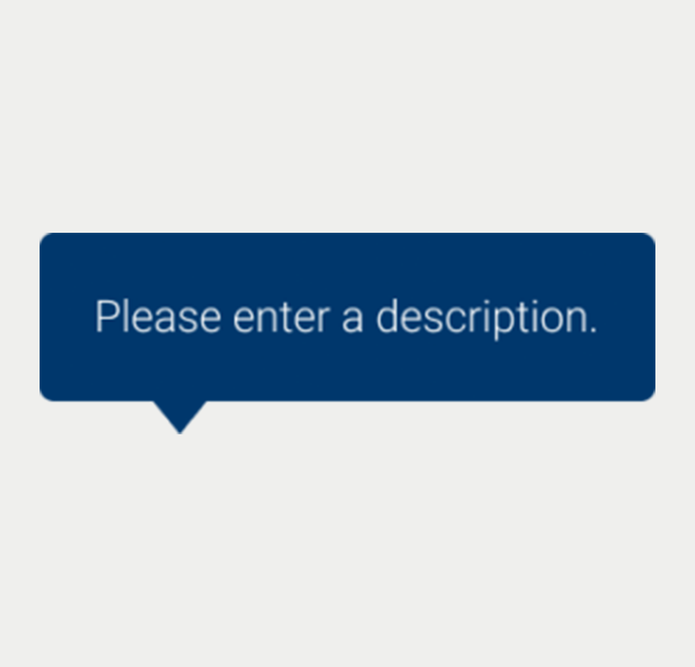
Tooltip Size-One_line
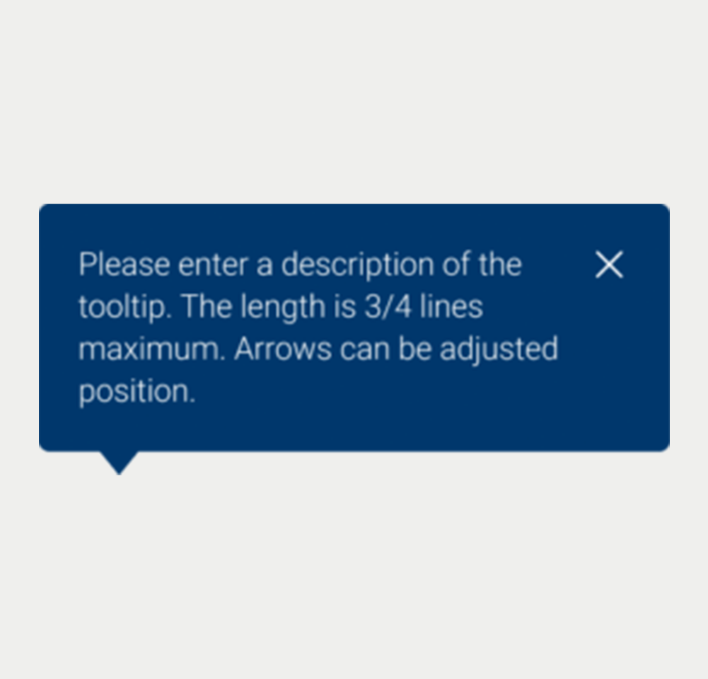
Tooltip Close Large
Tooltip V2
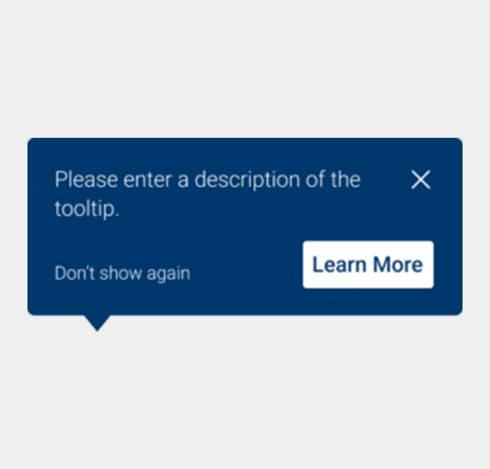
Tooltip V3
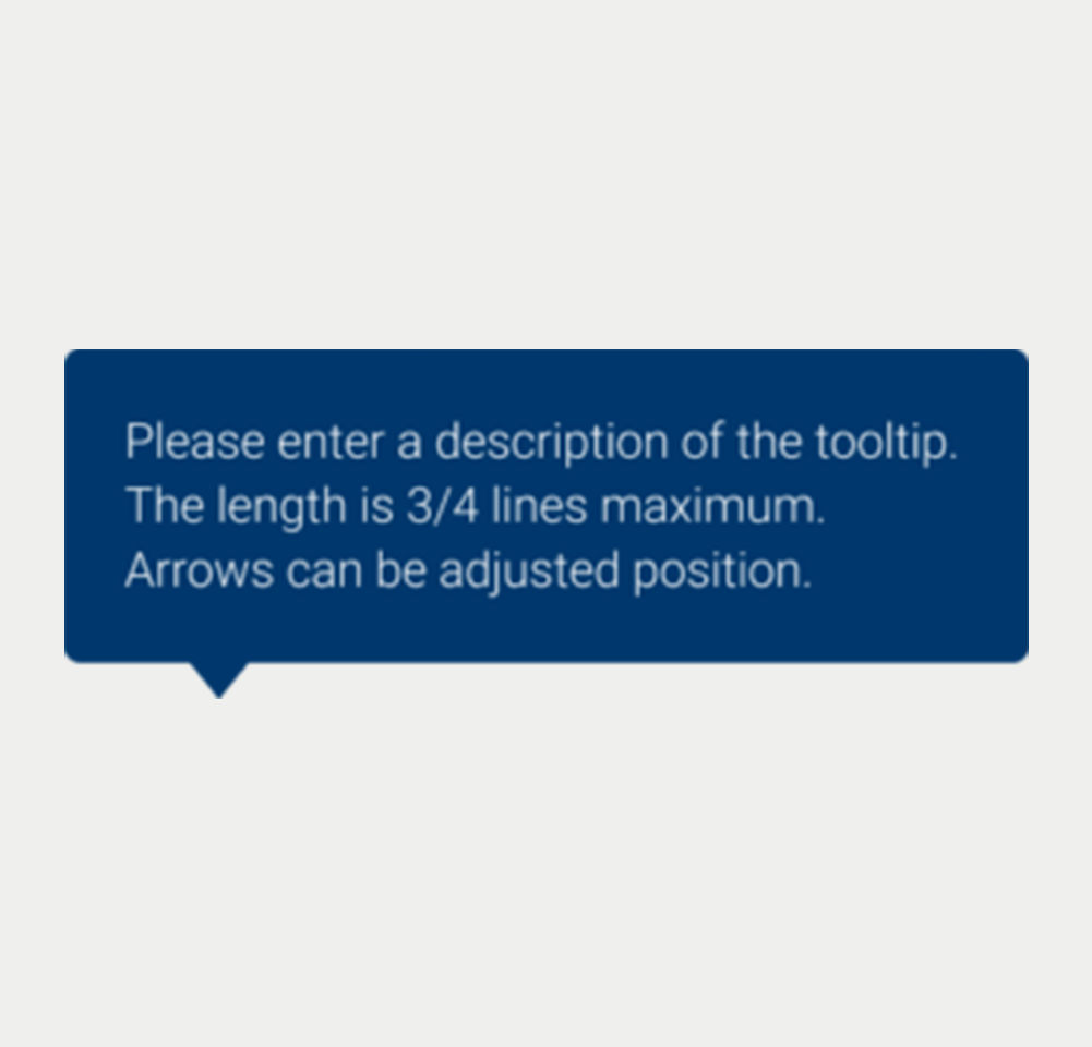
Tooltip Arrow Left-Down
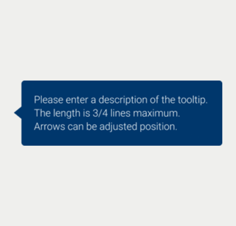
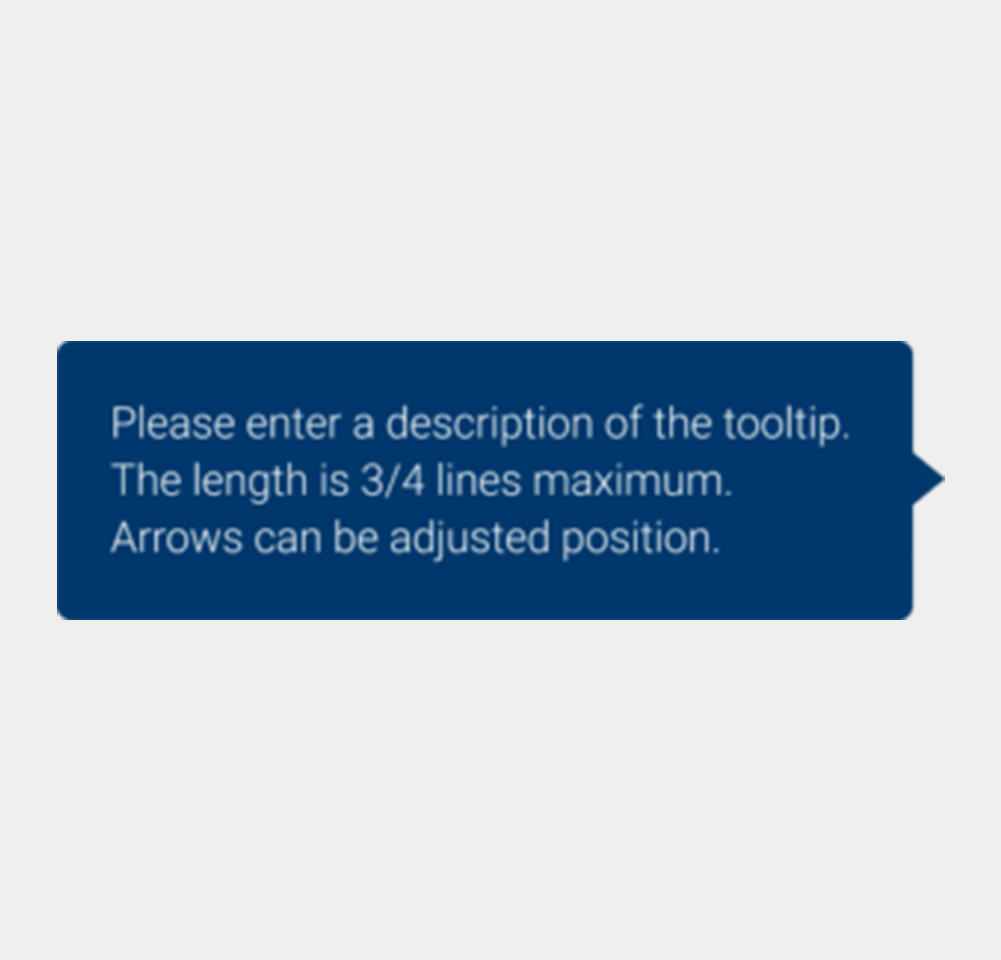
Tooltip Arrow Left-side
Tooltip Arrow Right-Down
Tooltip Arrow Right-side
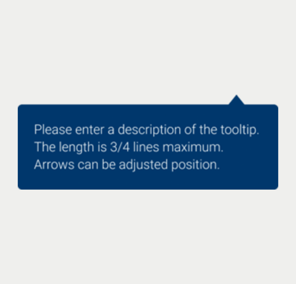
Tooltip Arrow Right-Top
Prototype
On this page
Keywords
- Tooltip Component: A user interface element that provides additional textual information when a user hovers over or focuses on another element.
- Assistive HTML Attributes: Attributes like title or ARIA attributes that offer context-sensitive information to enhance user understanding and accessibility.
Breakdown of Components
Default Tooltip
- Label: The tooltip is linked to an element via the title or aria-describedb
yattributes, providing explanatory text upon user interaction. The aria-describedby attribute references the ID of the tooltip's content, which facilitates the conveyance of this content to assistive technologies when the component is accessed via keyboard navigation. Additionally, an aria-hidden="true" attribute is used to conceal the tooltip's content from the screen until it is required for accessibility when the element receives keyboard focus. - Visibility Toggle: User actions such as clicking or focusing on the associated element trigger the visibility of the tooltip.
- Behavior and Interaction: User interactions dictate the tooltip's display, ensuring it appears close to the described element without covering other interactive components of the interface.
- Hiding the tooltip: The user must be able to hide the tooltip with the keyboard only. When the focus is on the trigger button or the mouse hovers on it and the tooltip is displayed, the user must be able to hide the tooltip with the Escape key.
- Hovering content: The tooltip must remain visible when the user hovers over it with the mouse.
Actions
Screen reader
The tooltip content is made accessible to screen readers, often via the aria-describedby attribute, ensuring that the information is conveyed when the associated element gains focus.
Additional Notes
The tooltip should not be used as the sole method of conveying important information, as it may not be accessible in all user scenarios, such as touch-screen devices or for users with certain disabilities. It is best used to supplement the interface by providing additional context, explanations, or to guide the user through more complex interactions.
| Key | Function |
|---|---|
| Tab (Optional) | Optionally, pressing the Tab key can shift focus to the tooltip. |
The demo in mobile version will be available soon. In the meantime, we invite you to check out the desktop version.