New Components
Toggle
Used in digital interfaces to switch a single setting or option on and off. Resembling a physical switch, it provides a clear visual cue of its state, making it intuitive for users. Toggles are commonly employed for binary settings like turning options on or off in applications and websites, offering a simpler alternative to checkboxes for immediate, single-action settings.
When to use
- User Preferences: Utilize toggle switches for settings that can be turned on or off, reflecting user preferences without needing to navigate away from the current page.
- Immediate Activation: Implement toggles when the setting changes should apply immediately without any additional confirmation steps.
When not to use
- Complex Settings: Avoid toggles for settings that require more than a simple on/off state, such as dropdowns that offer multiple options.
- Critical Actions: Do not use toggles for actions that have significant consequences and require more deliberate confirmation, such as deleting an account.
Behaviors
- Mouse Interaction: Toggle switches should visibly respond to mouse clicks, indicating their state change from on to off or vice versa.
- Keyboard Navigation: Toggles should be accessible through the keyboard, allowing users to switch them using the Tab key for focus and the Enter or Space key to activate.
- Screen Reader Accessibility: Structure toggle elements with clear labels and use ARIA attributes to communicate the state and purpose of the toggle switch to screen readers.
Content
- Clear State Indication: Use visual cues like color contrast or text to clearly indicate the state of the toggle, ensuring users understand whether the option is enabled or disabled.
- Concise Labeling: Labels for toggles should be short and precise, informing users about the functionality of the switch.
- Immediate Feedback: Provide instant feedback upon state change so users know the action has been successfully performed.
- Avoid Ambiguity: Ensure that the purpose and consequences of the toggle are clear, avoiding any confusion about what the switch controls.
On this page
Figma files and assets
Designers can import all design documents from our Figma repository using our provided link below. This simplifies the design process and ensures easy access to the latest design assets for a more efficient workflow.
Feel free to utilise the prototype display located below as a practical example and demonstration of how the component is intended to operate. This interactive representation serves as a visual guide to help you grasp the expected functionality and behavior.
Design
Assets

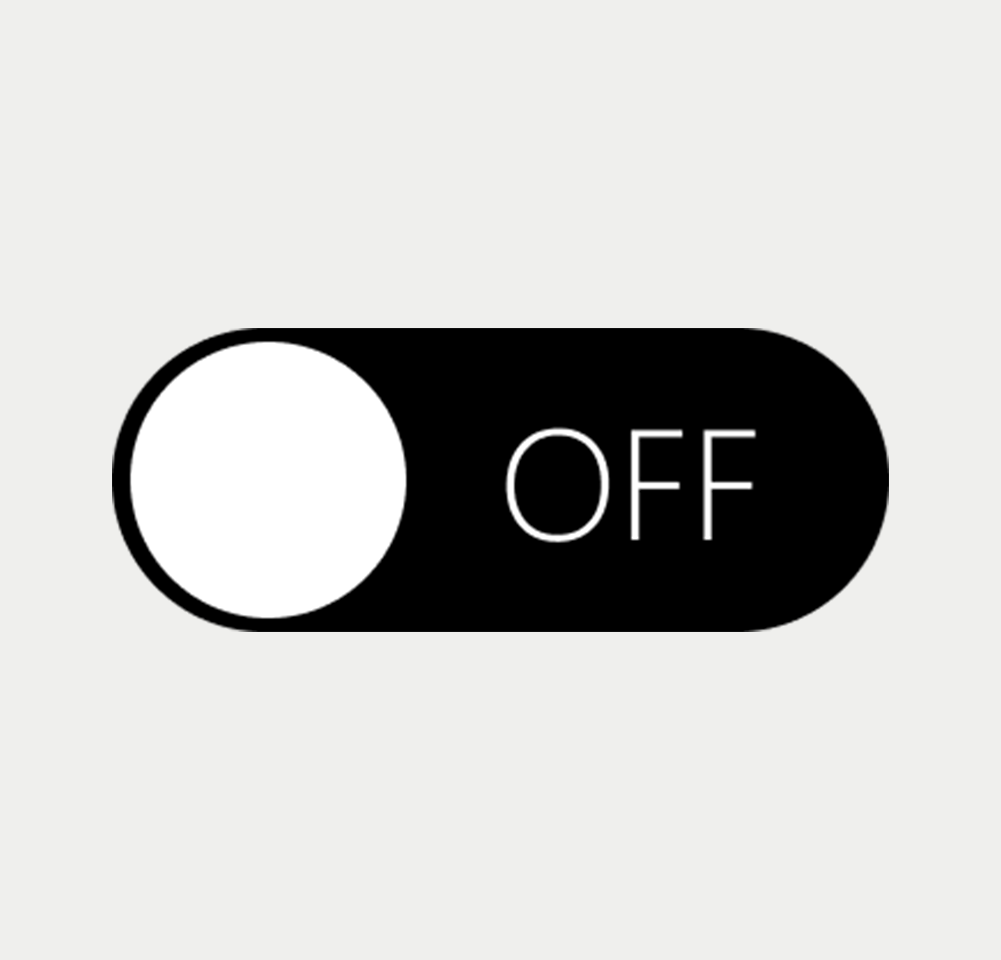
Toggle

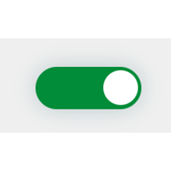
Toggle
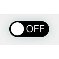
Toggle

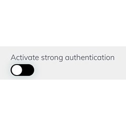
Toggle
Prototype
On this page
Keywords
- Toggle Switch: A user interface element allowing users to switch a single option on or off.
Breakdown of Components
- Labeling and Identification: Each toggle switch must have a clear text description. Employ a <label> element, aria-labelledby, or aria-label attribute to succinctly describe the purpose and function of the toggle.
- State Indication: Visually indicate the state (on/off) of the toggle. This can be done through color changes, position shifts of the switch, or textual indicators.
- Screen Reader Compatibility: The toggle switch should be correctly identified by screen readers. Use ARIA attributes such as role="switch" and aria-checked to convey the current state.
- Focus Indication: When the toggle switch gains focus, it should have a visible focus indicator, such as an outline or border highlight.
- Disabled State Handling: If a toggle switch is not available for interaction, clearly indicate its disabled state visually and use the disabled attribute to make it non-interactive.
- Feedback on Interaction: Provide immediate feedback when the state of the toggle changes, which can be visual, such as a color change, or auditory, like a sound for screen reader users.
Screen reader
- The correct label is essential for screen readers, providing descriptions for the associated toggle switch .
On this page
| Key | Function |
|---|---|
| Space | Toggles the switch on or off |
| Tab | Shifts focus to the right |
| Shift + Tab | Moves focus to the left |
The demo in mobile version will be available soon. In the meantime, we invite you to check out the desktop version.