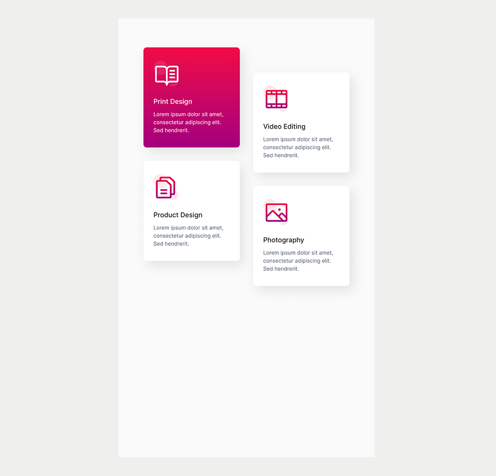
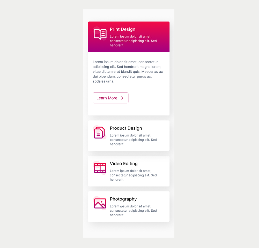
New Components
Tab panel
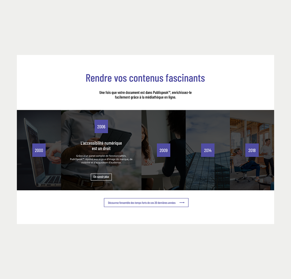
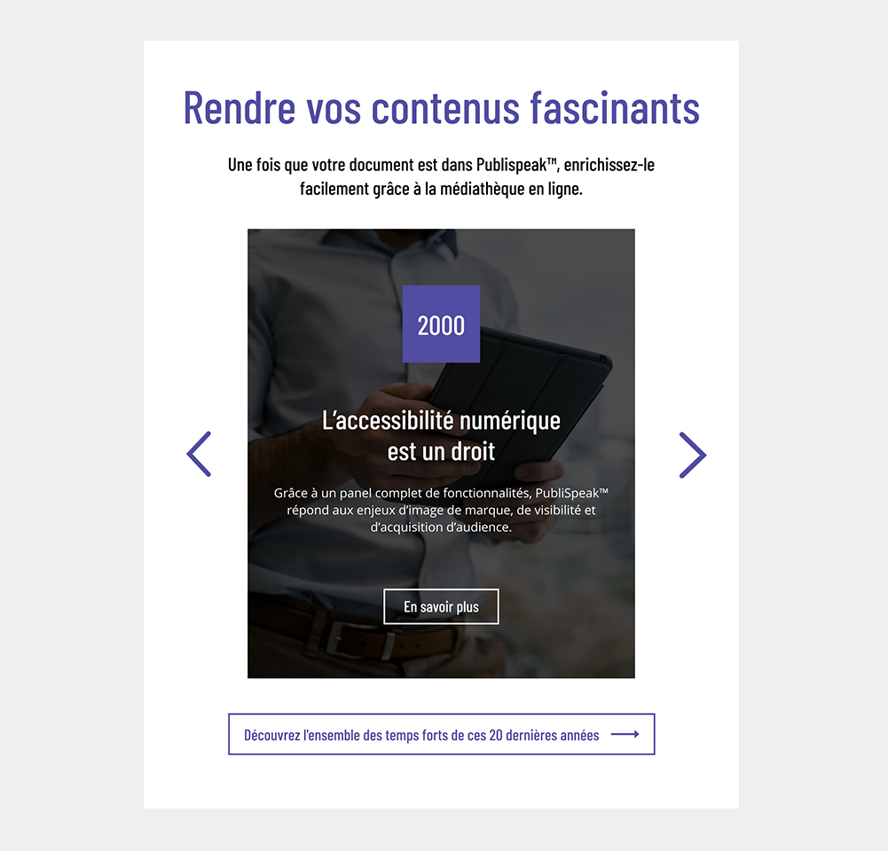
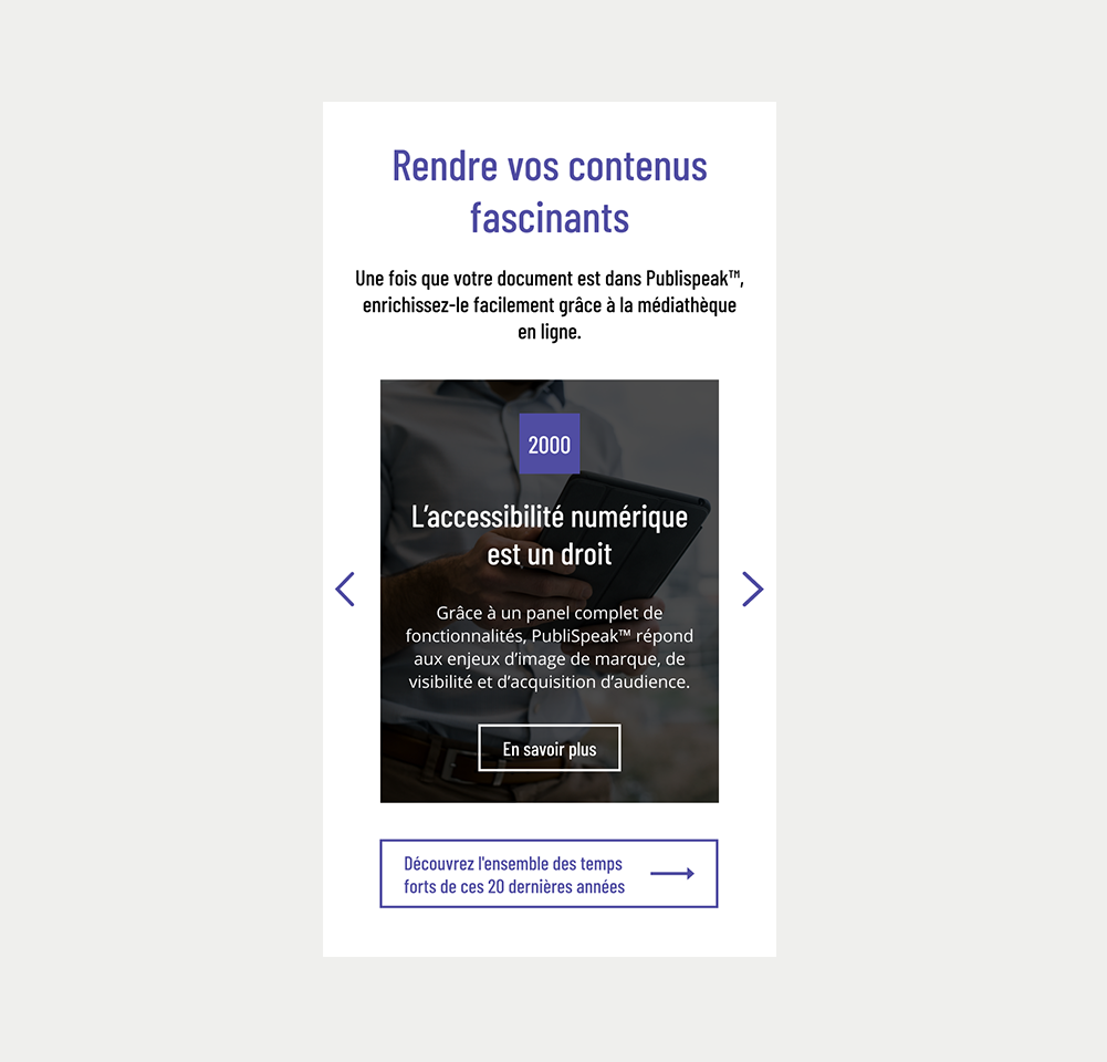
A tab panel is a component in the user interface that enables users to switch between various content sections simply by clicking on tabs.
Usually, each tab panel houses a single content section, and only one tab panel can be visible at any given time. While tabs are commonly positioned at the top of the content, they can also be placed along the sides or bottom. Tab panels are widely used in web applications, software applications, and graphical user interfaces as a means to organise content and facilitate user interaction with the required information.
When to use
Tabs are useful when your information can be neatly divided into labeled sections, with the first section being most important.
Checklist when deciding to use a tab panel:
- Your content can be logically separated into distinct labeled sections.
- The first section is more important than the others.
- Users typically won't require access to all sections at the same time.
When not to use
- Navigation: Avoid using a tab panel if you intend to use it as a form of page navigation.
- Sequential content: If content of each panel is to be consulted in a specific order. E.g. A step by step guide on how to open an account.
- Comparisons: If comparison between content of different tabs is needed. E.g. Having a tab panel for each model of a car dealership.
- Long-form content: Tabs are most effective with short and concise content. If a tab involves extensive scrolling, it contradicts the purpose of using tabs for a streamlined appearance.
- Small screen resolutions: The tablist is commonly placed at the top of the tab panel, positioning buttons beside one another. However, this can cause scrolling on smaller screens, which goes against the reflow criterion.
Choose between tabs, accordions
Both tabs and accordions can be used to hide sections of content and allows the user to reveal the information they need.
| In favour of Tabs | In favour of Accordion |
|---|---|
| All the content are closely related or parallel. | A substantial amount of content must be structured within a confined space. |
| Not all information needs to be viewed at the same time. | Sequential reading isn’t vital. |
| Users need to move quickly between content. | Users may need to open multiple sections in parallel to compare the content. |
| The content load of each tab is relatively light. | |
| The content of a specific tab needs to be prioritised by being displayed first. |
Figma files and assets
Designers can import all design documents from our Figma repository using our provided link below. This simplifies the design process and ensures easy access to the latest design assets for a more efficient workflow.
Feel free to utilise the prototype display located below as a practical example and demonstration of how the component is intended to operate. This interactive representation serves as a visual guide to help you grasp the expected functionality and behavior.
Tab panel
Design
Assets
Desktop
Tablet
Mobile
Side Tab panel
Assets
Prototype
Design
Desktop
Tablet
Mobile
On this page
Keywords
- Tablist: A container holding multiple tabs.
- Tab: A button that triggers a panel.
- Active Tab: The button representing the currently displayed tab panel.
- Panel: A container holding the content of the tab panel.
- Title: An accessible name.
Breakdown of Components
Tablist
- A tablist consists of tab buttons grouped together to form a container for a set of tabs.
- To designate an element as a tablist, apply the role="tablist" attribute to the container containing the tab buttons.
- Always provide a title for the tablist. This title names the entire tab panel and helps screen reader users understand its content. Use either an aria-label or an aria-labelledby attribute to create the title for the tablist.
- If a visible title already exists on the page, use aria-labelledby to link the title with the tablist, ensuring screen reader users can access it easily.
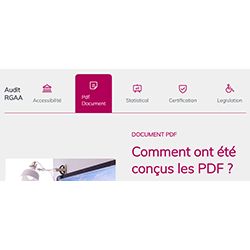
<h3 id="tablist-title">Accessible documents</h3>
<div role="tablist" aria-labelledby="tablist-title"></div>Tab
- Create tab buttons using HTML's native <button> tags.
- This button needs to be defined as a tab button. The ARIA role="tab" indicates an interactive element inside a tablist that, when activated, displays its associated tabpanel.
- Ensure tab buttons display a visible focus when navigating with a keyboard, often achieved with a 2px border around the button.
- Include the aria-selected attribute for each tab.
- For inactive tabs, set aria-selected="false" to indicate they are not active, and their content is hidden.
- Set
aria-selected="true"for the active tab, indicating its active status and visible content.
- Use tabindex="-1" on non-active tabs to exclude them from regular keyboard navigation, keeping only the active tab accessible.
- Link each tab to its corresponding panel through the aria-controls attribute.
- For visibility during screen magnification, use percentage-based widths for tabs and panels to maintain proportional scaling.
- Explicit labels are crucial to identify hidden content within tabs. They offer descriptive indicators for users, especially those relying on assistive technologies like screen readers, making the experience more accessible and inclusive.
<button role="tab" aria-selected="false" id="tabbutton-2" tabindex="-1" aria-controls="tabpanel-2">Powerpoint</button>Active Tab
- Distinguish the active tab from inactive tabs by applying a thicker border and using a distinct color.
- This visual contrast is particularly beneficial for users who can't perceive colors, aiding them in identifying the active tab.
- The enhanced border also improves visibility for users who rely on screen magnification, aiding them in recognizing the active tab.
- As the tab is created using an HTML button element, you don't need to add tabindex="0" to the selected (active) tab.
- HTML button elements are inherently keyboard accessible and are naturally part of the regular tab order.
<button role="tab" aria-selected="true" id="tabbutton-1" aria-controls="tabpanel-1">PDF</button>Panel
- Use role="tabpanel" on the content panel element to identify it as the container for tab panel content.
- This role attribute clarifies the element's function in the accessibility structure, indicating it contains content linked to the relevant tab.
- Add an aria-labelledby attribute to the content panel.
- Use the identifier of the corresponding tab as the attribute's value.
- This connection between the tab and its content enhances accessibility and comprehension of the tab panel for users.
- Add a unique id on the panel that can be used in the aria-controls attribute of the corresponding tab button.
- Add a tabindex="0" on the visible tabpanel to allows access to the panel with the keyboard.
<div role="tabpanel" aria-labelledby="tabbutton-1" id="tabpanel-1" tabindex="0">
    <p>An accessible PDF is a document containing XML tags, elements that can be used to indicate a title, an image, a table, a list of bullets, a graphic, etc.</p>
</div>On this page
| Key | Function |
|---|---|
| Tab |
|
| Enter/Space | When a tab has focus, the tab is activated and its associated panel is displayed. |
| Right Arrow |
When the focus is on a tab:
|
| Left Arrow |
When the focus is on a tab:
|
| Home | When the focus is on a tab, the focus moves to the first tab. |
| End | When the focus is on a tab, the focus moves to the last tab. |
The demo in mobile version will be available soon. In the meantime, we invite you to check out the desktop version.