New Components
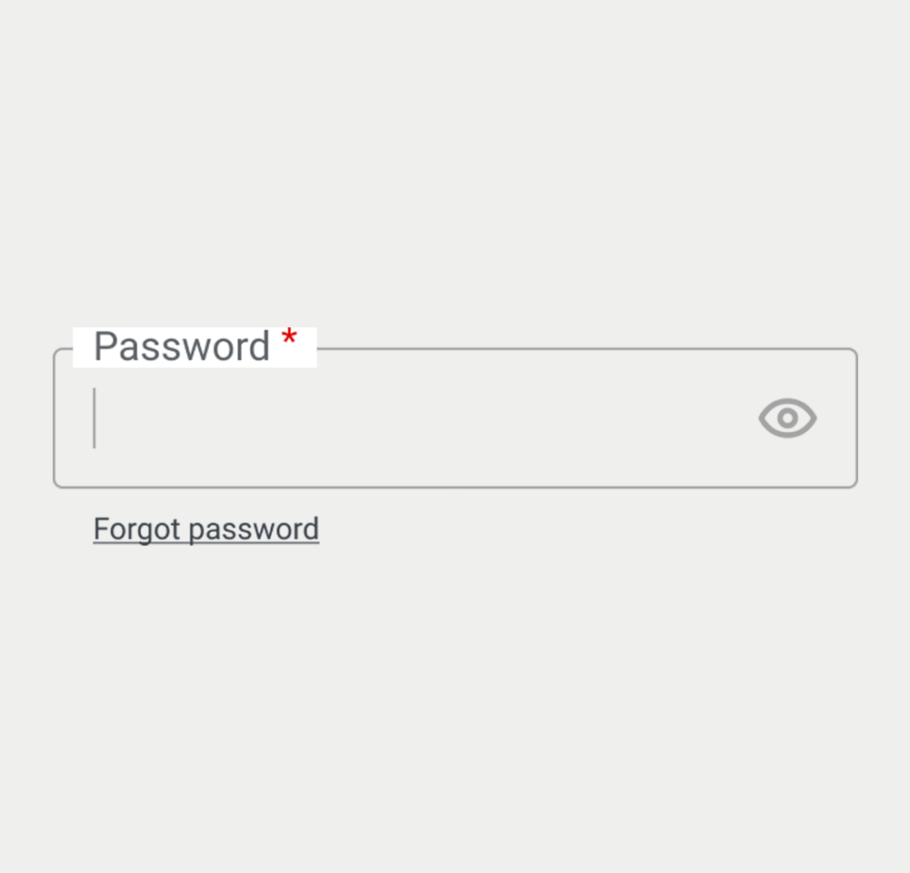
Password Input
The password input component is a secure field designed to handle user-created passwords. It masks inputted characters to protect sensitive data, typically displaying dots or asterisks instead of the actual characters typed by the user. This component often includes features like strength indicators and the ability to toggle visibility for user convenience. It’s essential for authentication processes, allowing users to create and enter their unique identifiers while maintaining privacy.
When to use
- Confidential Authentication: Utilize password inputs for fields requiring the user to enter sensitive data, ensuring privacy and security during the authentication process.
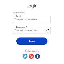
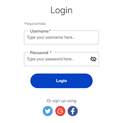
- Form Security: Implement password fields in forms where a secure input of confidential information is necessary, such as sign-up forms and login pages.
When not to use
- Non-Sensitive Data: Avoid using password inputs for non-sensitive information as it obscures the text and can cause user input errors.
- Public Information: Do not use password fields where information shared is meant to be public or visible, like usernames or comments.
Behaviors
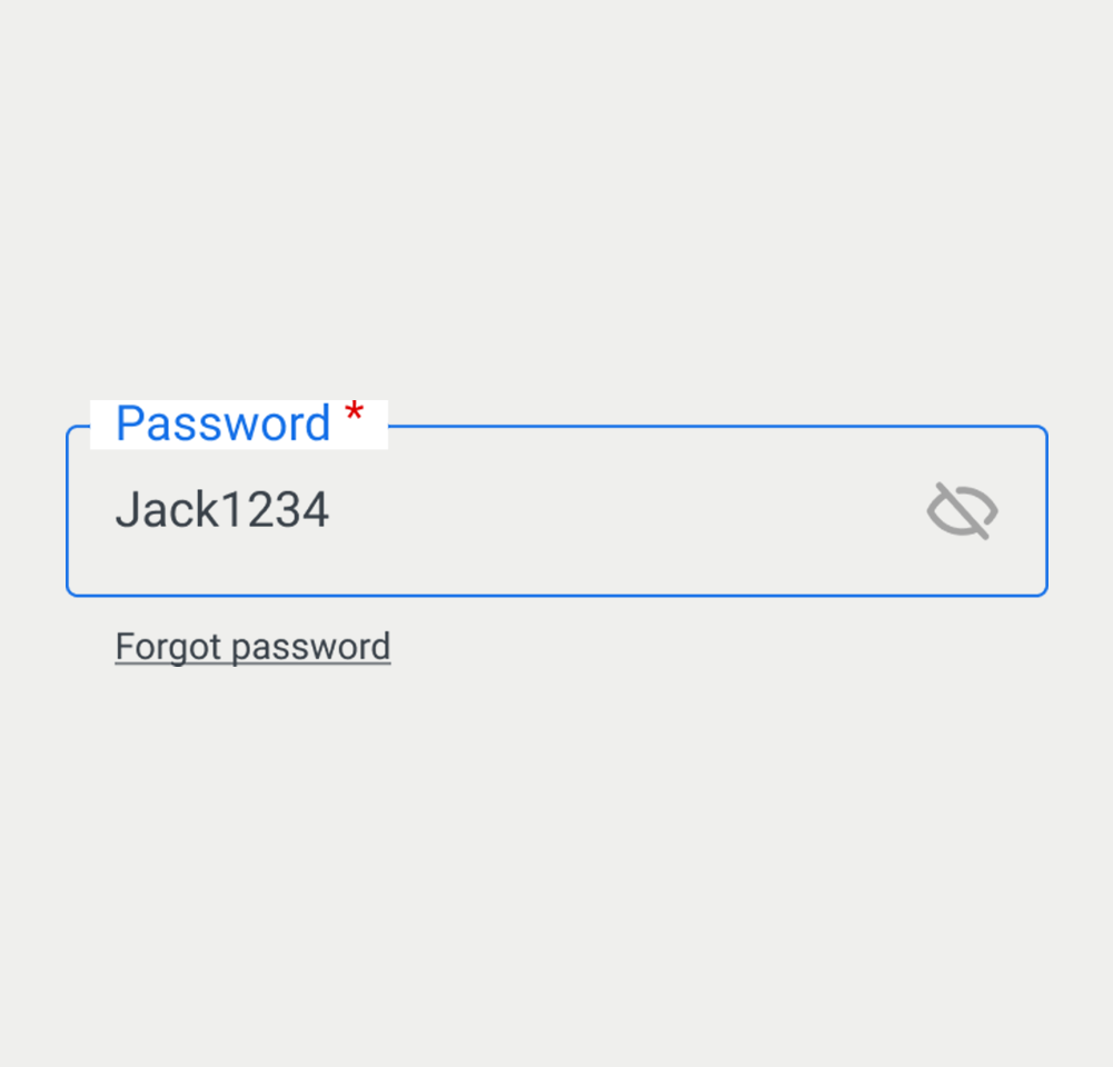
- User Interaction: Password fields should hide user input by default, displaying placeholder characters (such as asterisks or dots) to maintain confidentiality.
- Visibility Toggle: Provide a toggle feature allowing users to view their input, ensuring accuracy during typing.
- Screen Reader Accessibility: Password inputs should be clearly labeled for screen readers, with ARIA attributes indicating their purpose as a secure field.
Content
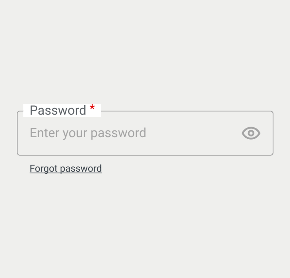
- Clear Labeling: Labels for password inputs should be straightforward, indicating that the field is for password entry.
- Strength Indicators: Optionally include strength indicators to encourage strong password creation.
- Consistent Design: Maintain a consistent look and feel for password inputs across your application or website to support a cohesive user experience.
On this page
Figma files and assets
Designers can import all design documents from our Figma repository using our provided link below. This simplifies the design process and ensures easy access to the latest design assets for a more efficient workflow.
Feel free to utilise the prototype display located below as a practical example and demonstration of how the component is intended to operate. This interactive representation serves as a visual guide to help you grasp the expected functionality and behavior.
Design
Assets
Password
Password
Password
Password
Password
On this page
Keywords
- Password Input: A secure user interface element designed for users to enter sensitive data, typically obscured to protect the information.
Comprehensive Accessibility Guide
- Label: The password field is associated with a <label> element, with its for attribute matching the input's id, to ensure clear identification and accessibility.
- Mandatory Fields: Password fields are often marked as required, using the
requiredattribute or aria-required="true". This is visually indicated by an asterisk (*) next to the label. The span containing the (*) cans be hidden for assistive technologies through the aria-hidden="true" attribute - Autocomplete: For security reasons, password inputs typically have the autocomplete attribute set to "new-password" or "current-password", depending on the context, to manage browser autofill behavior.
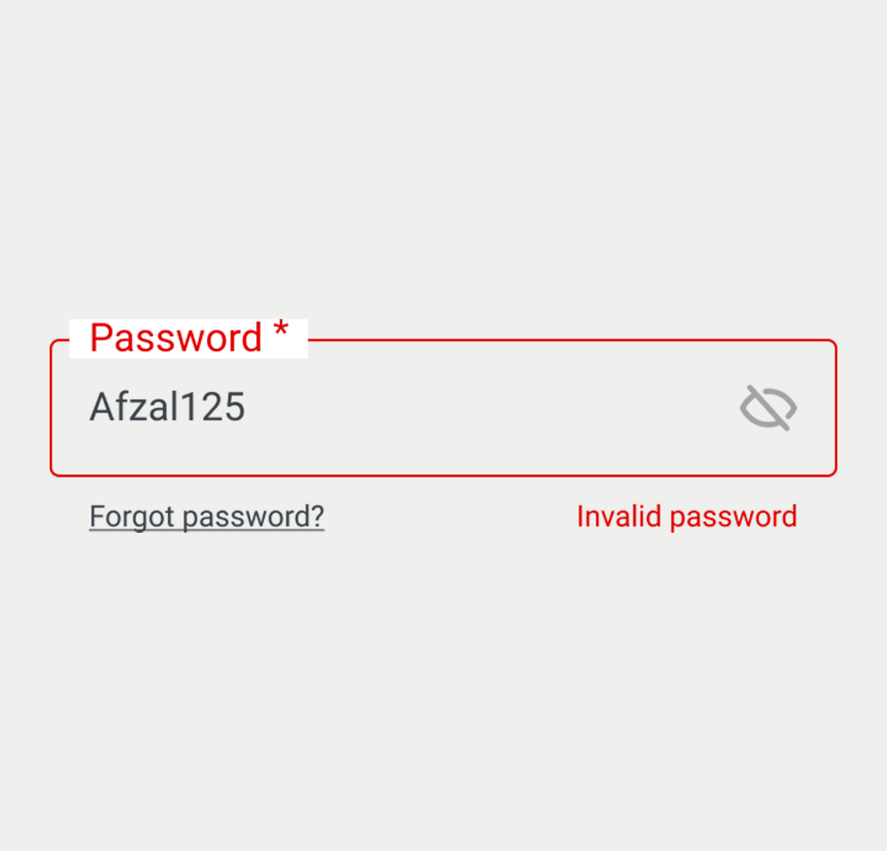
- Error and Success States: Visual cues, such as border color changes or helper text, signal the validity of the password entered. The aria-invalid="true" attribute is used to indicate to assistive technologies that the password is invalid, and the aria-describedby can be used to link the visible error message to the field.
- NOTE: Both aria attributes need to be removed when the field is valid.
- Disabled State: When interaction with the password field is not appropriate, such as during processing stages, it is rendered inactive and styled distinctly to reflect this. The disabled attribute indicates that a field is not interactive.
- Helper Text: As indicated in the text input, supplementary text under the label, like password requirements, guides the user on what constitutes a valid password. Link the helper text to the field using the aria-describedby attribute, while providing format guidance in the helper text itself, ensuring the best possible user experience.
Screen reader
- Screen Reader Compatibility: Password inputs are made accessible by using ARIA attributes and clear labeling, ensuring screen readers can interpret the field correctly.
- The <label> element is crucial for screen readers, providing descriptions for the associated password fields through the for attribute linkage.
Additional Notes
- The password input is exclusively for obscured text entries to maintain confidentiality. Unlike a textarea, it is for single-line use only, with additional features like a visibility toggle often incorporated to enhance usability.
| Key | Function |
|---|---|
| Shift + Tab / Tab | Moves the focus to the password input field. |
The demo in mobile version will be available soon. In the meantime, we invite you to check out the desktop version.