New Components
Pagination
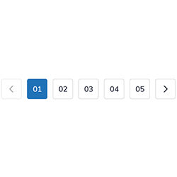
Pagination is a tool used for navigating through extensive content across multiple pages. Typically placed at the bottom of a page, it offers links to move between next, previous, numbered, and sometimes first or last pages, making large content sets more accessible and manageable, thereby enhancing user experience and usability.
When to Use
- Content Division: Employ pagination for dividing lengthy content or large sets of data into separate, manageable pages.
- User Navigation: Use pagination to facilitate user navigation across different sections or pages of content, particularly in e-commerce sites, search results, or blogs.
When not to use
- Limited Content: Avoid pagination if the content or data is minimal and can be effectively displayed on a single page.
- Infinite Scrolling Pages: Do not use pagination for pages designed for infinite scrolling, where content loads continuously as the user scrolls down.
Behaviors
- Mouse Interaction: Ensure pagination links respond visually to mouse interactions, such as through changes in color, underlining, or highlighting, to indicate their clickable nature.
- Keyboard Accessibility: Pagination should be fully accessible via the keyboard, allowing users to navigate between pages using the Tab key and select pages using the Enter key.
Screen Reader Accessibility
- Clear Identification: Label pagination components clearly for screen readers, possibly using ARIA labels or landmarks to indicate their role as page navigation tools.
- Current Page Indication: Use ARIA attributes or other methods to indicate which page is currently being viewed, aiding users in understanding their position within the set of pages.
Content
- Concise Labels: Keep pagination labels concise, typically using numbers or simple navigational terms like "Next" and "Previous."
- Visible Current Page: Highlight the current page number distinctly to make it stand out from other page numbers.
- Balanced Range Display: Show a balanced range of page numbers around the current page, without overloading the user with too many options.
- Responsive Design: Ensure the pagination component adapts to different screen sizes, maintaining clarity and usability.
Keywords
- Pagination: navigation method that allows users to access different pages of content sequentially or directly.
Key Accessibility Features
- Navigation Landmark: Use the <nav> tag to define the component as a navigation landmark.
- ARIA Label: The aria-label="Page navigation" attribute on the <nav> element clearly identifies the purpose of the pagination component.
- Unique Navigation Names: If multiple navigation elements exist on the page, each would have a unique aria-label.
- Hidden Angle Brackets: The angle brackets («, ‹, ›, ») used in the "First", "Previous", "Next", and "Last" links are hidden from screen readers using <span aria-hidden="true">. This reduces vocalisation while maintaining visual cues for sighted users.
- Current Page Indication: The current page is marked with aria-current="page" to inform screen readers that this page is the active page.
- Hidden Text for Icons: For links represented as icons or symbols, hidden text (inside span with aria-hidden="true") and title attributes provide context for screen reader users.
- To provide more context to the links for screen readers, you can add a visually hidden span with the class "sr-only" to each link tag. Add <span class="sr-only"> Page </span> in the link tag and with this modification, screen readers will read the title of each link as "Page 1 link", "Page 2 link", and so on, providing better context to users."
On this page
| Key | Function |
|---|---|
| Tab | Moves the focus to the left. |
| Tab | Moves the focus to the right. |
| Shift + Tab | Validate the selection. |
The demo in mobile version will be available soon. In the meantime, we invite you to check out the desktop version.