New Components
Checkbox
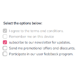
A checkbox is a component that allows users to make a selection from a set of options. Typically presented as a small square box, it can be either checked (selected) or unchecked (not selected). Checkboxes are commonly used in forms and settings where users can indicate their choices or preferences. They are particularly useful for options that are not mutually exclusive, allowing multiple selections from a group of choices. When a checkbox is selected, a checkmark or a tick appears inside the box, visually indicating the user’s choice.
When to Use
- Multiple Choices: Utilize checkboxes when offering users a range of options from which multiple choices can be selected.
- Non-Exclusive Selections: Employ checkboxes in scenarios where selecting one option does not exclude the selection of other options.
- Form Inputs: Implement checkboxes in forms where users need to specify their preferences or choices among a set of distinct options.
When Not to Use
- Single Choice: Avoid checkboxes for situations where only one option can be selected from a group; use radio buttons instead.
- Binary Decisions: Do not use checkboxes for binary choices (yes/no, true/false); toggle switches are more appropriate for such scenarios.
Behaviors
- Mouse Interaction: Ensure that checkboxes respond to mouse clicks, changing state from checked to unchecked or vice versa.
- Keyboard Navigation: Allow users to navigate through checkboxes using the Tab key and select them using the Spacebar or Enter key.
- Screen Reader Accessibility: Mark checkboxes with appropriate ARIA roles and labels to ensure they are identifiable and accessible through screen readers.
Content
- Clear Labeling: Accompany each checkbox with a clear and concise label indicating what selecting the checkbox represents.
- Group Labeling: When checkboxes are part of a group, provide a descriptive label for the entire group to indicate the nature of choices.
- Visual Consistency: Maintain a consistent design for checkboxes, ensuring they are easily recognizable and aligned with the website's or application's overall design.
- Immediate Feedback: Ensure that the state of the checkbox (checked/unchecked) is immediately visible and clear to the user.
On this page
Keywords
- Checkbox: A user interface element allowing selection of multiple options from a set.
- Form: A section on a web page where users input data and make selections.
- ARIA (Accessible Rich Internet Applications): A set of attributes to make web content more accessible to people with disabilities.
- Fieldset: An HTML element used to group related elements within a form.
- Label: Text associated with form elements, like checkboxes, to describe their purpose.
Breakdown of Components
- Checkbox Element: The fundamental component. It is an input element with the type attribute set to "checkbox". Each checkbox should have a unique ID for labeling.
- Label: Provides a textual description for each checkbox. Labels are associated with checkboxes using the 'for' attribute, which matches the ID of the checkbox.
- Fieldset and Legend: Used for grouping related checkboxes. The fieldset wraps the group of checkboxes, and the legend provides a title or description for the group.
- ARIA Attributes: Enhance accessibility, particularly for screen readers. For instance, aria-checked can indicate the state of the checkbox, and role="checkbox" ensures the correct role is conveyed to assistive technologies.
- Labelling Attribute: Associate the visible label with the custom checkbox using the
aria-labelledbyattribute. Ensure each label has a unique id, and assign the same id to the aria-labelledby attribute of the custom checkbox. - Tabindex Attribute: The use of non-generic HTML tags inherently renders the new component non-operable via keyboard. Therefore, the tabindex=0 attribute is introduced to make it keyboard-accessible. Additionally, keyboard interactions are managed through JavaScript event handling.
Screen Reader Accessibility
- Proper Labeling: Ensure each checkbox has a label that screen readers can read. This is achieved by linking the label to the checkbox using the 'for' attribute.
- Descriptive Group Labels: Use the fieldset and legend tags to provide context for a group of checkboxes, allowing screen readers to inform users about the nature of the choices.
- Keyboard Navigation: Ensure checkboxes can be navigated using the keyboard, typically the Tab key to move focus and the Spacebar or Enter key to toggle the state.
- State Announcement: Screen readers should announce the state of the checkbox (checked/unchecked) when it gains focus.
- Semantic HTML: Use standard HTML elements like input, label, fieldset, and legend which are inherently recognized by screen readers, enhancing the accessibility of the form.
On this page
| Key | Function |
|---|---|
| Up / Down Arrow | Navigate to the next or previous selection. |
| Enter / Space | Toggle the Checkbox on or off. |

The demo in mobile version will be available soon. In the meantime, we invite you to check out the desktop version.