New Components
Burger Menu
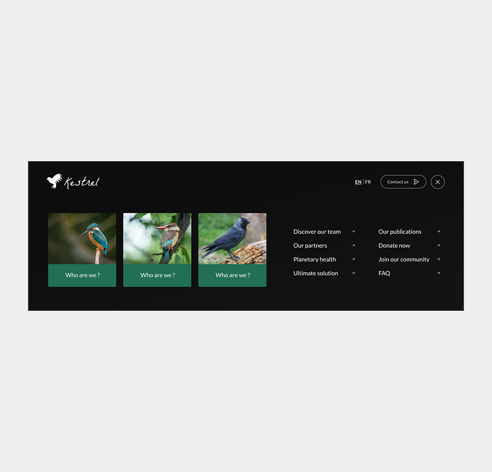
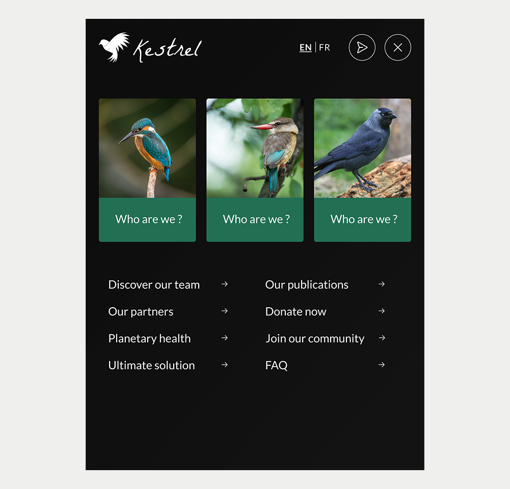
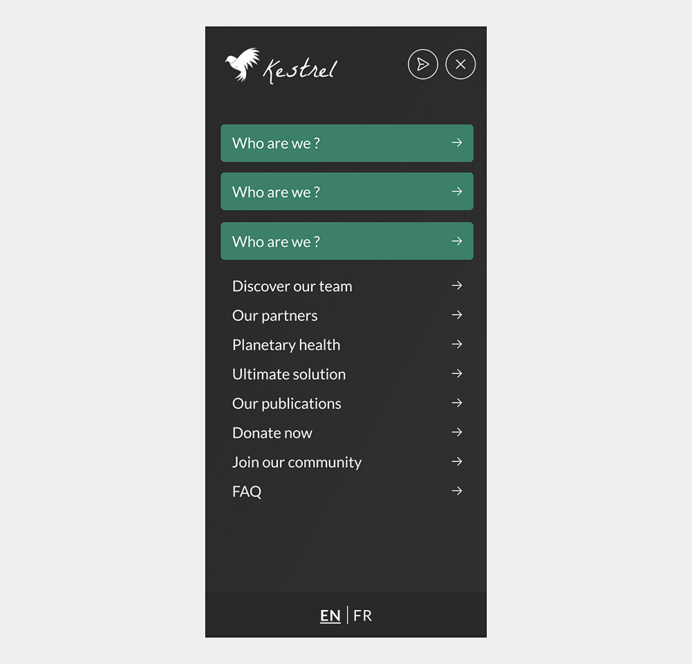
A burger main menu is usually represented by three stacked lines, forming an icon that signifies a hidden menu. When users click or tap on these lines, a menu slides into view or a drawer appears, revealing a list of navigation items or other elements that users can interact with.
When to use
- For a neat and focused website appearance, a burger menu can hide options until you need them.
- If your website has an abundance of navigation choices, a burger menu can assist in presenting a less crowded look by concealing options within a sidebar or drop-down.
When not to use
- On desktop sites with ample space, using traditional navigation bars or menus can improve usability by making options immediately visible to users.
- For websites with crucial sections that users need to see right away (e.g. language switcher), using a hamburger menu might hide these choices and decrease their prominence
- When you have only a small number of pages, it's usually more effective to directly display navigation links for straightforward accessibility.
On this page
Figma files and assets
Designers can import all design documents from our Figma repository using our provided link below. This simplifies the design process and ensures easy access to the latest design assets for a more efficient workflow.
Feel free to utilise the prototype display located below as a practical example and demonstration of how the component is intended to operate. This interactive representation serves as a visual guide to help you grasp the expected functionality and behavior.
Design
Assets
Desktop (AC-001)
Tablet (AC-001)
Mobile (AC-001)
Prototype
On this page
Keywords
- Burger menu: A button that shows or hides the navigation of a website
- Navigation: A framework enabling users to move across a website.
- Menu: Encompasses options or actions users can select from.
- Parent Menu Item: Represents a primary item in the menu under which sub-items, known as child items, are situated. These can also be considered as top-level menu items.
- Submenu: A compilation of secondary navigation elements displayed when a user interacts with a parent menu item.
- List: An element that arranges items or values in an ordered (numbered) or unordered (bulleted) sequence.
- Link: Permits users to transition between locations within the same or different web pages.
Breakdown of Components
Burger menu
- Use a <button> tag featuring the hamburger icon is used to toggle the menu's visibility.
- Use explicit labels (e.g., aria-label="Main Menu"), ensuring that it is easy to understand that this button opens a menu.
- Use WAI-ARIA attributes such as aria-haspopup="true" and aria-expanded="false" to indicate the presence of a closed menu. Adjusting the aria-expanded value to true signifies that the burger menu is opened.
- Since the burger menu controls the visibility of the navigation which is a separated element, using the aria-controls WAI-ARIA attributes is vital for setting this relationship. This attribute holds the id of the navigation tag (aria-controls ="id of the <nav> tag containing the hidden menu").
<button aria-label="Main Menu" aria-expanded="false" aria-controls="navigation" id="burger"></button>Navigation
Establishes a section as a navigation landmark. Various navigation types (primary, secondary, breadcrumbs, lateral) exist, with the navigation bar serving as a website's primary navigation.
- Identify the menu inside, ideally using the HTML5 <nav> tag to allow users access to the menu directly.
- Label menus to make them easier to understand. Employ simple and descriptive labels for users to differentiate among multiple navigations. Use the attribute aria-label for labeling a navigation, such as aria-label="Main navigation".
- Do not forget the unique id on the <nav> tag that needs to be assigned in the aria-controls attribute of the burger menu.
<nav id="navigation" role="navigation" aria-label="Main navigation">Menu
- Define the menu's structure through a list format. This structural detail enables assistive tools to announce the item count and facilitate navigation.
- Use the link tag to define individual menu items, each directing to a designated destination, be it a page section or a new page.
- Use markup to signify the current menu item, such as the current web page on a site, enhancing navigation within the menu. This indication should cater to both visual users and assistive technologies.
<ul>
    <li><a href="#">Home</a></li>
    <li><a href="#">About</a></li>
    <li><a href="#">Services</a></li>
    <li><a href="#">Contact</a></li>
</ul>On this page
Interaction with the keyboard
When the focus is on the last item in the menu and the Tab key is pressed again or the user presses the Esc key, enhance user experience by restoring focus back to the burger menu button. This prevents user disorientation caused by the open menu not aligning with the focus point and facilitates easy menu reopening without the need to navigate through previous elements.
| Key | Function |
|---|---|
| Tab |
If burger menu is closed:
|
| Space/Enter |
|
| Esc key | Closes the menu and moves focus back to the burger menu button. |