PDF Accessibility
Interactive Form
Forms in PDFs allow users to interact with the document by filling out fields, selecting options, or submitting data. These fields can include text boxes, checkboxes, radio buttons, dropdown menus, and more. Properly tagging forms is essential for accessibility, ensuring all users, including those relying on assistive technologies, can navigate and interact with the form fields effectively. Accessible forms use structured tags to define the role, label, and purpose of each field.
Before tagging or preparing a PDF for accessibility, it is essential to identify the types of forms present in the document. This ensures each form element is tagged appropriately and provides the correct functionality for the end user.
Types of Form Elements
- Text Fields: For user input, such as entering names, email addresses, or other data.
- Checkboxes: For selecting one or more options from a set.
- Radio Buttons: For selecting a single option from a group.
- Dropdown Menus: For selecting a single option from a list of choices.
- Buttons: For actions like submitting the form, resetting fields, or navigating.
- Date Pickers: For selecting dates in a calendar-style format.
- Signature Fields: For digital signatures, enabling users to sign the document electronically.
On this page
- Review the Document
- Go through the document carefully to locate all form fields.
- Identify their purpose and functionality.
- Check Document Requirements
- Ensure you understand the intended use of the document and how users are expected to interact with the forms.
- Check for Existing Forms
- If the document already contains form fields, review them to ensure they meet the functional and accessibility requirements.
- Enter the Prepare Form Tool
- Navigate to Tools > Prepare Form.
- Click Prepare Form to enter the form editing mode.
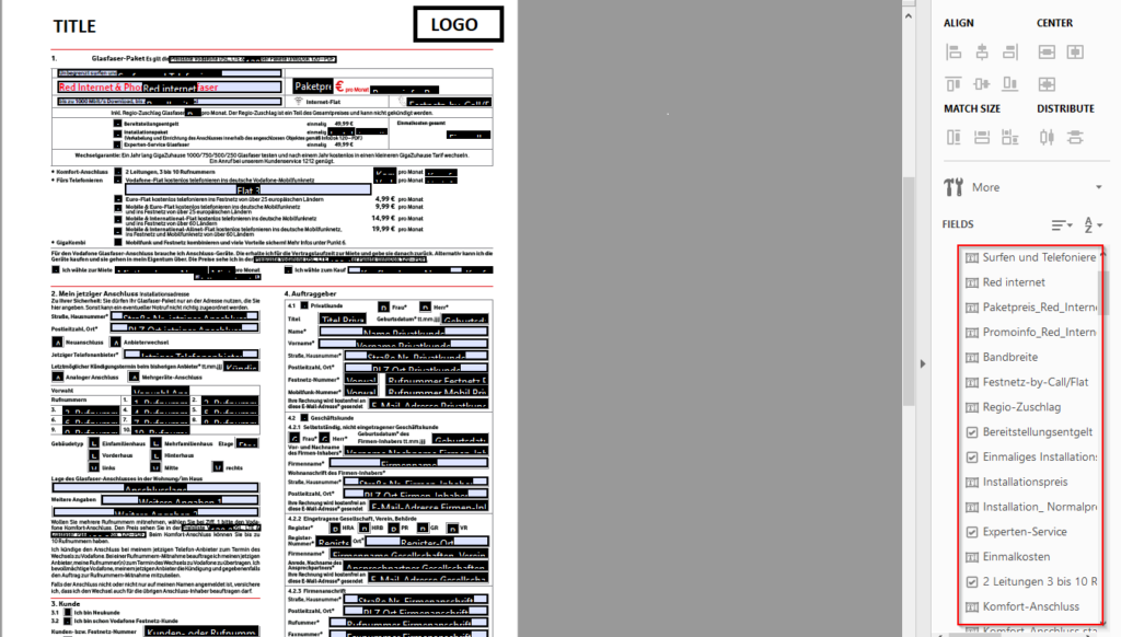
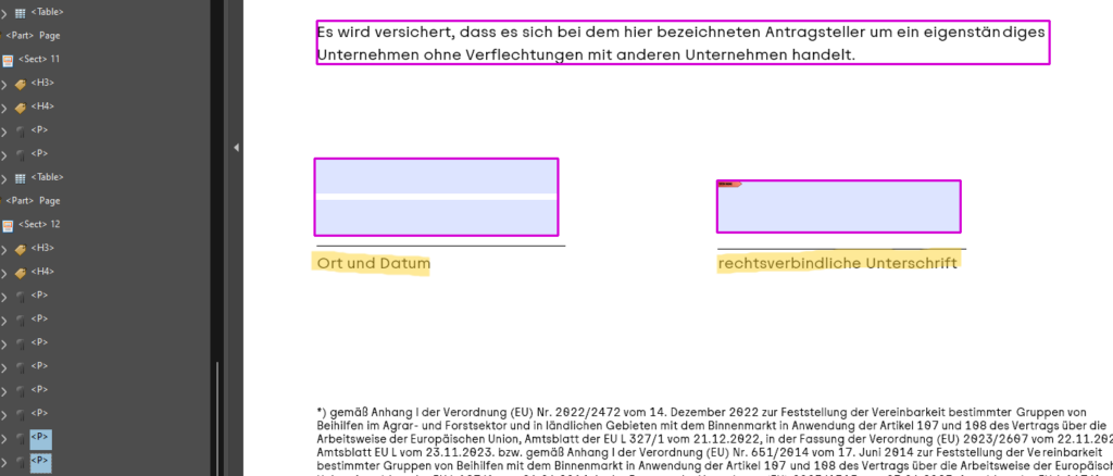
- Acrobat will automatically detect form fields if the document has any existing ones and display them for editing. It should look like this. This shows that there already forms present in the document
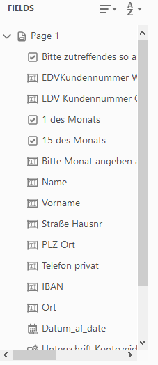
If the document doesn’t already contain any forms, new ones will need to be created. Acrobat’s toolbar provides various types of form fields that can be inserted into a PDF. The most commonly used ones are:

- 1. a. Text Field
- Click on the Text Field tool in the toolbar.
- Draw a box where you want the text field to appear.
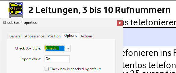
- b. Checkbox
- Click on the Checkbox tool.
- Draw the checkbox where needed.
- c. Radio Button
- Click on the Radio Button tool.
- Draw the first radio button and assign a Group Name for the radio button group (e.g., “Yes/No”).
- Add additional radio buttons to the same group for other options (e.g., “Yes”, “No”).
- d. Dropdown Menu
- Click on the Dropdown tool.
- Draw the dropdown box where needed.
- Right-click and select Properties to add items to the dropdown menu (e.g., “Option 1”, “Option 2”).
- e. Button
- Click on the Button tool.
- Draw the button in the document and assign an action, such as Submit Form, Reset Form, or Print Form.
- f. Signature Field
- Click on the Signature Field tool.
- Draw the signature box where the user will sign.
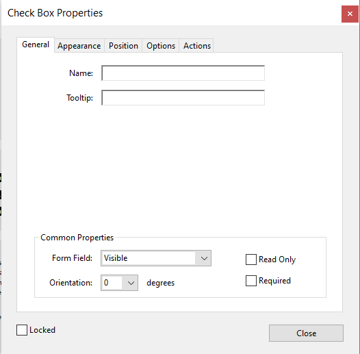
- Configure Field Properties
After adding the form fields, configure their properties to ensure they function properly
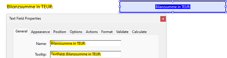
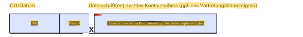
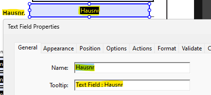
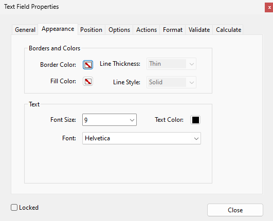
- a. Name: Assign a unique and meaningful name to each field. This helps identify the form element within the PDF and prevents confusion with other fields.
- b. Tooltip: It provides short text labels that help users understand what each form field is about. They appear when users hover over a field and are also announced by screen readers. The tooltip should clearly describe the purpose of the field using just a few words. Keep it simple, direct, and consistent across all form elements. Use a single, clear word or short phrase that identifies the field’s content.
Examples:
- First name → “First name”
- Last name → “Last name”
- Email field → “Email”
- Phone number → “Phone number”
- Date of birth → “Date of birth”
- Address → “Address”
- Company name → “Company name”
- Job title → “Job title”
- Country → “Country”
- City → “City”
- Gender → “Gender”
- Expiration date → “Expiration date”
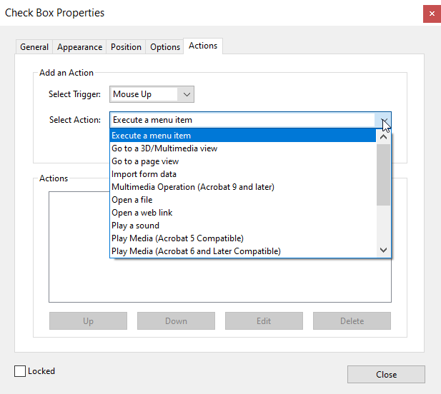
- c. Actions: For buttons, specify the action that will be triggered such as submitting the form, resetting fields, or redirecting to another page. While commonly used for navigation, actions can serve a variety of purposes depending on the form’s functionality.
When forms are correctly structured, screen readers can announce each form field, its label, and any associated instructions or error messages. This provides users with clear information on how to fill out the form and where to focus next. Labels are especially important, as they associate descriptive text with the form elements, making it easier for users to understand what information is being requested.
Keyboard Shortcuts
- Enter forms mode: Enter (when on a form field)
- Exit forms mode: NVDA+Space
- Navigate to the next form field: F
- Navigate to the previous form field: Shift+F
- List all form fields: NVDA+F7 (then select “Form Fields” tab)
- Check/uncheck a checkbox: Space
- Select an item in a combo box: Up/Down Arrow
- Navigate radio buttons: Arrow Keys
- Press a button: Space or Enter
On this page
1. Content and Integrity Checks
Ensure that the original layout and content are preserved:
Pages
- No pages should display "Warning, empty page" verify using both a screen reader and visual inspection.
- Compare page count and content before/after processing.
- Perform manual visual checks.
Text and Copy
- No typos or altered text.
- Maintain original language and texts.
Form Field Consistency
- Do not redesign form fields unless explicitly requested.
- No changes to form logic (e.g., auto-fill, carbon copy fields).
- Maintain original check mark styles (X vs ✔) and colors.
2. Form field behaviour and Interactivity
Ensure form usability and consistency:
Checkboxes
- Keep checkbox states, styling, and behavior exactly as in the original.
- Use only allowed symbols (e.g., "X" instead of ✔ unless otherwise requested).
- Ensure pre-filled checkboxes are editable or read-only per original intent.
Signature Fields
- Do not add or remove signature fields unless explicitly requested.
- Verify correct positioning and field type (digital vs text signature).
Font Size and Style
- Maintain original font size (unless a11y minimums required and approved).
- Check that resizing hasn’t affected layout or readability.
3. Tagging and Structure accuracy
Maintain semantic structure for screen readers:
Tagging Order
- Use a logical and meaningful tag order.
- Avoid excessive or duplicate tags.
- Ensure form field tags are present and named.
- Include tags for all visible content (e.g., footers, disclaimers, "Copy for…").
Reading Order
- Test with NVDA, JAWS, or VoiceOver for tab and read sequence.
- Check for floating artifacts or misgrouped elements.
4. Compliance and QA Process
Prevent systemic errors in output files:
Final File QA
- Manually review a sample of each batch.
- Run:
- PAC 2024
- Adobe Acrobat Accessibility Checker
- Screen reader testing
File Comparison
- Use original PDF vs tagged version for:
- Page count
- Font size
- Field states
- Metadata (title, form number, copyright)
The <Form> tag in PDF/UA is crucial for interactive elements like text fields, checkboxes, and buttons. It ensures that forms are accessible to users, including those using assistive technologies. Proper tagging and labeling of form elements improve usability and compliance with accessibility standards.
| Requirement | PDF/UA Section | EN 301 549 Ref | WCAG 2.1 Ref | Details / Notes |
|---|---|---|---|---|
| Form fields must be tagged | ISO 14289-1 §7.18 | §10.1.2.1 | 1.3.1 | Form fields must be represented as <Form> in the structure tree. |
| Each form field must have a programmatic label | §7.18.2 | §10.3.1 | 1.1.1, 1.3.1, 3.3.2 | Fields require labels, these must be programmatically associated. |
| Form field types must be semantically correct | §7.18.3 | §10.3.1 | 1.3.1 | Fields must use correct roles: e.g., text, button, checkbox. |
| Widget annotations must be referenced | §7.18.4 | §10.1.2.1 | 1.3.1 | Each field's widget (/Annot) must be part of the tag structure. |
| Form field types must be semantically correct | §7.18.3 | §10.3.1 | 1.3.1 | Fields must use correct roles: e.g., text, button, checkbox. |
| Tooltips or descriptions must be provided | §7.18.2 | §10.3.1 | 3.3.2 | Descriptive tooltips help users understand field purpose. |
| Form field types must be semantically correct | §7.18.3 | §10.3.1 | 1.3.1 | Fields must use correct roles: e.g., text, button, checkbox. |
| Reading order of form fields must be logical | §7.9 | §10.1.2.1 | 1.3.2 | The order in the structure tree must match visual and logical reading order. |
| Custom structure types must be mapped to standard roles | §7.8.4 | §10.1.2.1 | 1.3.1 | If using custom tags (e.g., <MyForm>), must map to standard roles like <Form>. |
| Unicode mapping for form content and tooltips | §7.11 | §10.1.2.1 | 1.1.1 | Text and labels must use /Alt, /ActualText, or Unicode to be readable by AT. |
| Grouped fields (radio buttons, checkboxes) must be semantically grouped | §7.18.3 | §10.3.1 | 1.3.1, 3.3.2 | Group and label buttons properly in structure. |
| Field appearance must be present | (ISO 32000-1) | §10.3.1 | 1.3.1 | Visible states of form fields (e.g., checkboxes) require /AP appearance streams. |
| Artifacts cannot include form fields | §7.6 | §10.1.2.1 | 1.3.1 | Form fields are real content and must not be marked as artifacts. |
| Error identification and suggestions required | — | §10.3.2, §10.3.3 | 3.3.1, 3.3.3 | Forms should identify input errors and provide guidance for correction. |
| Keyboard navigation supported | — | §11.5.2 | 2.1.1 | All form controls must be operable by keyboard alone. |
| Name, role, and value exposed to AT | — | §11.5.2 | 4.1.2 | Assistive technologies must be able to identify form control metadata. |
Predefined* form fields
*Predefined form fields - Form fields that are included by default in the form layout.
When remediating a Form PDF, it is critical to preserve the content and integrity of the form fields without making any modifications.
In cases where a tooltip is not explicitly provided, we will automatically extract relevant text from the associated PDF content to serve as the tooltip. This ensures that users still receive helpful contextual information, even in the absence of manually defined tooltips. The extracted text will be chosen based on proximity to the target element and semantic relevance, aiming to provide concise and meaningful guidance that enhances user experience and accessibility.
Checkboxes and radio buttons will retain their default visual styling as defined in the original PDF. For example, a selected checkbox may display an "X" or a checkmark” ✓”, depending on the document’s settings. This ensures consistency with the original document design and preserves the intended user experience during form interaction.
Missing form-field from original
Form fields will be intelligently generated according to the type of data required. For example, text inputs will be used for names or addresses, date pickers for date fields, and signature fields for capturing electronic signatures. This data-driven approach ensures that each form element is appropriately matched to its intended purpose, enhancing both usability and data accuracy.
Each newly created form field will have a tooltip that exactly matches the visible text label present on the document. This ensures consistency between the form’s visual elements and its underlying metadata, improving both user comprehension and accessibility. By mirroring the visible text, tooltips provide intuitive guidance and support assistive technologies in delivering accurate context to users.
All form fields will use a default font size of either 8px or 9px, determined by the specifications of the original document. This approach ensures visual consistency with the document’s design while maintaining readability and usability. The selected font size will align with the formatting standards present in the source file to preserve the document’s overall aesthetic and layout integrity.
General guidelines
Repetitive elements such as visible labels that are already represented in associated tooltips will be marked as artifacts. This prevents unnecessary duplication in the document’s tag structure and ensures a cleaner, more efficient reading experience, particularly for users relying on assistive technologies. By suppressing redundant content, the tagging process enhances document accessibility without compromising clarity or usability.
Identical visible content that appears consistently across multiple pages such as titles, page numbers, copyright notices, or graphics (e.g., logos) will be marked as artifacts. To minimize redundancy and improve document accessibility, only the first occurrence of such elements will be tagged. This ensures that assistive technologies do not repeatedly announce the same information on every page, resulting in a more streamlined and user-friendly reading experience.
The reading order of form fields within the document will adhere to the logical structure as defined by the PDF’s tagging and content hierarchy. This ensures that users navigating the form especially those using screen readers or other assistive technologies experience a coherent and intuitive flow that matches the intended sequence of the document. Maintaining this logical order enhances accessibility, usability, and overall user comprehension.
To ensure all interactive elements are fully usable and free of errors, the document will be tested using screen readers such as NVDA (Non-Visual Desktop Access). This verification process helps confirm that form fields, tooltips, and navigation order are properly conveyed to users relying on assistive technologies, thereby validating the document’s accessibility and functionality in real-world scenarios.