New Components
Text Input
The text input component is essential for user data entry. It’s used for inputting information like names or emails and can be customized for better usability and style. The standard text input is designed for brief, single-line input, while the text area is suited for more extensive, multi-line text entries.
On this page
When to Use
- Single-Line Input: Use the default text input for short, one-line content like names or email addresses.
- Customizable Fields: Employ text input when you need a field that can be tailored with validation rules, placeholders, and styling.
When not to use
- Multi-Line Content: Avoid text input for lengthy, multi-line entries; opt for a text area instead.
- Complex Data Entry: Do not use text input for complex data that requires more structured input methods, like dates or color pickers.
Behaviors
- Focus Interaction: Text input fields should highlight or change appearance when focused, indicating active input.
- Keyboard Navigation: Users should be able to access and interact with text inputs using the keyboard, typically navigating with the Tab key.
- Screen Reader Accessibility: Ensure text inputs are labeled properly for screen readers, using `aria-label` or associated `<label>` elements for clarity.
Content
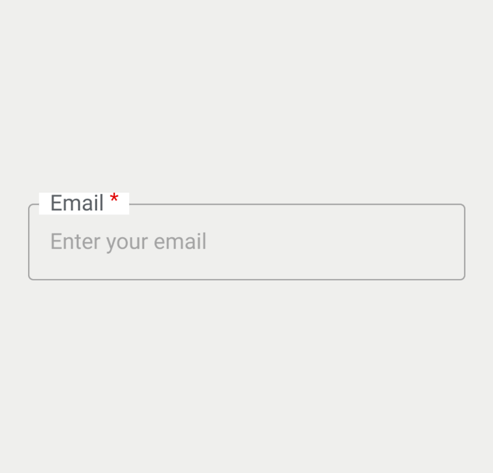
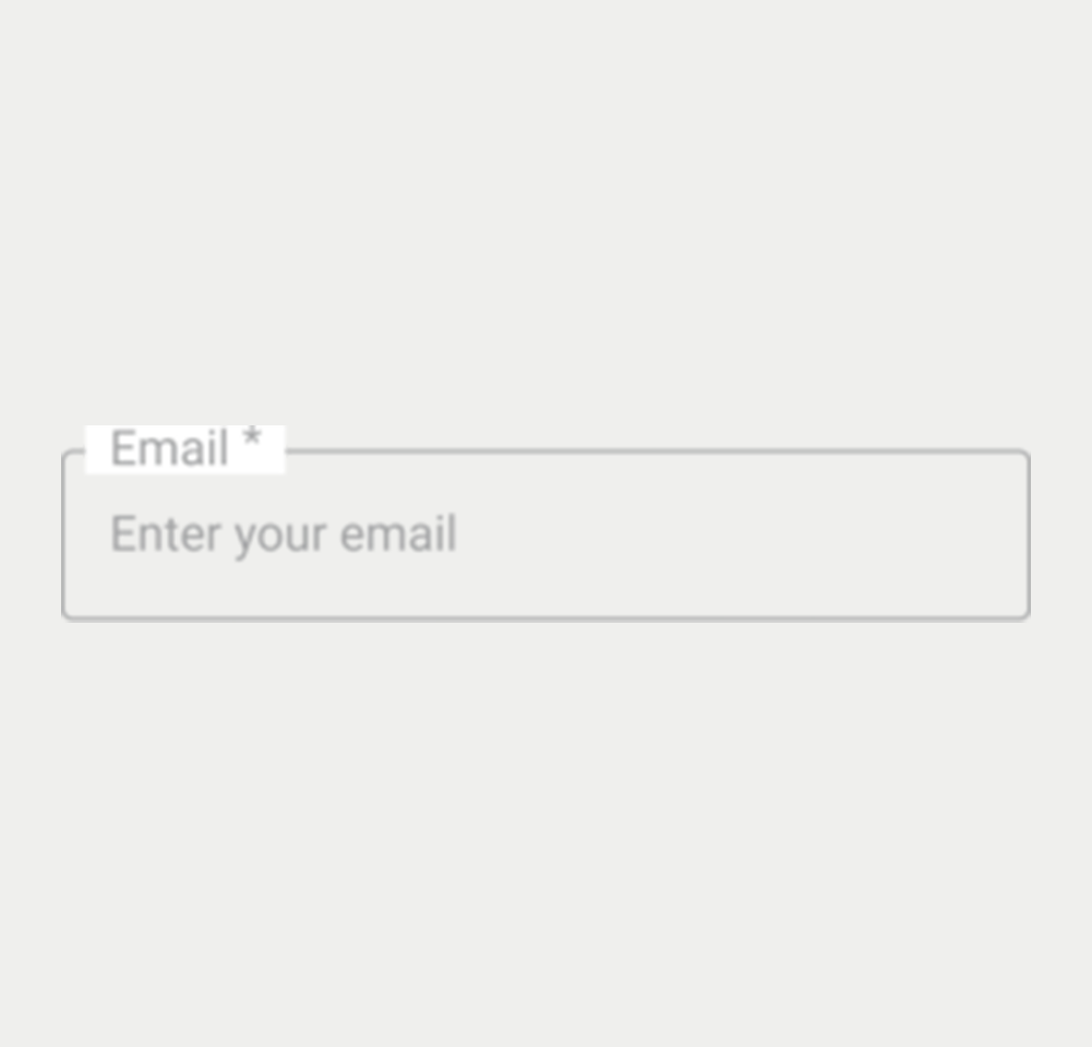
- Placeholder Text: Use concise, descriptive placeholder text to indicate the expected input or format.
- Clear Labeling: Each text input should have a clear, associated label that describes its purpose.
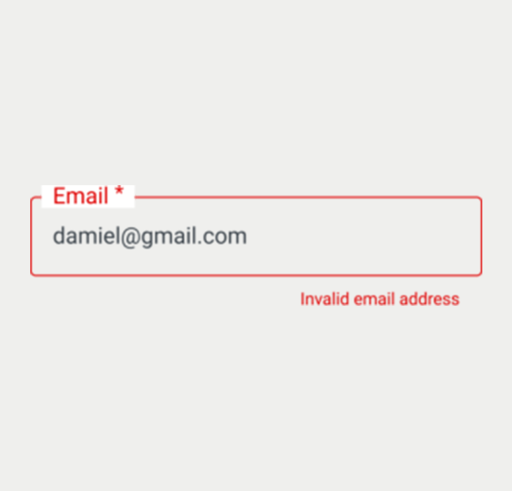
- Validation Feedback: Provide immediate, clear feedback for validation rules, like required fields or format errors (e.g., email validation).
- Consistent Styling: Maintain a consistent look and feel for text inputs across the application or website to ensure a cohesive user experience.
On this page
Figma files and assets
Designers can import all design documents from our Figma repository using our provided link below. This simplifies the design process and ensures easy access to the latest design assets for a more efficient workflow.
Feel free to utilise the prototype display located below as a practical example and demonstration of how the component is intended to operate. This interactive representation serves as a visual guide to help you grasp the expected functionality and behavior.
Username
Username
Username
Username
Username
Keywords
- Text Input: A user interface element allowing users to enter single-line text data into a form.
- HTML Form Elements: Components used to collect user inputs in HTML, such as text fields, checkboxes, radio buttons, and submit buttons.
Breakdown of Components
Default Text Input
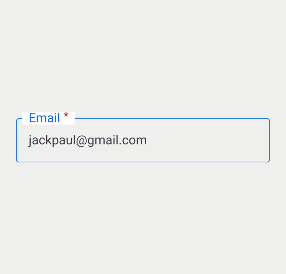
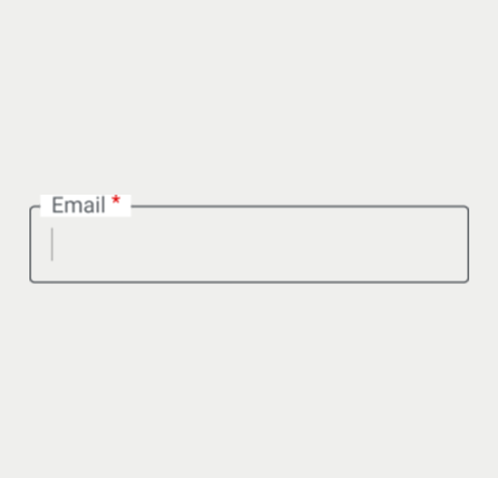
- Label: The text input is identified by a <label> with a for attribute matching the input's id, facilitating clear labeling and accessibility.
- Mandatory Fields: An input field is marked as compulsory by adding the required attribute or aria-required="true" to the form element. Visually, this is indicated by placing an asterisk before the label.
- Autocomplete: Input elements that necessitate it are furnished with the autocomplete attribute, complete with a set of pertinent attributes for functionality.
Field Validation
- Error and Success States: These states are indicated by changing the border color and displaying a message beneath the input field. The aria-describedby attribute links this message to the input for enhanced screen reader accessibility.
- JavaScript should dynamically append the error message when the text input is found to be invalid.
Disabled Fields
- Disabled State: Used when the input field is not available for interaction, such as when waiting for another action to complete. It's visually distinct to indicate its inactive status.
Additional Descriptions
- Helper Text: Additional descriptive text can be provided under the label to assist users in filling out the form. Link the helper text to its field using the aria-describedby attribute, while providing format guidance in the helper text itself, ensuring the best possible user experience.
Screen reader
- Each state and feature of the text input is designed to be compatible with screen readers.
- The use of the aria-describedby attribute in error and success states ensures that the status of the input is communicated to users relying on screen readers.
- The <label> element, associated with each input field via the for attribute, provides clear and concise descriptions, enhancing the overall accessibility of the component.
Additional Notes
- The text input is primarily for single-line entries, while a textarea is used for multi-line text, following the same styling principles but with increased height for more content.
| Key | Function |
|---|---|
| Shift + Tab / Tab | Moves the focus to the text box. |