New Components
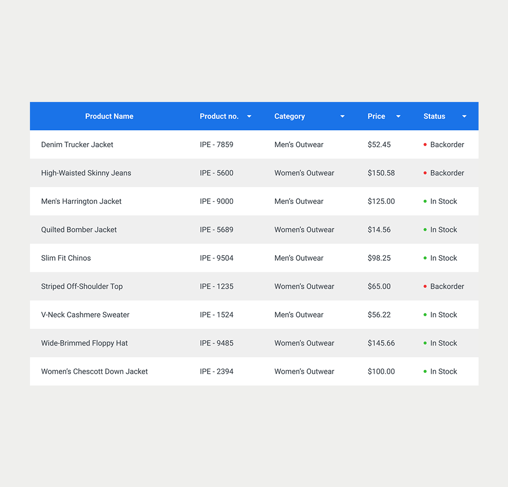
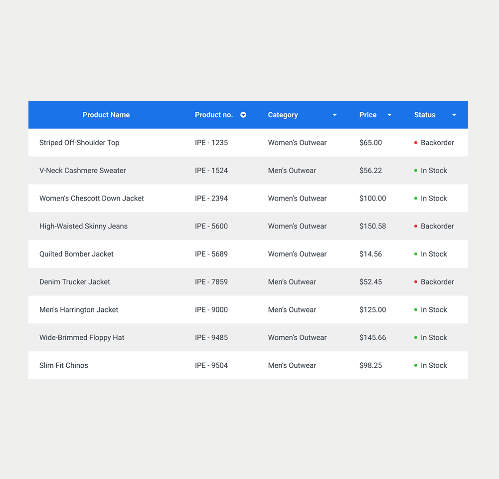
Tables
A table is a basic structure used to neatly organise and display data in rows and columns on web pages. Its main objective is to present data in an organized and structured way.
On this page
When to use a table
- Tables facilitate the visualisation of data which fits into rows and columns.
- Tables are useful when you want to compare different sets of data or show relationships between items.
- Tables are frequently used to present financial data, reports, and summaries.
- Tables are often used to present a textual alternative to complex structures such as graphs.
When not to use a table
- Avoid tables as a means of layout for content in a Grid format. This is better done using CSS and the flexbox formats.
- Try to consider other formats, such as normal text or lists if the data is very simple.
- Overly complex tables should be avoided as they may be difficult to understand. Alternative views should then be considered.
On this page
Figma files and assets
Designers can import all design documents from our Figma repository using our provided link below. This simplifies the design process and ensures easy access to the latest design assets for a more efficient workflow.
Feel free to utilise the prototype display located below as a practical example and demonstration of how the component is intended to operate. This interactive representation serves as a visual guide to help you grasp the expected functionality and behavior.

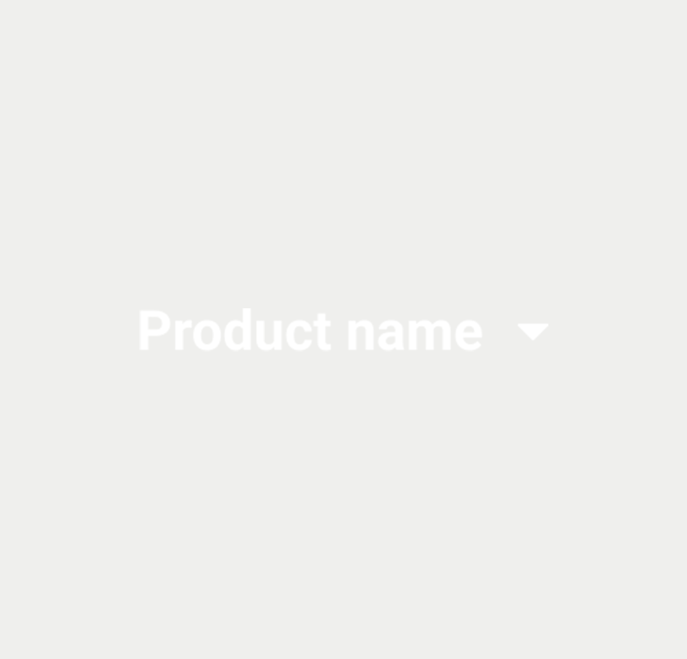
Element
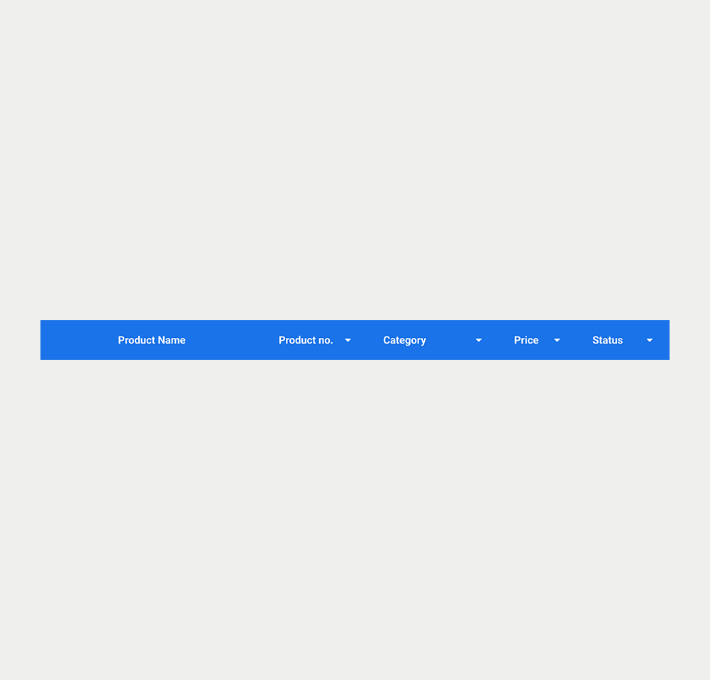
Element
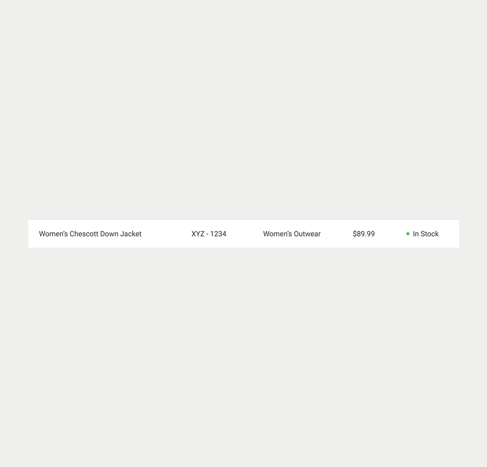
Element
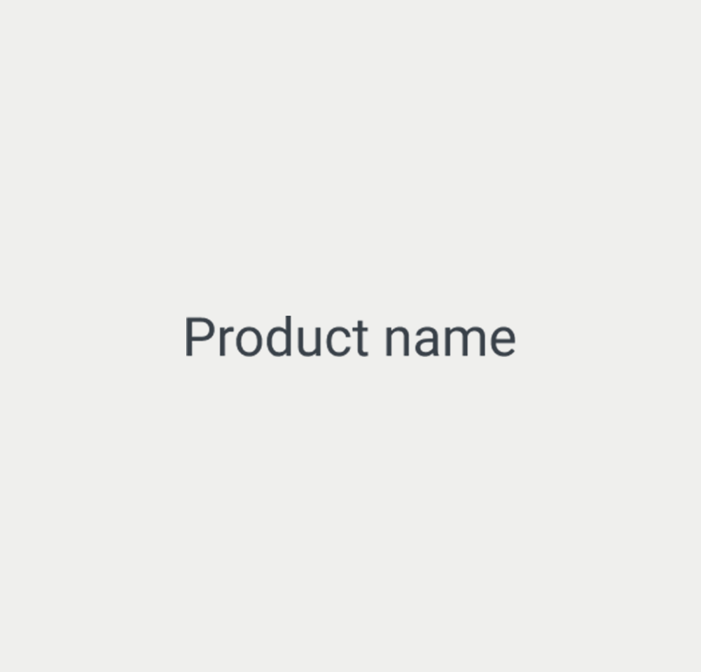
Element
Frame 1
CaretDown
CaretUp
Default arrow
Frame 6
Frame 16
Keywords
- Table : A structured format for displaying data in rows and columns, for organisational and comparison purposes.
- Row : A horizontal grouping of cells in a table, representing a single record or entry.
- Column : A vertical grouping of cells in a table, representing a category, label or characteristic.
- Cell : The basic unit of a table, lying at the intersection of a row and a column, storing a piece of data.
- Header : A row and/or column (usually the first row or column), which helps users understand the structure of the tabular data.
- Scope : The relationship between a header and the data it describes.
- Caption : A title or short description of the entire table, providing users with an overview of its content or purpose.
- Summary : A more detailed explanation (visible or programmatic) of what the table contains and how to interpret it — particularly helpful for complex tables.
Breakdown of Components
HTML Structure
Container
The <table> tag is used to represent the data in a two-dimensional table, consisting of rows and columns of cells with data.
Header
It is essential to define header cells in <th> tags. These cells identify the contents of columns or rows. By using the scope attribute, the header cells can be associated with the corresponding data cells.
- For column headers, use scope="col".
- For row headers, use scope="row".
Table rows and data cell
Table rows are defined using <tr> tags, which group individual cells into horizontal rows. Inside each row :
- Header cells, <th>, are used to provide a label for the rows or columns.
- Data cells, <td>, contain each data in the table.
Table Sections
To further improve clarity and structure, tables can be divided into three main sections :
- <thead>: Wraps the table’s header rows.
- <tbody>: Wraps the body rows (main data of the table).
- <tfoot>: Optionally wraps footer rows, such as totals or summary values.
Caption
Tables usually include a <caption> element to provide a short title or explanation of the table's purpose. It should be placed immediately after the opening <table> tag. This helps users decide if they need to check the rest of the table content or skip over it.
<table>
  <caption>List of available products</caption>
  <!-- Table content -->
</table>Summary
The <caption> tag can be further exploited to accomodate a summary describing the composition of the table, which is particularly useful for complex tables. Alternatively, the aria-describedby attribute can be used to associate a summary to the table.
<table>
  <caption>
    Annual Budget Overview<br>
    <span>This table presents departmental budgets for the financial year 2024. The first column lists the departments. The header spans two rows: the top header groups budget-related columns, while the second header row separates allocated and spent amounts. The final column shows the variance between the allocated and spent budgets. Each data row corresponds to a department and contains its budget details.</span>
</caption>Scope
Using the scope attribute on <th> elements is often unnecessary in straightforward tables, since browsers and assistive technologies can usually infer whether a header applies to a row or a column. However, including scope can enhance reliability, especially for assistive technologies that may struggle to make these assumptions correctly. In more complex tables, explicitly setting scope becomes more important to clarify header relationships.
Column and row spanning
When a table structure includes merged cells using colspan or rowspan, it can become difficult for screen readers to determine how header cells relate to each data cell. These structural complexities can hinder accessibility because they disrupt the standard horizontal and vertical associations. It is thus better to simplify the presentation by dividing a large table into multiple smaller, logically grouped tables. Alternatively, the recommended approach is to use the id and headers attributes to create clear, programmatic links between each data cell and the appropriate header cells.
Empty cells
For empty cells or cells with non-text content, add a <span> with the “sr-only” class containing relevant text, which can be vocalized by screen readers.
<td>
    <span class="sr-only">Non applicable</span>
</td>ARIA Attributes
Native HTML tags and attributes should be used whenever possible — they are automatically accessible if marked up correctly. However, ARIA attributes can also be used for a custom table layout. To ensure proper semantic structure and assistive technology support when building custom tables, certain ARIA roles and attributes must be applied systematically.
- The table container has the role="table" attribute.
- Each row container has the role="row" attribute and is either a DOM descendant of or owned by the table element or an element with role="rowgroup".
- Each cell is either a DOM descendant of or owned by a row element and has one of the following roles:
- role="columnheader" if the cell contains a title or header information for the column;
- role="rowheader" if the cell contains title or header information for the row;
role="cell" if the cell does not contain column or row header information.
- The attributes aria-label, aria-labelledby and aria-describedby can be used to provide a label, caption or description related to the table.
Special Features
Tables can include the several features to enable your users to interact with the data it presents.
Sortable Tables
- Sort the contents of each column, in ascending or descending order.
- Includes a visual indicator (for example, '▼' and '▲') on the headers of each sortable columns, usually hidden to assistive technologies using the aria-hidden="true" attribute.
- The header text of sortable columns is wrapped in a <button
>element. - The aria-sort attribute is set on the column header of the currently sorted column. The value will be set to "ascending" if the data cells in the column are sorted in ascending order, or "descending
"if the data cells in the column are sorted in descending order.
Actions
- Some tables offer the possibility to select rows using checkboxes.
- Action bars can also be present in some tables. The actions can concern selected rows, or the entire table.
Screen reader Accessibility
- A screen reader typically announces that it encounters a table along with the number of rows and columns present.
- If a caption has been included, it is read by the screen reader, thus providing an introduction to the table.
- Screen reader users can navigate through the table cell by cell, row by row, or column by column.
- The screen reader reads the row or column header, and then the content of the data cells, allowing the user to understand the context of the information. Well-defined headers are important, as they allow the screen reader to make these associations correctly.
Keyboard Operability in Tables
- Tables are not keyboard operable by default.
- If interactive items are present in the table (such as links or buttons), they inherit default keyboard interactions. Each component is thus included in the tab order, and can be activated using the Enter key.
The demo in mobile version will be available soon. In the meantime, we invite you to check out the desktop version.