New Components
Radio Button
Radio buttons allow users to select one option from a set of mutually exclusive choices. They’re ideal for forms where users must make a single choice; they’re easily navigable via mouse or keyboard and are screen-reader friendly with proper labeling.
On this page
When to use
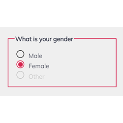
- Binary Choices: Implement radio buttons for making a selection when presenting users with a set of mutually exclusive options. For example: gender, Yes or No questions, etc...
- Grouped Options: Use radio buttons when the user needs to view all available options side-by-side for a clear comparison.
When not to use
- Independent Options: Avoid radio buttons for independent choices that do not relate to a group of options, where checkboxes would be more appropriate.
- Large Sets of Options: Do not use radio buttons when presenting users with a long list of options; a dropdown menu might be a better alternative to conserve space.
- Multiple Selections: Avoid radio buttons when multiple selection is required or possible. The checkbox is more adapted to this scenario.
Behaviors
- Mouse Interaction: Radio button options should respond visually to mouse interaction, indicating selection with a filled circle or a color change.
- Keyboard Navigation: Radio buttons should be navigable through the keyboard, allowing users to select options using the arrow keys, Tab key, and Enter key.
- Screen Reader Accessibility: Clearly label each radio button with a text label, and use fieldsets and legends for groups of radio buttons. Employ ARIA attributes such as role="radio" and aria-checked to communicate the state and group of the radio buttons to screen readers.
Content
- Clear Labeling: Each radio button should have a concise label that clearly describes the option it represents.
- Logical Grouping: Organize radio buttons into logical sets using fieldsets and legends, indicating the relationship between the options.
- Visual Distinction: Visually distinguish the selected radio button from others using a contrasting color or icon, ensuring users can easily identify their choice.
- Avoid Ambiguity: Ensure each radio button's purpose is clear and that the consequences of selection are understood, avoiding confusion about what is being chosen.
On this page
Figma files and assets
On this page
- Keywords
- Breakdown of Components
- Labeling and Association
- Grouping and Fieldset
- State Indication - Custom radio buttons
- Error Handling and Feedback
- Testing Guidelines
- Code Overview
- Native Radio Button
- Custom Radio Button
- Grouping and legend
- Radio buttons
- Keyboard interactions
- Screen Reader Accessibility
Keywords
- Radio Button: A UI element for selecting one option from a set of mutually exclusive choices.
- Form: A section on a web page for user input and selection.
- ARIA: Attributes that enhance web accessibility.
- Fieldset: Groups related elements within a form.
- Label: Describes the purpose of form elements, like radio buttons.
Breakdown of Components
Labeling and Association
- Radio Button Element: Essential for user selection, where each radio button shares a common name attribute but maintains a distinct ID for individual labeling.
Grouping and Fieldset
- Fieldset and Legend: Used to logically group radio buttons together, with fieldset encompassing the set, and legend providing an overarching title or description.
State Indication - Custom radio buttons
- ARIA Attributes: Crucial for screen reader users. Attributes like aria-checked inform about the selection status, while role="radio" accurately presents the element's function.
- Ensures keyboard navigability for radio buttons, allowing focus control with tabindex="0", and enabling interaction through keyboard events managed via JavaScript.
Error Handling and Feedback
- Implement clear and immediate feedback mechanisms for error handling, guiding users to correct any selection mistakes with visual cues or descriptive error messages.
Testing Guidelines
- To effectively conduct accessibility compliance testing, it's essential to prioritize keyboard navigation and utilize screen reader technology to verify adherence to accessibility standards.
Code Overview
Native Radio Button
- Each radio button is linked to a <label> element using the for attribute on the label and assigning an id with the same value to the input element. This ensures that screen readers announce the correct labeling information.
- The radio buttons must be placed within a <fieldset>, which contains a descriptive label provided by a the <legend> element. This grouping context and descriptive label help organize and clarify the purpose of the radio buttons.
- The radio buttons input type="radio" are inherently keyboard accessible. They will display the browser's default focus indication or can be customized with CSS to provide a visible focus indication.
Custom Radio Button
When creating custom radio buttons, all the inherited accessibility features that comes with the input type="radio" and fieldset need to be manually added, either though ARIA attributes or javascript.
Grouping and legend
- Enclose each custom radio button within list items (<li>) organized within an unordered list (<ul>).
- Add the role="radiogroup" to the <ul> element, ensuring that the list will be recognized as a group of radio buttons.
- Add a unique id on the legend of the radio buttons and add an aria-labelledby attribute on the ul element with the id of the legend. This will make sure that the screen reader will read the lengend when the focus arrives on the first radio button.
- Include an aria-activedescendant attribute on the <ul> element and set its value to the ID of the visually selected radio button. This attribute indicates the currently active (selected) radio button within the radio group to assistive technologies.
Radio buttons
- Transform each <li> element into a radio button by adding role="radio" to them. This ensures semantic clarity and accessibility for screen readers.
- Ensure each <li> element includes the aria-checked attribute. Set its value to true for the checked radio button and false for all others. It's crucial that only ONE radio button within the group has the aria-checked attribute set to true. This attribute communicates the checked state of each radio button to assistive technologies.
- Include tabindex="0" attribute on all radio buttons (<li> elements), enabling them to be part of the tab order and accessible via keyboard navigation. This attribute ensures keyboard accessibility to interact with the radio buttons.
Keyboard interactions
- All the keyboard interactions for a custom radio button needs to be handled with javaScript. See the keyboard navigation tab to see all of them.
Screen Reader Accessibility
- Clear Labeling: Each radio button is labeled for screen readers using the 'for' attribute.
- Group Context: The fieldset and legend tags provide context for a set of radio buttons, aiding screen reader users.
- Keyboard Navigable: Radio buttons can be navigated and selected using the keyboard.
- State Communication: Screen readers announce the selected state when the radio button is focused.
- Semantic HTML: Using standard HTML tags like input, label, fieldset, and legend ensures built-in accessibility support.
| Key | Function |
|---|---|
| Tab |
|
| Down/Right arrow |
|
| Up/Left arrow |
|
| Enter / Space |
|
The demo in mobile version will be available soon. In the meantime, we invite you to check out the desktop version.