New Components
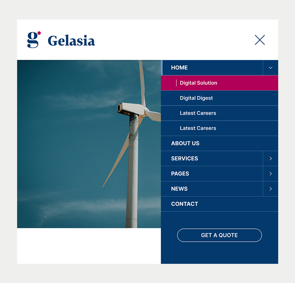
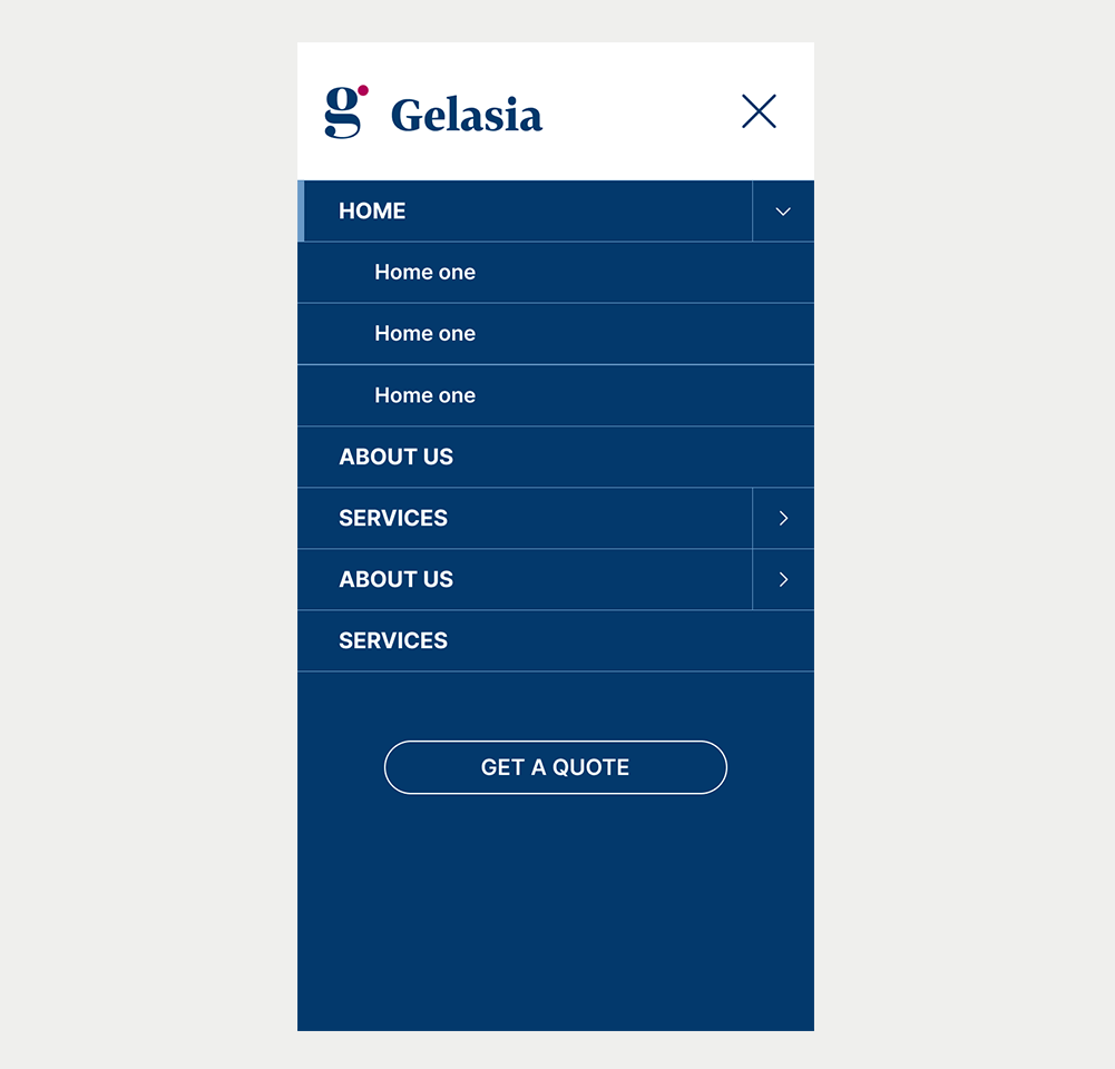
Navigation Bar
Navigation menus replicate the layout of the website, assisting users in navigation. Given their fundamental roles, menus are pivotal components in both web pages and applications, demanding focused consideration during the design and development phases.
On this page
When to use
- When the website consists of various pages or sections, a navbar becomes valuable for enabling users to effortlessly move between them. This might involve pages like "Home", "About us", "Blog", and "Contact us"
- Implementing a fixed or sticky navbar, which remains at the top while users scroll, enables consistent access to the main sections. This feature enhances the overall user experience.
- Individuals with limited attention or short-term memory gain advantages from menus that are straightforward and distinguishable, featuring easily recognizable states like the current page.
When not to use
- For single-page websites, a navigation bar might not be necessary. Instead, contemplate employing a scrolling menu that guides users to various sections within the page.
- Landing Pages: Often, landing pages are designed to restrict navigation in order to focus the user's attention on specific content or calls to action.
On this page
Figma files and assets
Designers can import all design documents from our Figma repository using our provided link below. This simplifies the design process and ensures easy access to the latest design assets for a more efficient workflow.
Feel free to utilise the prototype display located below as a practical example and demonstration of how the component is intended to operate. This interactive representation serves as a visual guide to help you grasp the expected functionality and behavior.
Design

Desktop
Tablet
Mobile
Prototype
Keywords
- Navigation: A framework enabling users to move across a website.
- Menu: Encompasses options or actions users can select from.
- Parent Menu Item: Represents a primary item in the menu under which sub-items, known as child items, are situated. These can also be considered as top-level menu items.
- Submenu: A compilation of secondary navigation elements displayed when a user interacts with a parent menu item.
- List: An element that arranges items or values in an ordered (numbered) or unordered (bulleted) sequence.
- Link: Permits users to transition between locations within the same or different web pages.
Breakdown of Components
Navigation
Establishes a section as a navigational landmark. Various navigation types (primary, secondary, breadcrumbs, lateral) exist, with the navigation bar serving as a website's primary navigation.
- Identify the menu inside, ideally using the HTML5 <nav> tag to allow users access to the menu directly.
- Label menus to make them easier to understand. Employ simple and descriptive labels for users to differentiate among multiple navigations. Use the attribute aria-label for labeling a navigation, such as aria-label="Main navigation".
<nav id="navigation" role="navigation" aria-label="Main navigation">Menu
- Define the menu's structure through a list format. This structural detail enables assistive tools to announce the item count and facilitate navigation.
- Use the link tag to define individual menu items, each directing to a designated destination, be it a page section or a new page.
- Use markup to signify the current menu item, such as the current web page on a site, enhancing navigation within the menu. This indication should cater to both visual users and assistive technologies.
<ul>
    <li><a href="javascript:void(0);" aria-current="page" class="active">Home</a></li>
    <li><a href="javascript:void(0);">Shop</a></li>
    <li><a href="javascript:void(0);">About us</a></li>
    <li><a href="javascript:void(0);">Contact</a></li>
</ul>Submenu
Submenus appear as drop-down lists, offering an overview of a website's page structure. This eliminates the need for users to navigate through the parent page before reaching the child destination.
- Specify Submenus with both visual cues and accessibility attributes to designate navigation items with submenus.
- A visual cue like a down chevron icon can highlight the presence of submenus
- Use WAI-ARIA attributes aria-haspopup="true" and aria-expanded="false" indicates that a submenu is present and collapsed. Changing the value of this attribute to aria-expanded to true will indicate that the submenu is open.
- The submenu must work with both the mouse and the keyboard.
<li class="has-submenu">
    <a href="javascript:void(0);" aria-haspopup="true" aria-expanded="false">
        Products
    </a>
    <ul>
        <li><a href="javascript:void(0);">Product 1</a></li>
        <li><a href="javascript:void(0);">Product 2</a></li>
    </ul>
</li>Interacting with Submenus
Submenus should remain closed when navigating through the menu using the tab key. This prevents keyboard users from having to navigate through all submenu items to reach the next top-level item. Instead, consider the following approaches:
- Use the Parent Menu Item as a toggle:
- This method is suitable when the parent menu item merely provides an overview of the submenu and doesn't perform an action like linking to a webpage.
- Use a button as a toggle:
- When the parent menu item is a link to a webpage, you can add a separate button to the parent item. This button can serve as a way to open and close the submenu.
| Key | Function |
|---|---|
| Tab |
|
| Shift + Tab |
|
| Space/Enter |
|