New Components
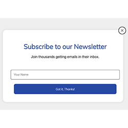
Modal Window
A modal window, also known as a dialog, is a pop-up window that appears on top of the main content of a website or application. It typically requires user interaction before the user can return to the main content. Modal windows are commonly used for displaying important messages, alerts, or interactive forms.
On this page
When to Use
When to use a Modal Window:
- Critical Information: Use a modal window for displaying critical information that requires immediate attention from the user, such as error messages or important alerts.
- Confirmation: Modal windows are effective for confirmation dialogs, such as prompting the user to confirm an action before proceeding, deleting a file or submitting a form.
- Focus Attention: Use modal windows to focus the user's attention on a specific task or piece of content, such as a login or registration form.
- Temporary Interruptions: Modal windows are useful for temporary interruptions that require user input, such as notifications or updates that need to be acknowledged before continuing.
When not to use
- Continuous Content: Avoid using modal windows for content that users need to interact with frequently, as opening and closing modal windows can be disruptive to the user experience.
- Complex Forms: Modal windows are not ideal for displaying complex forms or workflows that require a lot of user input, as it can be difficult for users to navigate within a confined space.
- Mobile Devices: Modal windows can be problematic on mobile devices, where screen space is limited and users may have difficulty closing the modal or navigating back to the main content.
Usability
Control: Users should always have control over the appearance of modal windows. They should only appear in response to a user's action, such as clicking on a button. The goal is to prevent users from being surprised by the sudden appearance of a modal or having their navigation through a page disrupted. However, there are exceptions to this rule, such as when an urgent alert needs to be conveyed to the user immediately, such as when a session is about to end.
Name: Every modal should have a clearly visible title that explains its content. This title is essential for users, including those using assistive technologies, in identifying and understanding the content of the modal.
Multi-modal: Avoid nesting modals within each other. If a scenario requires multiple modals, consider using a dedicated page instead to streamline the process.
Scrolling: Avoid creating modals with extensive content that requires scrolling to view all information. If unavoidable, ensure that a scrollbar is consistently visible and easily identifiable for users.
Keywords
- Modal Button : A modal button is a user interface element, typically a clickable element like a button, that triggers the opening of a modal window when clicked. It serves as a clear visual indicator to users that interacting with it will display additional content or require their attention.
- Modal Window : A modal window, also known as dialog, is a temporary window that appears on top of the main content of a website. It is used to display important information, request user input or confirm an action, and typically requires the user to interact with it before returning to the main content.
- Tab Order: The tab order refers to the sequence in which elements receive focus when the user navigates through the page using the Tab key. For modal dialogs, it's important to manage the tab order so that users can easily navigate through the dialog's interactive elements in a logical order.
Breakdown of Components
Modal button
- A button tag <button> is used for the component to ensure accessibility for users navigating with a screen reader and keyboard.
- To indicate to screen reader users that the button triggers a dialog, an aria-haspopup="dialog" attribute is added to the button tag, clarifying the action upon activation..
Code overview
Native Modal Window
Native modal windows are implemented using the native <dialog> tag in HTML, offering several advantages over custom modal windows. But what are these advantages?
- Accessibility: Native modal windows inherently adhere to accessibility standards, ensuring compatibility with screen readers and keyboard navigation.
- Simplicity of Implementation: The <dialog> tag simplifies the creation of modal windows in HTML, requiring less code than custom implementations which typically depend on additional JavaScript and CSS for handling visibility, animations, and accessibility features.
- Tab order: The tab order is handled by default when a <dialog> tag is used, as the tag's default property of display: none; excludes all components within the modal when it's closed.
- Responsive Design: Native modal windows seamlessly integrate with responsive design principles, automatically adjusting their size and layout to fit various screen sizes and orientations.
- Keyboard Support: Taking into account the use of the Escape key to close the dialog is already accounted for when employing a <dialog> tag, thus minimizing the need for JavaScript manipulation.
- Browser Support Handling: Native dialogs are directly supported and maintained by browsers. This means that as browsers update and evolve, the <dialog> tag will automatically benefit from any improvements or bug fixes, reducing the need for manual updates and compatibility fixes.
- Concerning focus management, this still must be constrained within the dialog when it is open through javascript.
Custom Modal Window
Developing a fully customized modal window necessitates increased utilization of accessibility attributes and JavaScript manipulation.
- The role="dialog" attribute is crucial because it indicates to assistive technologies that the content that just appeared in the center of the user's screen is a dialog. This helps users understand that the dialog is separate from the rest of the page and requires their attention.
- The dialog must include a main <hx> heading associated via the aria-labelledby attribute to the dialog element, ensuring screen reader users understand the purpose of the dialog upon its appearance.
- Adding the aria-modal="true" attribute ensures that the dialog behaves as a modal window, requiring exclusive user attention until its closure, thereby enhancing navigation and interaction.
- Upon the dialog's appearance, focus must automatically be shifted to the first interactive element of the modal window, facilitating seamless navigation for users.
- The icon that has been implemented as a close button has an
aria-labelattribute to ensure that the purpose of the component is clear to users navigating with assistive technologies. - To maintain the user's attention, when the dialog is closed, the focus returns to the button that opened the dialog, hence ensuring users are not confused with the navigation.
- To maintain a logical tab order and exclude dialog elements when it's closed, the
display: none;CSS property is applied, ensuring a streamlined user experience during navigation. - Adding a transparent effect to the background when the dialog appears in the center of the screen improves accessibility. It reduces visual distractions for users with low vision or cognitive impairments, emphasizing the dialog's content. This enhancement improves focus and comprehension, particularly in situations requiring clear visual attention for effective interaction.
- Enabling the use of the escape key to close the dialog benefits keyboard users. It offers a simple, efficient way to dismiss the dialog without needing precise mouse interactions.
- The focus must be constrained within the dialog when it is open, ensuring that users cannot navigate to elements outside the dialog, thus preventing the focus to place itself on elements that are in the background of the dialog.
Screen reader
- aria-haspopup="dialog": This attribute is used to indicate that activating an element will trigger a dialog or pop-up. It helps assistive technologies understand the relationship between the triggering element and the dialog.
- role="dialog": This attribute is used to define an element as a dialog or modal window. It helps assistive technologies identify and properly handle the dialog, ensuring users understand its purpose and interaction.
- aria-modal: This attribute is used to specify whether an element is a modal dialog. When set to "true", it signifies that the dialog is modal, thereby blocking interactions of assistive technologies with the rest of the page until it is closed.
- aria-labelledby: This attribute is used to associate a dialog with an element that serves as its title. It helps users of assistive technologies understand the purpose of the dialog.
| Key | Function |
|---|---|
| Tab |
|
| Shift + Tab |
|
| ESC(Escape) | Closes the dialog and focus returns on the button activating the dialog. |
The demo in mobile version will be available soon. In the meantime, we invite you to check out the desktop version.