New Components
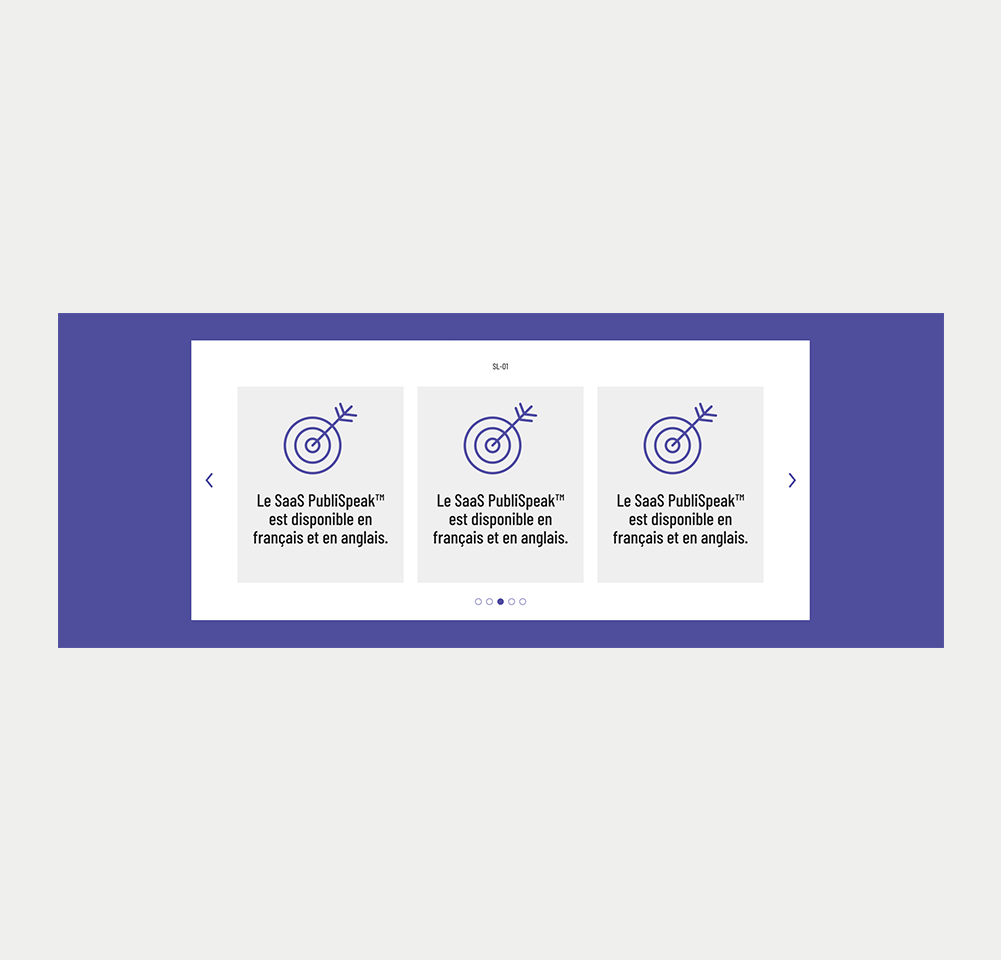
Carousel Slider
A Carousel Slider, also known as a Content Slider, lets users move through a set of things like images, text, or videos horizontally or vertically. They’re common on websites to showcase products, news, or portfolios.
On this page
When to use
While carousels might hold visual appeal and save space, they often face criticism due to accessibility and usability concerns. Nevertheless, when approached with accessibility in consideration, carousels can still offer value to your website.
- Showcasing Multiple Items: If you possess a range of items to exhibit like highlighted products, noteworthy news, client endorsements, or a portfolio gallery, a carousel can be effective. It facilitates convenient browsing through multiple items.
- Saving Space: In scenarios where web page space is restricted, carousels can accommodate more content within a given area, in comparison to static content.
- Capturing User Attention: Carousels effectively capture a user's attention. The dynamic shift of images or content swiftly draws the viewer's gaze.
When not to use
- Information Overload: When a carousel includes excessive content or numerous items, it can overpower users, making it challenging to digest the information presented.
- Abundance of Slides: When a slider houses numerous slides, navigation within the carousel can become tedious and repetitive.
- Important Information: If your carousel includes crucial information, remember that not all visitors will wait for each slide. Opting for static content presentation ensures essential messages aren't overlooked.
- Mobile Experience: Carousels can face challenges on mobile devices due to smaller screens, slower loading, or swipe issues. A stacked content presentation might prove more efficient.
On this page
Figma files and assets
Designers can import all design documents from our Figma repository using our provided link below. This simplifies the design process and ensures easy access to the latest design assets for a more efficient workflow.
Feel free to utilise the prototype display located below as a practical example and demonstration of how the component is intended to operate. This interactive representation serves as a visual guide to help you grasp the expected functionality and behavior.
Design
Desktop
Tablet

Mobile
Prototype
Keywords
- Slide: These are the distinct content elements showcased within the carousel, encompassing images, text, videos, or any amalgamation of these components.
- Navigation Arrows: Typically depicted using left and right arrows, they enable users to manually navigate through the slides.
- Pagination buttons: They are commonly displayed as a set of dots or numbers corresponding to each slide in the sequence. These provide an alternative means for users to manually move through the slides while showing the current position within the slide set.
- Container: This is the main container encompassing all elements of the carousel slider. It usually holds the currently displayed slide, navigation controls, and additional components.
- Content: Slides may display text, images and multimedia.
- CTA button (optional): Slides might feature a call-to-action button, urging users to undertake specific actions such as 'Buy Now,' 'Read More,' 'Sign Up,' and so forth.
Breakdown of Components
Container
The slides typically create a grouping or list of items. Therefore, it's wise to utilise WAI-ARIA roles like 'group/region' on the main container and 'list' on the container of all slides to designate them as such for assistive technologies. These roles establish the carousel wrapper as a significant landmark and intricate widget, composed of multiple elements.
Because a carousel holds multiple information slides, it's crucial to provide a clear title to such a complex widget. This way, users reading content through assistive technologies can readily comprehend the carousel's contents. Achieve this using WAI-ARIA attributes like aria-label or aria-labelledby. While aria-label can directly label content in the code, aria-labelledby is preferable when a visible title already exists on the page. Simply assign an ID to the visible title and link it via the aria-labelledby attribute.
<div id="carousel" role="group" aria-label="Featured news carousel">
  <div id="carouselSlides" role="list">
    <!-- All slides -->
  </div>
</div>Slides
Given that the slides container was defined as a list, it's important to label each slide as a list item using the role="listitem". When a screen reader encounters the attributes role="list" and role="listitem", it perceives the carousel as a collection of items and indicates the count of slides contained within the carousel.
<div id="slide1" role="listitem">
    <h2>Slide 1 Title</h2>
    <p>Slide 1 Content</p>
</div>
<div id="slide2" role="listitem">
    <h2>Slide 2 Title</h2>
    <p>Slide 2 Content</p>
</div>Navigation Arrows
- Setting Up: Preferably, define them using the <button> element, which inherently offers several accessible attributes.
- Providing Clear Titles: Use aria-label attributes on each button to clarify their purpose for screen reader users. For instance, aria-label="next slide" and aria-label="previous slide".
- Visible Focus Clarity: Always ensure clear visual indication when arrows receive the keyboard focus.
- Visual Aspects: Ensure arrows are easily visible. They should offer strong contrast against their background and be adequately sized, making it easy to click/pressed. Place the previous arrow on the left side of the carousel and the next arrow on the right.
- State: When the end or beginning of the carousel is reached, it's important to disable the next or previous arrow accordingly. They can also be hidden, but this action should consistently employ aria-hidden or aria-disabled attributes.
- Icons: In case <svg> tags are used for creating visual arrow, these icons are decorative and should possess the attribute aria-hidden="true". This conceals them from assistive technologies for enhanced accessibility.
<button id="prevSlide" aria-label="previous slide">
    <!-- SVG or icon for arrow go here -->
</button>

<button id="nextSlide" aria-label="next slide">
    <!-- SVG or icon for arrow go here -->
</button>Pagination buttons
- The Container: Designate all buttons as a group with a meaningful title to help users of assistive technologies in recognising that these buttons facilitate carousel navigation. Use the role="group" attribute to define the group, and incorporate the title via the aria-label.
- Setting Up: Preferably, define them using the <button> element, which inherently offers several accessible attributes.
- Providing Clear Titles: Use aria-label attributes on each button to clarify their purpose for screen reader users. For instance, aria-label="Go to slides 7 to 9"
- Indicate Current Button: The currently selected button should possess a noticeable visual difference to signify the currently displayed slide (like a distinct color or border). Use the aria-pressed attribute to indicate the current slide. For the button representing the current slide, set aria-pressed="true". For others, use aria-pressed="false". Dynamically update these attributes as slides change.
- Visible Focus Clarity: Always ensure clear visual indication when pagination buttons receive the keyboard focus.
<div aria-label="Carousel Pagination" role="group" aria-label="Carousel pagination">
  <button aria-label="Go to Slide 1 to 3" aria-pressed="true">1</button>
  <button aria-label="Go to Slide 4 to 6" aria-pressed="false">2</button>
  <button aria-label="Go to Slide 7 to 9" aria-pressed="false">3</button>
</div>Interaction with the keyboard
Intial tab order
The focus order within a carousel slider should logically correspond to the visual positioning of the content, ensuring comprehensibility for all users, particularly those relying on keyboard navigation or screen readers. Below is the recommended focus order:
- Slides: Initially, the focus should be directed to the first visible slide. In cases where these slides include interactive elements like links or buttons, it's crucial to integrate them within the existing focus sequence. If multiple slides are visible simultaneously, the focus should transition through each of them before progressing to the subsequent element.
- Navigation Arrows: Subsequently, the focus should be directed towards the navigation arrows. If the previous arrow is visible and enabled, it should be the initial focus before the next button.
- Pagination Buttons: Lastly, the pagination buttons should receive the focus. These buttons allow users to directly choose individual slides.
After interaction
When a user clicks the next or previous button in a carousel or activates them using a keyboard, the focus should ideally shift to the newly presented slide content. The tab order should now be as follows:
- Slides and any interactive contents thet might contain.
- Navigation Arrows. First the previous button and then the next button
- Pagination Buttons.
| Key | Focused element | Function |
|---|---|---|
| Tab | Element before carousel slide: | If the slides contain interactive elements, focus goes to the first interactive element of the first slide |
| Tab | Interactive element on slide |
|
| Tab | Previous button | Focus goes to the next button |
| Tab | Next button | Focus goes to the first pagination button |
| Tab | Last pagination button | Focus goes to the next interactive element on the page |